
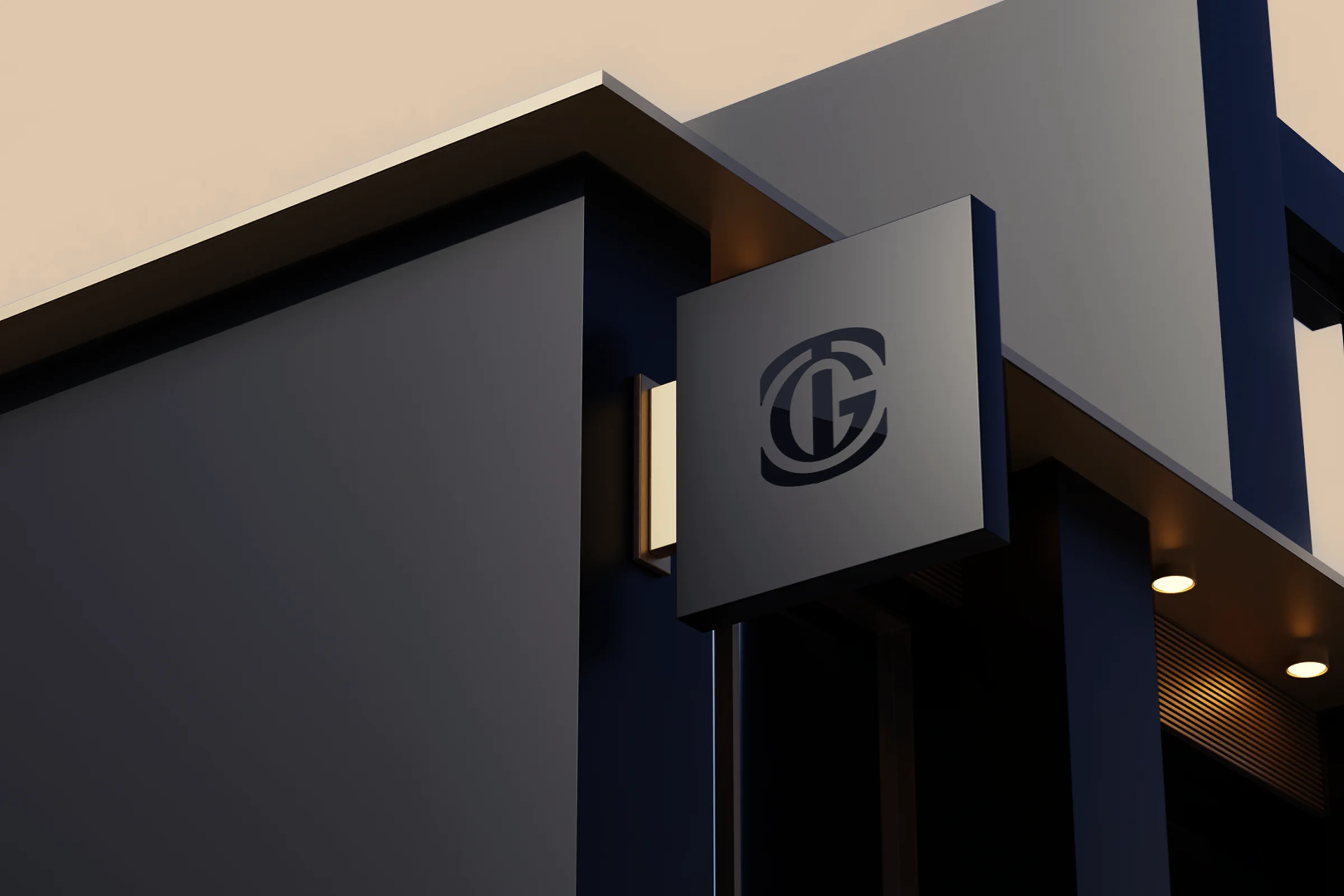
About the project
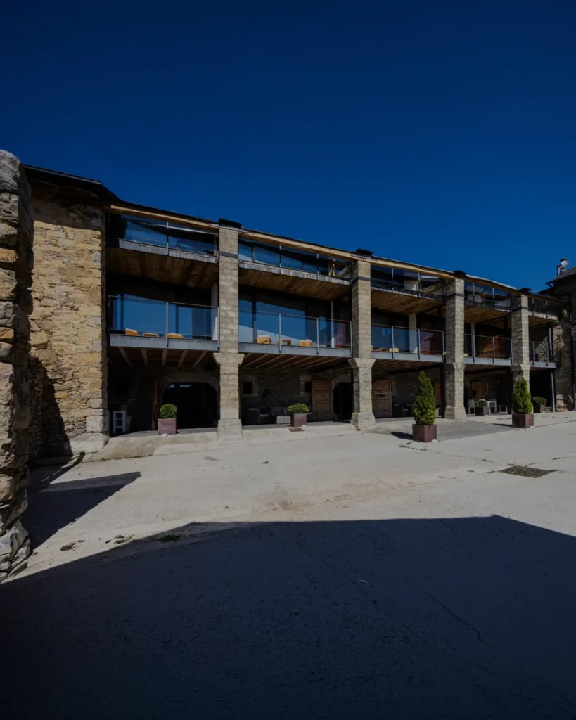
Tico Grupo Inmobiliario is the Tico Capital group's estate agency in La Cerdanya, and it doesn't work like a typical agency: it doesn't market third-party properties. Every home it offers has been chosen, renovated and prepared by the group itself. It needed a brand that conveyed that difference: judgement, guarantees and non-negotiable quality.
Desafío y solución
Guaranteeing what you control from start to finish
Challenge
In a valley with many estate agencies, and brands that all look alike, TGI had a unique argument: it doesn't broker, it selects and transforms every property before selling it. But that has to come across before the first viewing. The brand had to speak at once to investors looking for returns with guarantees and to home buyers looking for a place without surprises, and position itself in a more exclusive, understated register than the rest of the sector.
Solution
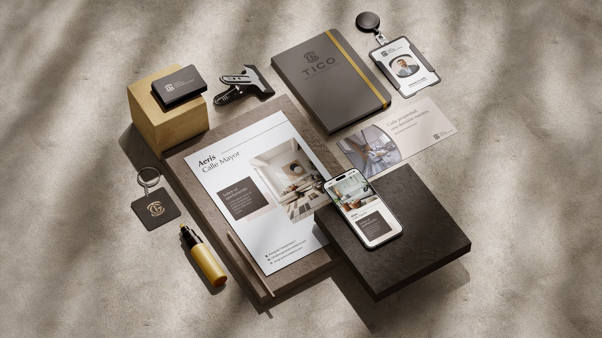
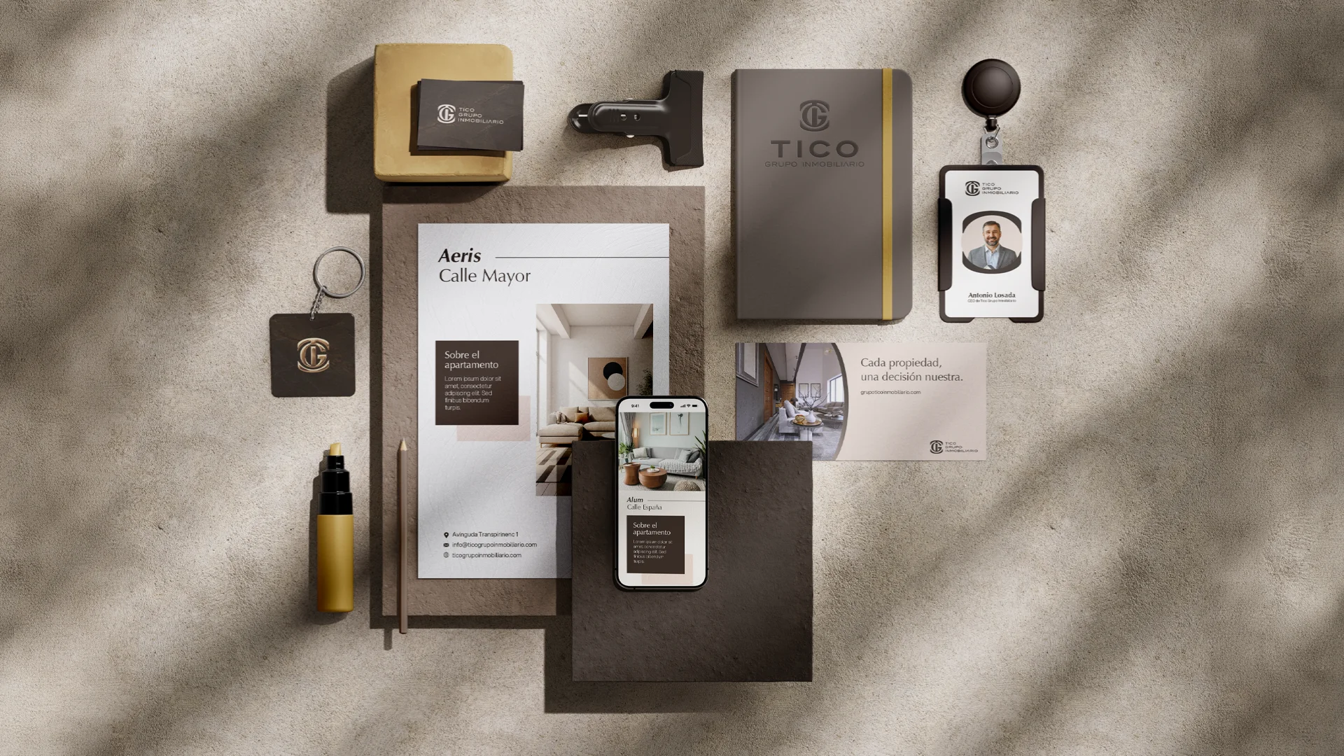
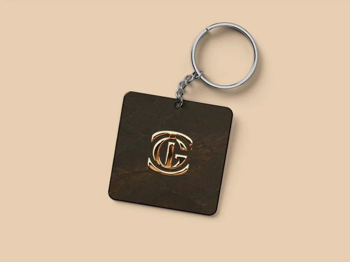
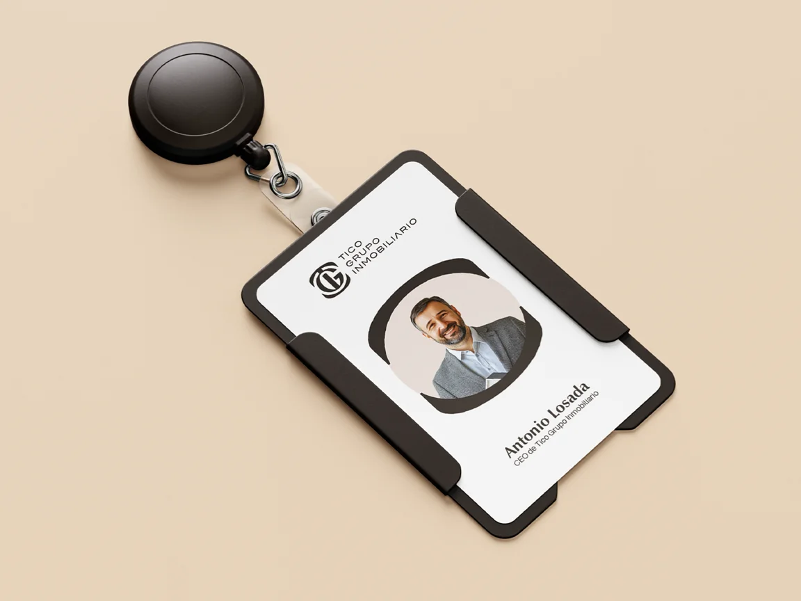
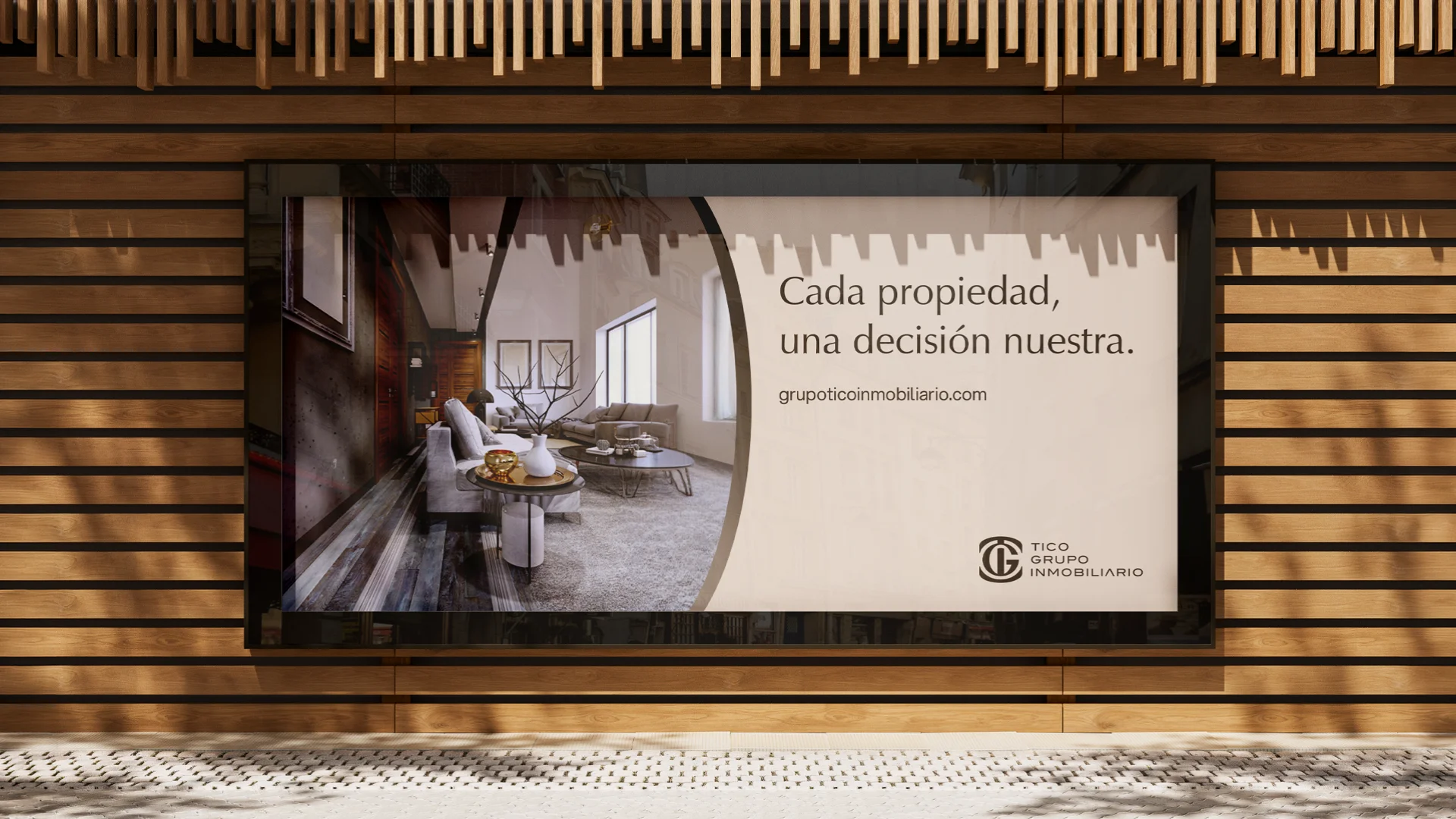
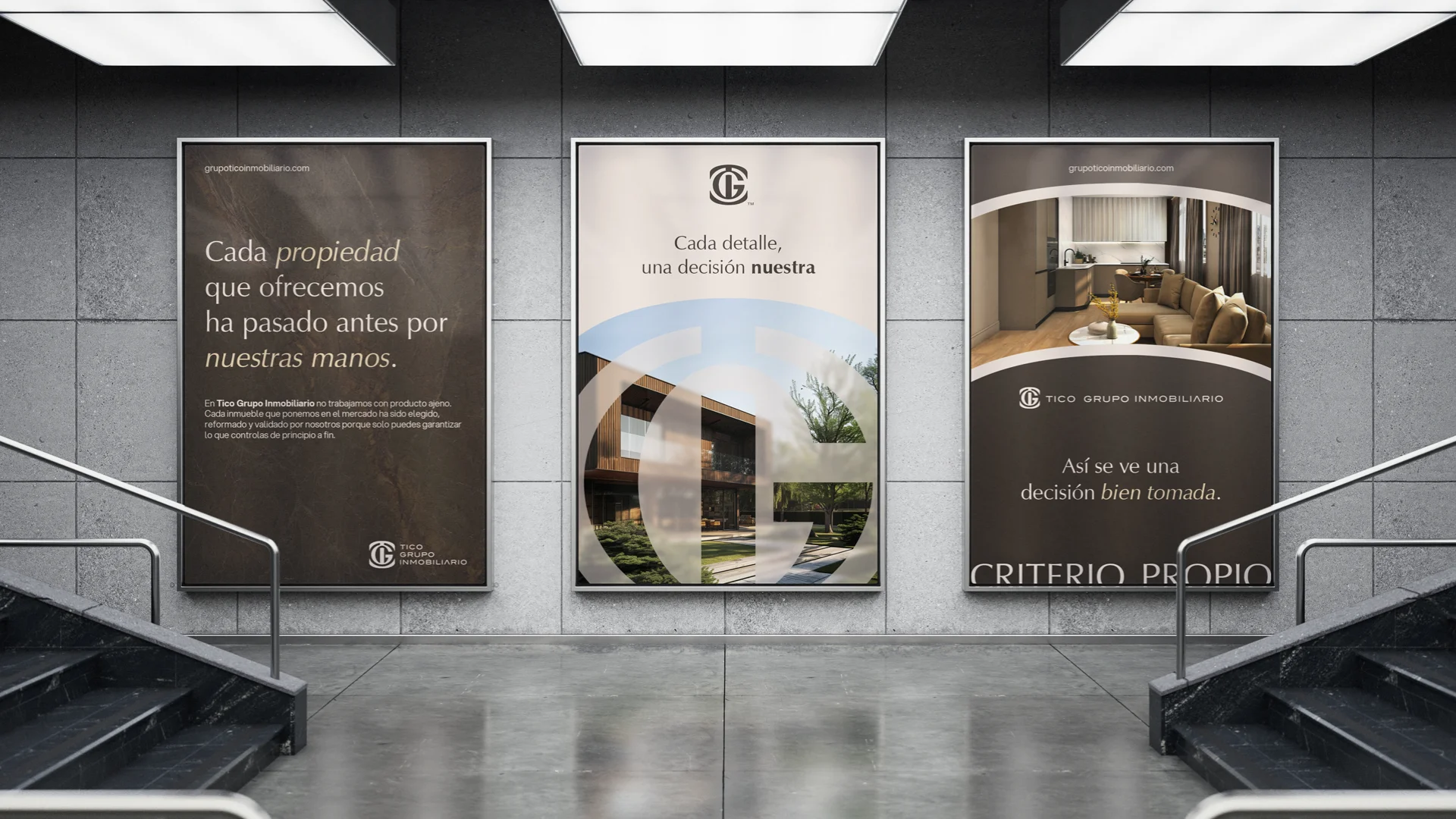
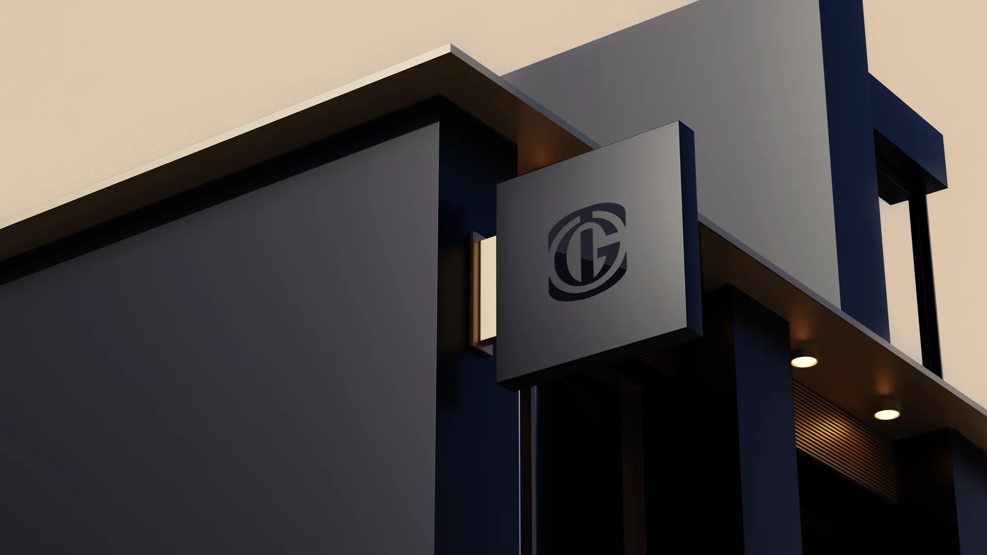
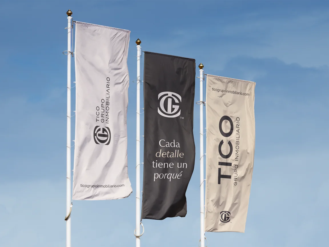
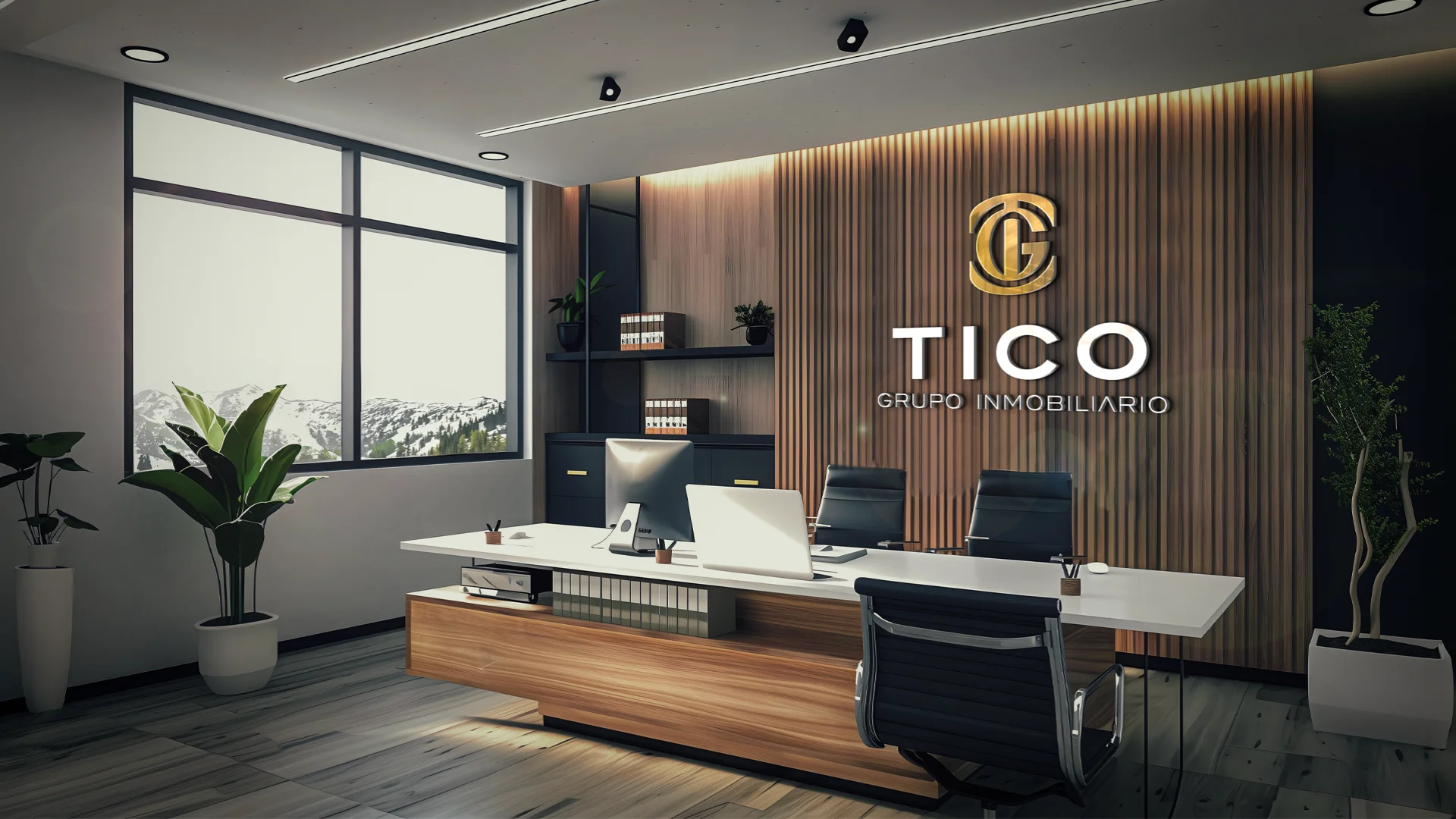
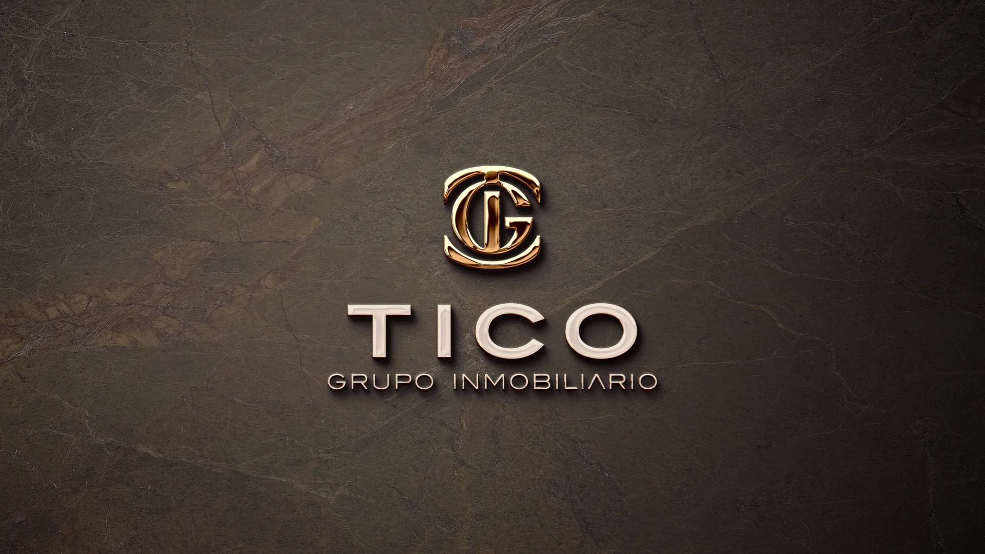
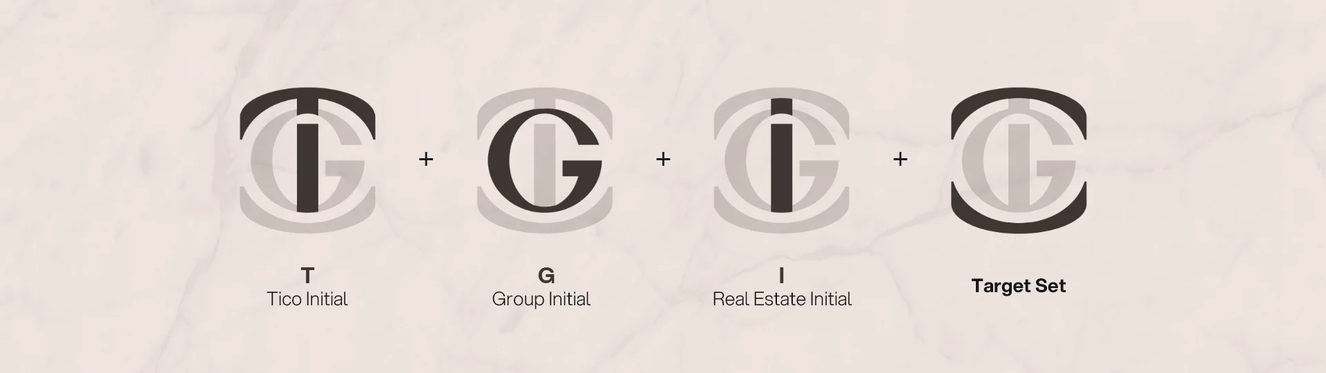
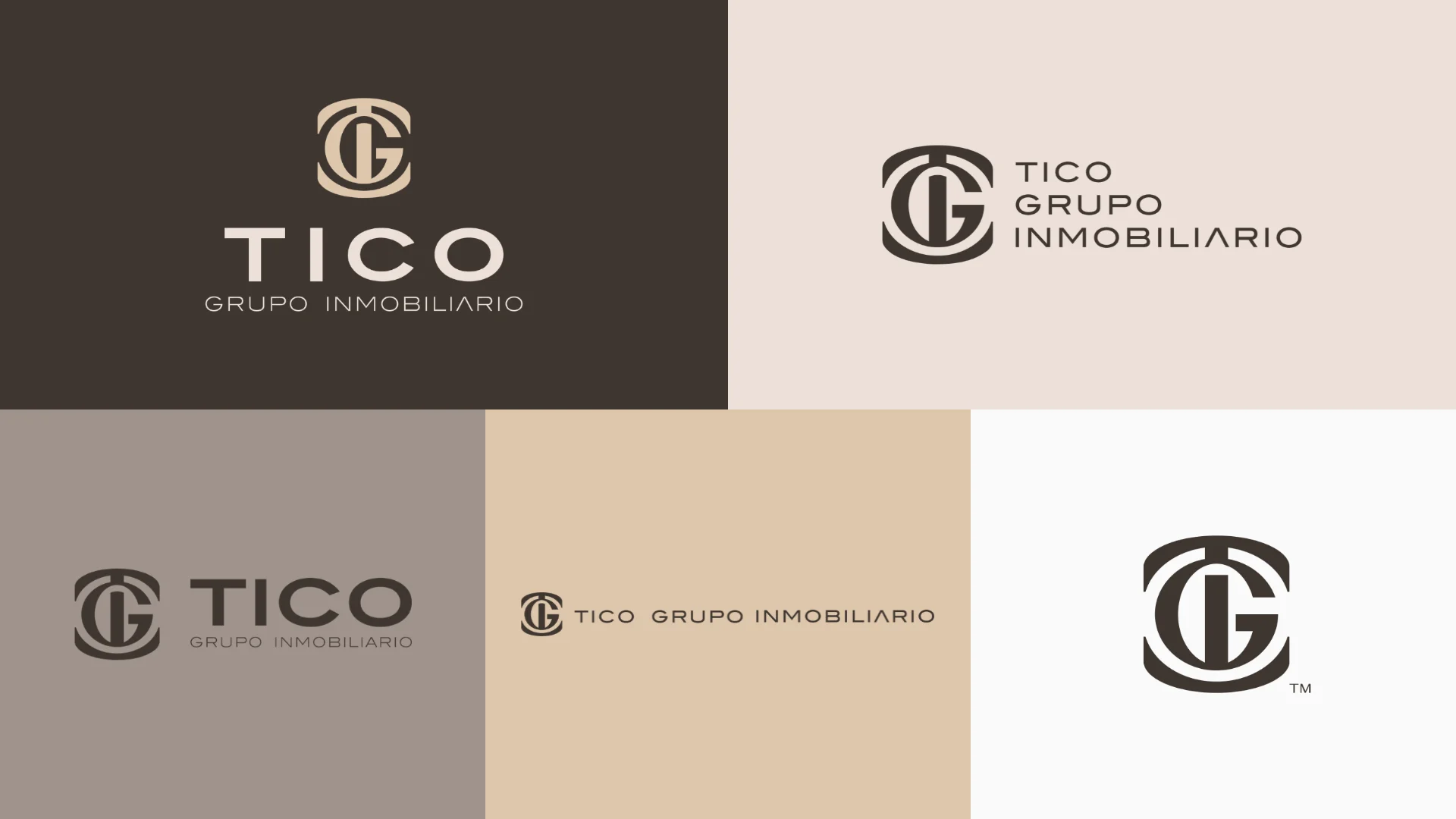
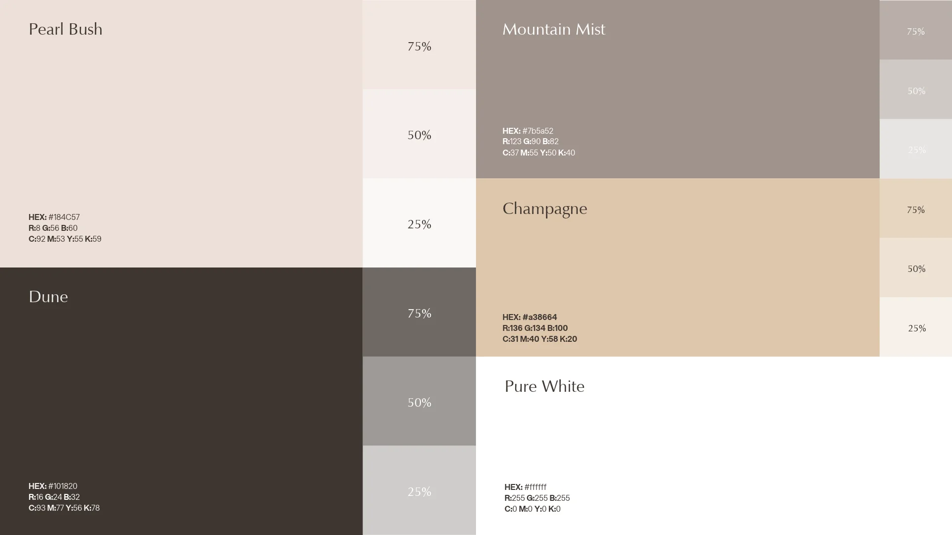
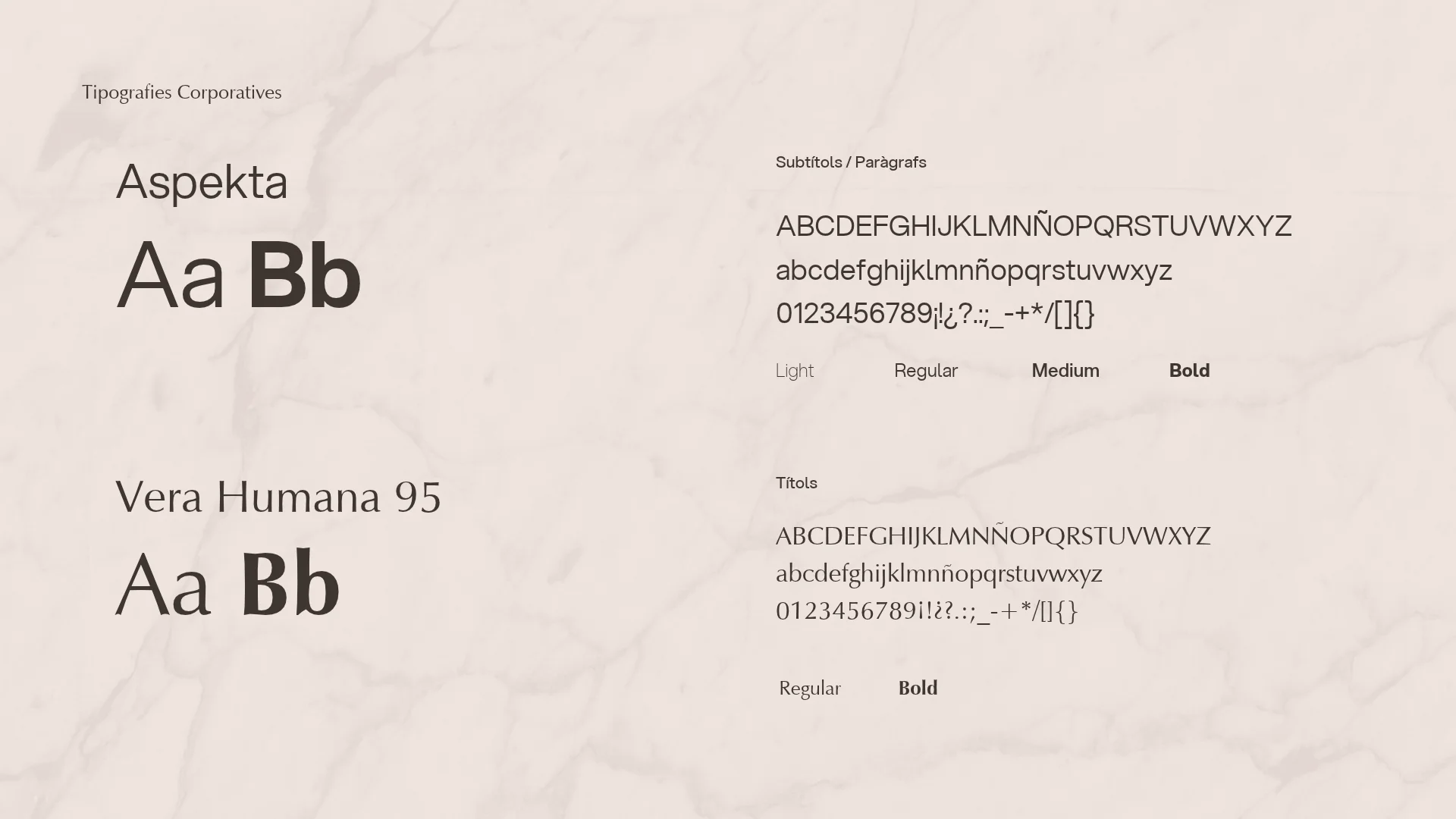
A monogram that intertwines the T of Tico, the G of Grupo and the I of Inmobiliario inside a circle representing a set goal. It's built on a grid of circles and lines, like the seal of a house with history. TICO is set in wide, solid capitals, and "Grupo Inmobiliario" in a fine stroke. After analysing the competition, split between bright colours and generic logos, the palette sits in a warm, neutral territory: pearl blush, mountain mist, dune, champagne and pure white, with gold finishes. Vera Humana for headlines and Aspekta for body text. The system reaches stationery, property sheets, staff passes, keyrings, banners, posters, the office and the shopfront.
Process
How we did it
The same method as always: understand the business before drawing anything, and never move on to the next phase without your approval.
Discovery
Understand the business- Kick-off meeting
- Competitors
- Goals
Concept
Find the idea- Moodboard
- Sketches
- Creative direction
Identity
Build the brand- Logo
- Colour & type
- Applications
The concept
The T, the G and the I intertwined in a single seal, inside the circle of a set goal: the group, the agency and a way of working where every property is a decision of its own.
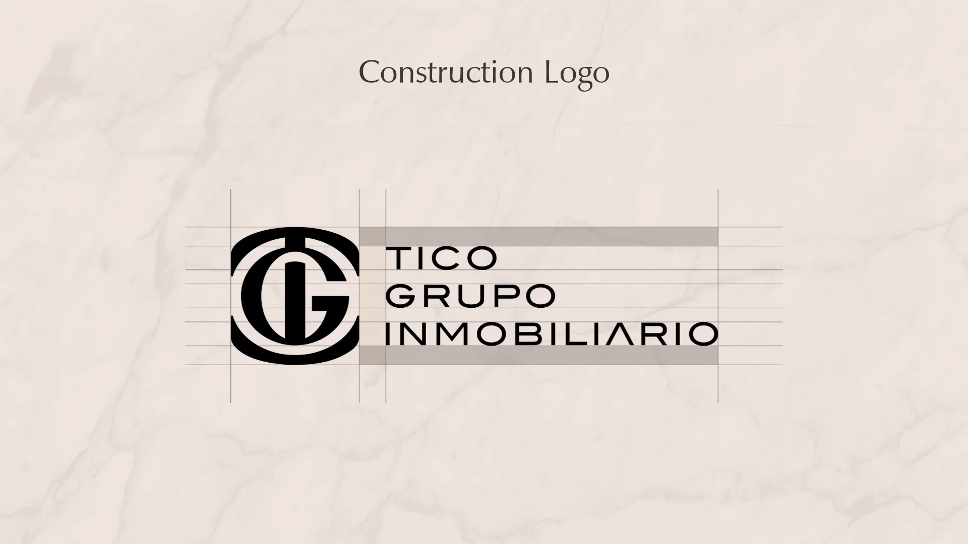
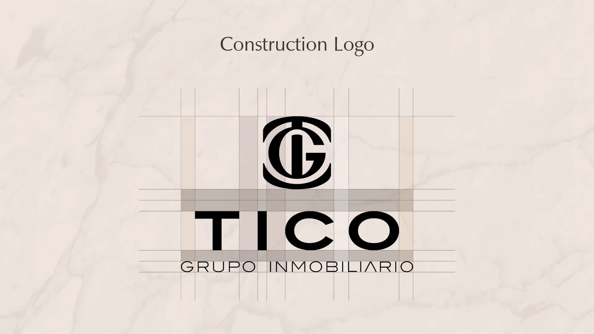
An estate agency that only sells what it has chosen and renovated can't look like the others. That's why the TGI brand had to feel like a seal.
01
Visual identity
Logo · Colour · Typography
02
Brand applications
Stationery · Apparel · Posters