About the project
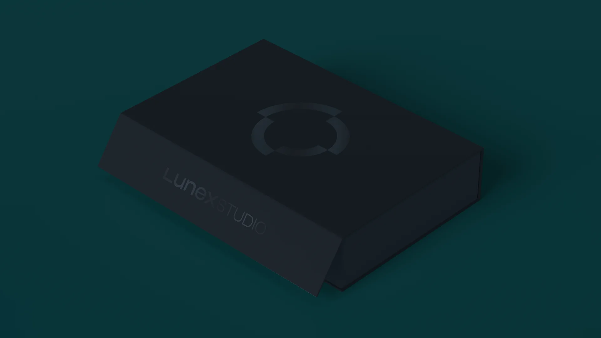
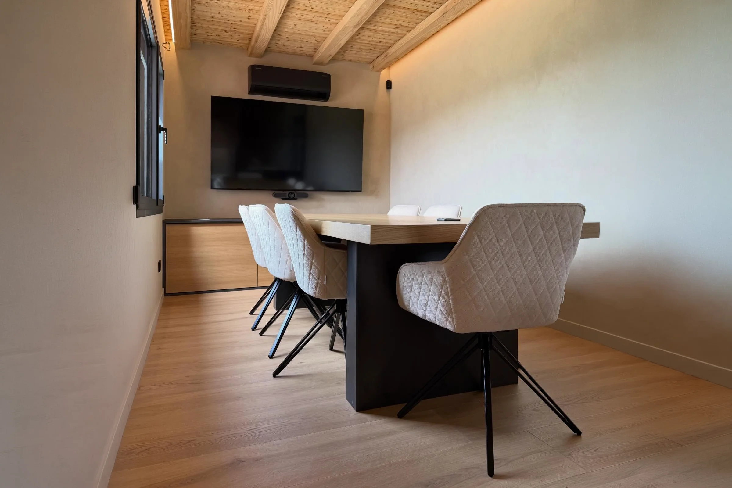
Lunex Group was born from the vision and surname of building engineer Toni Luna (luna means "moon" in Spanish): seeing every space as a canvas where life takes shape. It brings the architecture studio and the construction company together under one brand. Lunex Studio signs off the projects, plans and renders, and Lunex Build carries out renovations and new builds. It needed an identity that united both sides of the business with the precision of a blueprint and the solidity of a building.
Challenge and solution
Two trades, one signature
Challenge
An architecture studio and a construction company speak to different clients at different moments: some buy an idea, others a build. Lunex needed each side to have its own name without clients feeling they were dealing with two companies, and the group to show it can take on an entire project, from the first sketch to handing over the keys. On top of that, in a local sector full of warm colours and similar brands, it wanted a more restrained, contemporary image, with professionalism, transparency and approachability.
Solution
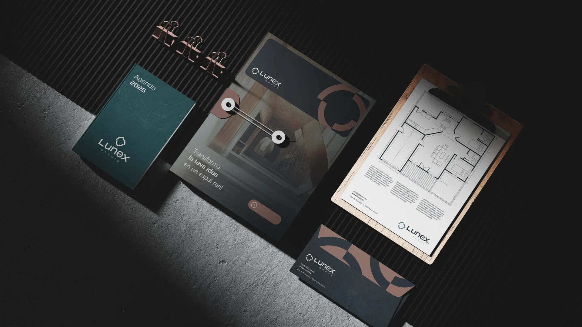
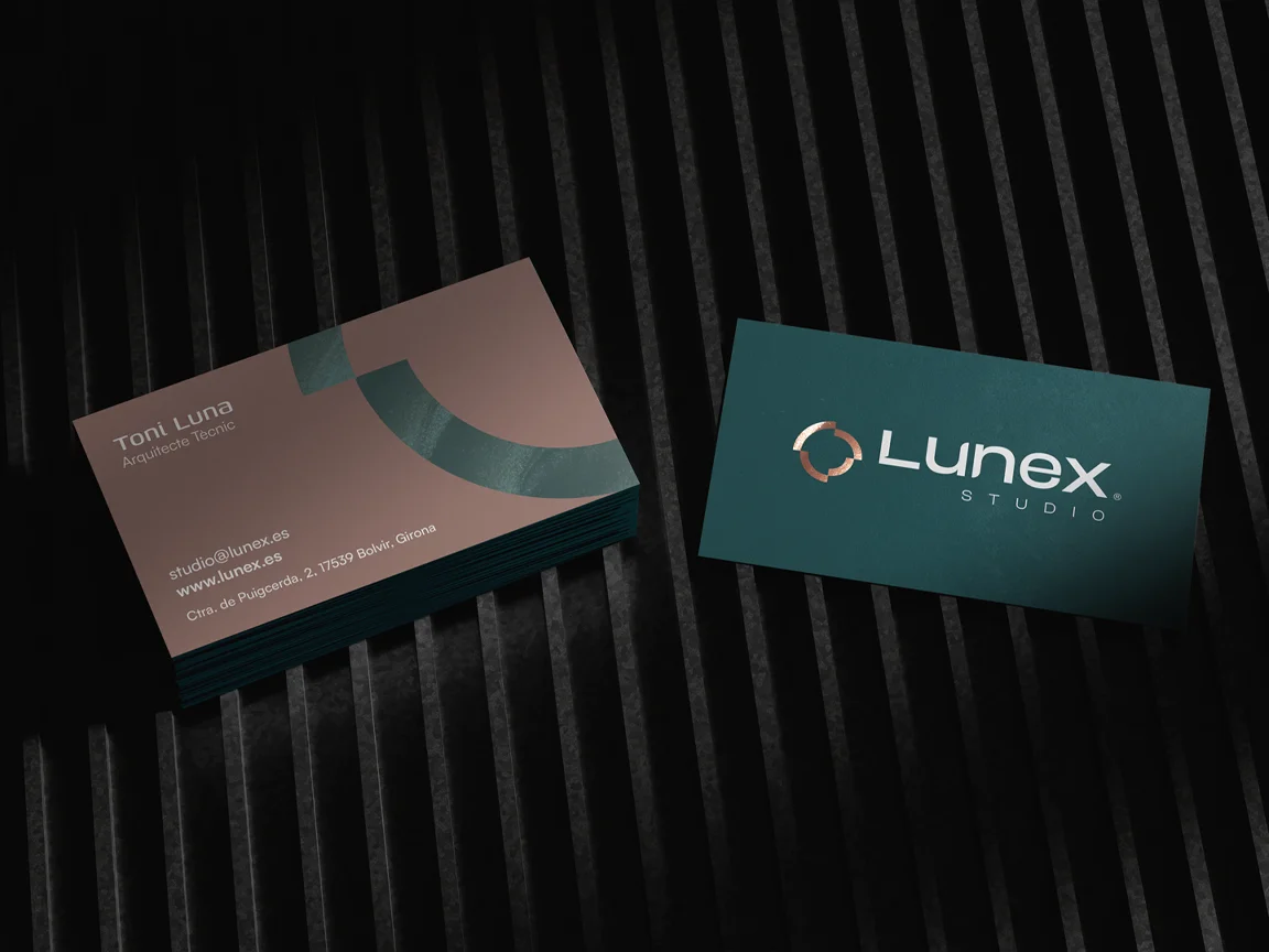
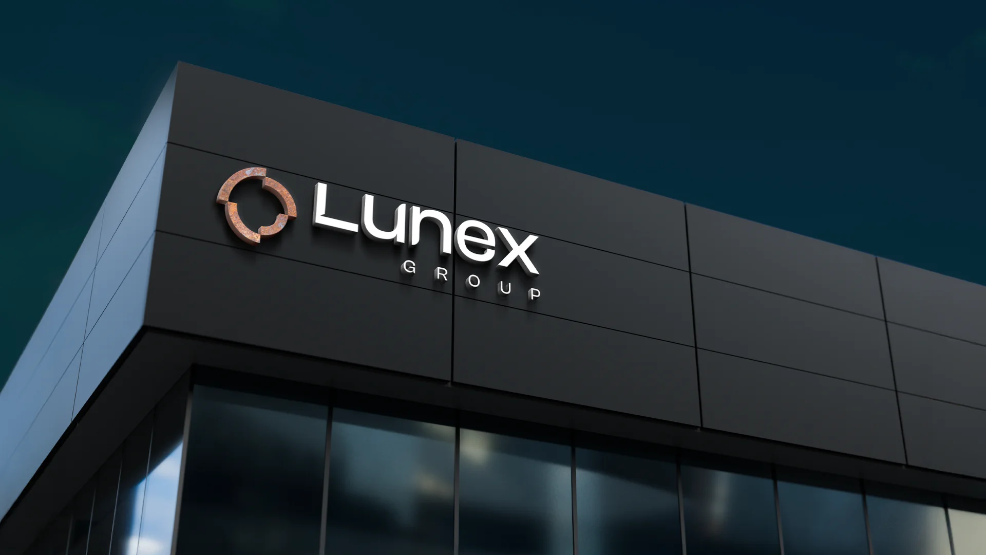
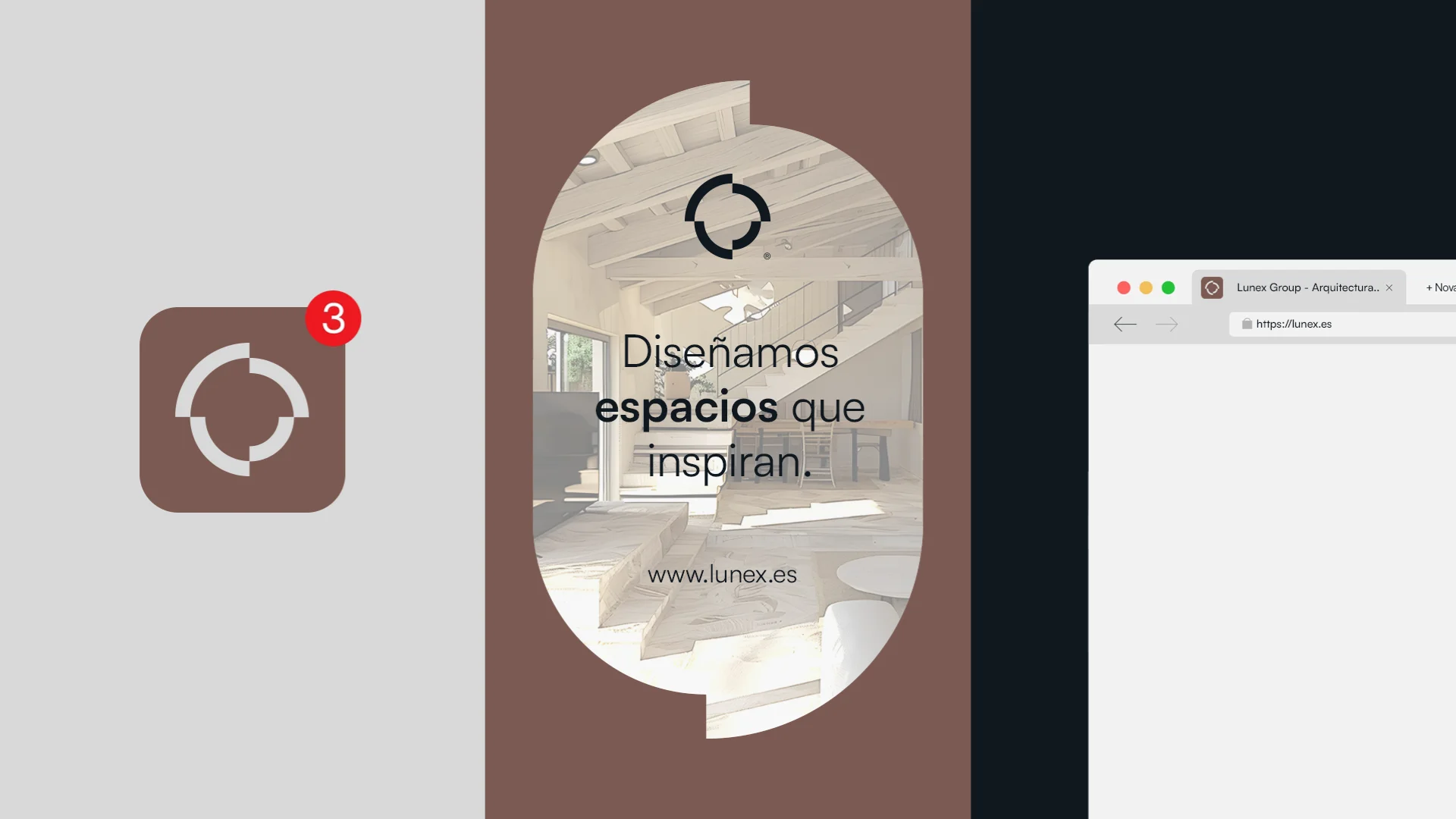
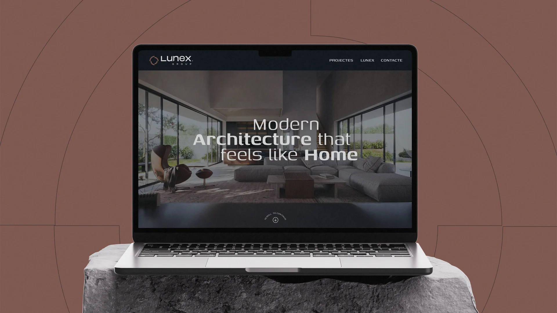
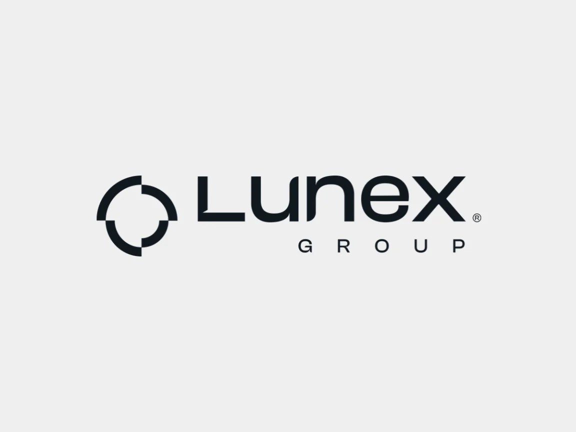
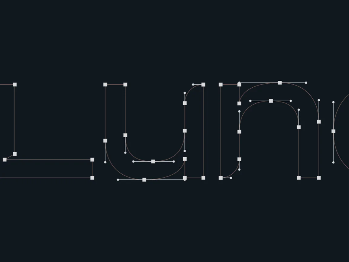
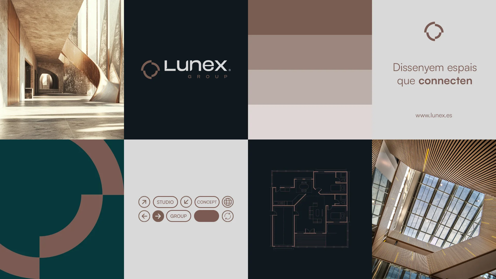
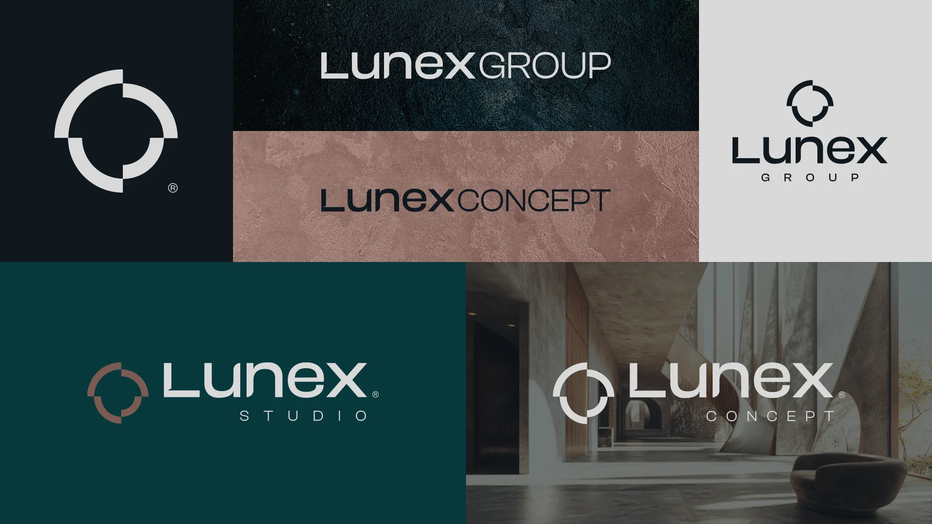
A symbol that brings two ideas together. On one side, the phases of the moon, which are also the phases of a build. On the other, the negative of an architectural blueprint. The result is a circle split into four offset quarters, built on a grid of concentric circles. A parent brand and two sub-brands share the symbol and logotype, and only the descriptor changes: Group, Studio or Build. After analysing the competition, the palette moves away from the sector's warm tones with a deep petrol green, black, taupe, a soft terracotta and light grey. The brand also came to life in the premises with backlit signs, in an interior of marmorino, vintage wood and black finishes that matches the identity's restraint.
Process
How we did it
The same method as always: understand the business before drawing anything, and never move on to the next phase without your approval.
Discovery
Understand the business- Kick-off meeting
- Competitors
- Goals
Concept
Find the idea- Moodboard
- Sketches
- Creative direction
Identity
Build the brand- Logo
- Colour & type
- Applications
The concept
The phases of the moon, which are also the phases of a build, over the negative of a blueprint: a circle that fills in quarter by quarter, like a project moving from drawing to construction.
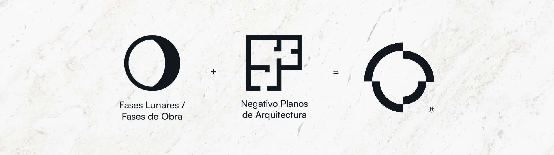
A project isn't delivered all at once: it's built in phases. That's why the Lunex brand grows like the moon, from blueprint to building.
01
Visual identity
Logo · Colour · Typography
02
Brand applications
Stationery · Apparel · Posters