
About the project
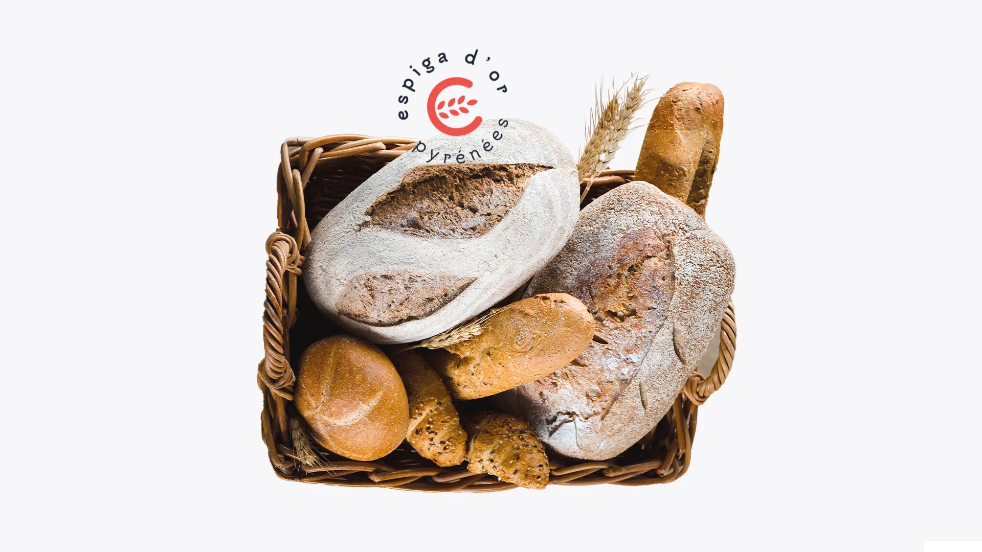
Espiga d'Or Pyrénées was a bakery and café with its own workshop. It combined traditional Cerdanya products with French artisan pastries and bread. They wanted a clean image that conveyed quality and craftsmanship and carried France in its identity.
Challenge and solution
French, without the clichés
Challenge
In baking, Frenchness is usually told through clichés: the beret, the Eiffel Tower or a bistro typeface. Espiga d'Or needed the opposite: a clean, quality brand that spoke of the workshop and the craft, where France came through without dressing up. It also had to work for a business with two sides, bakery and café, from the bread bag to the takeaway cup.
Solution
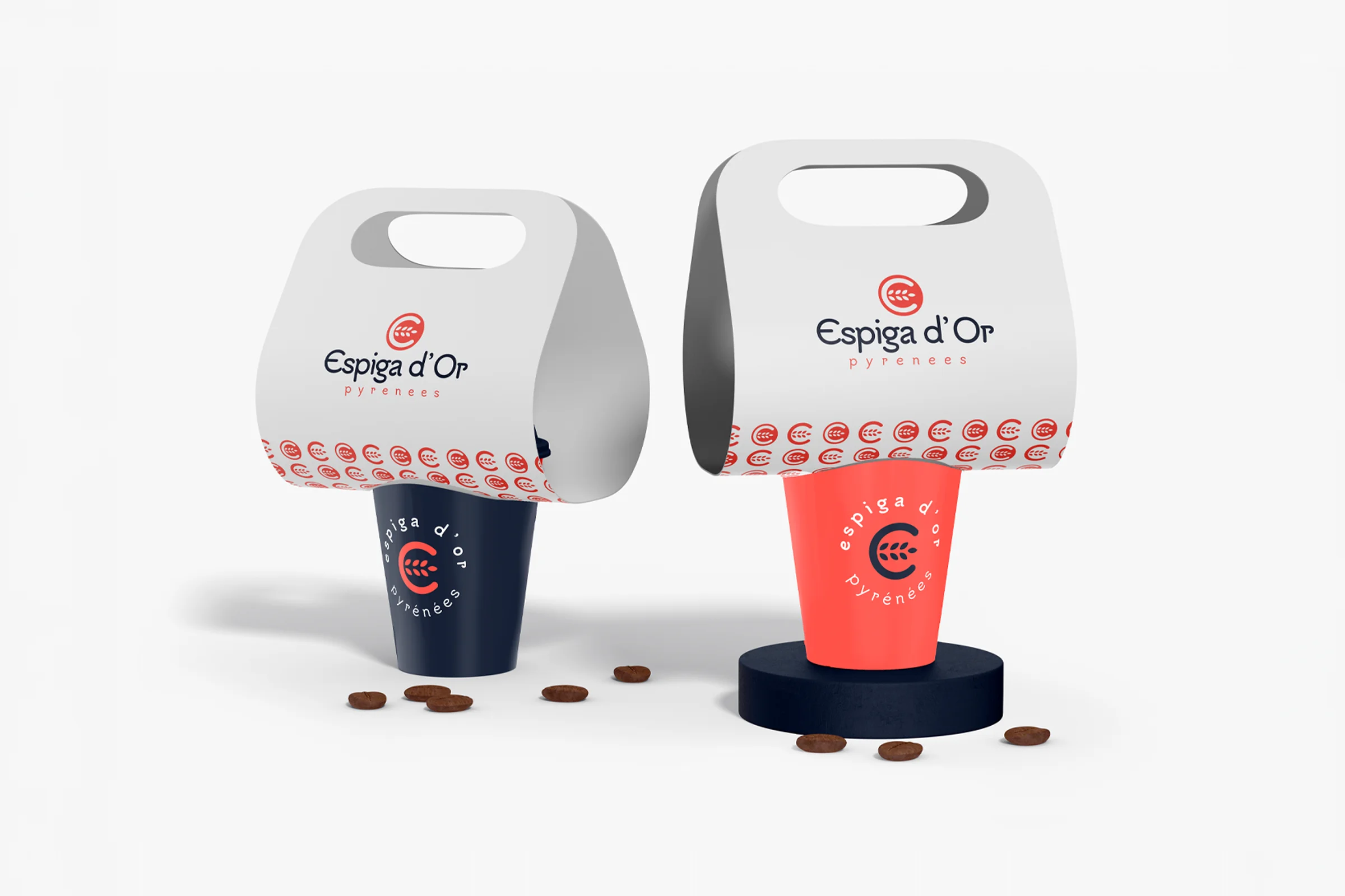
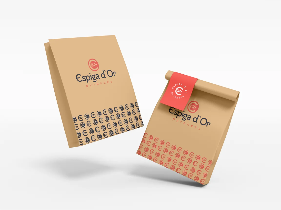
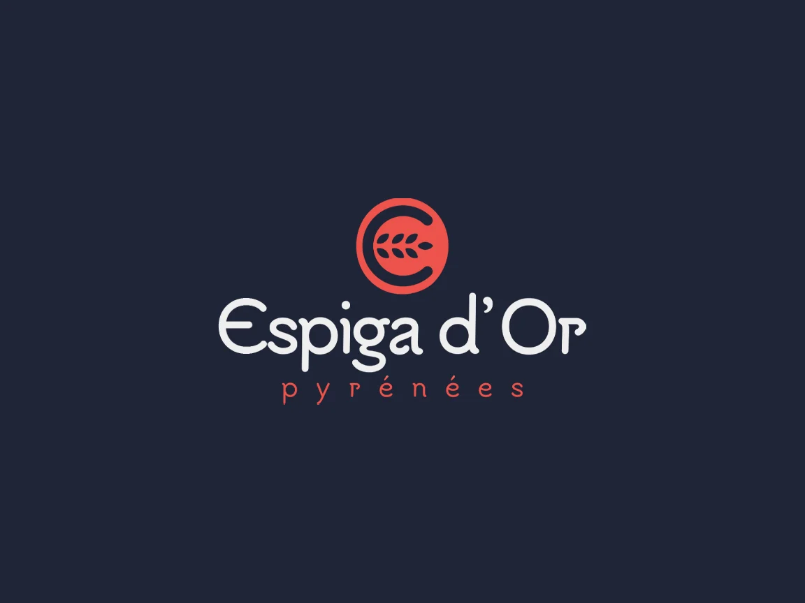
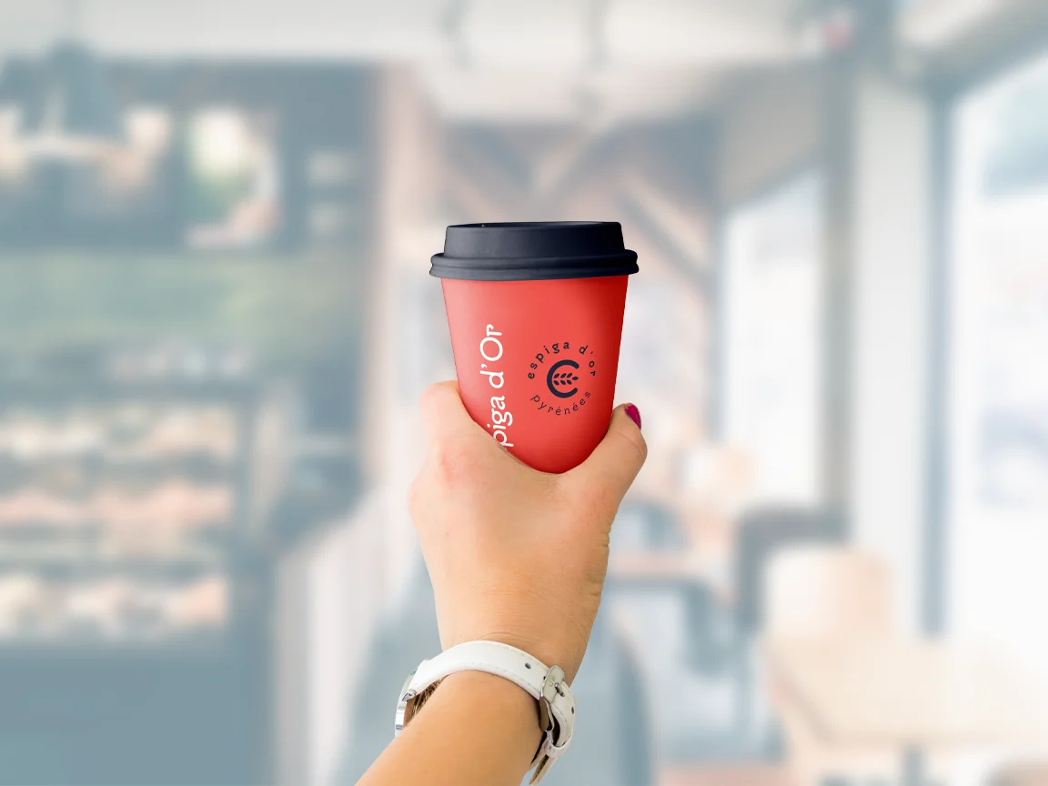
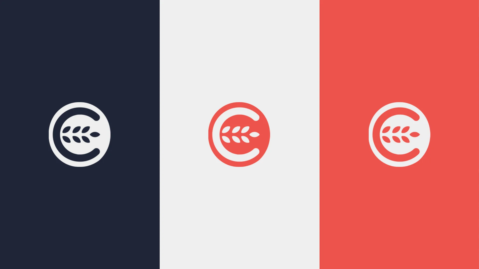
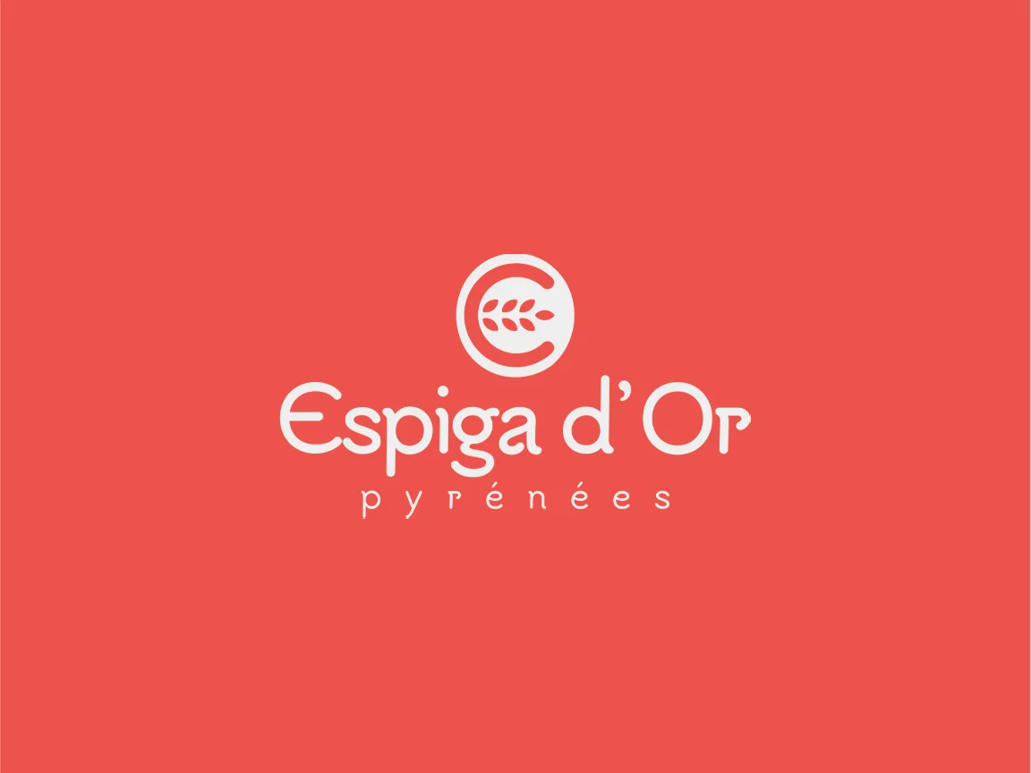
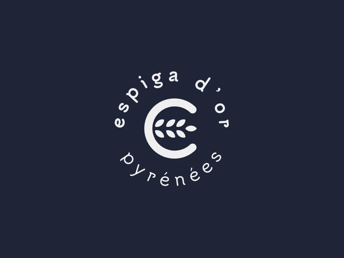
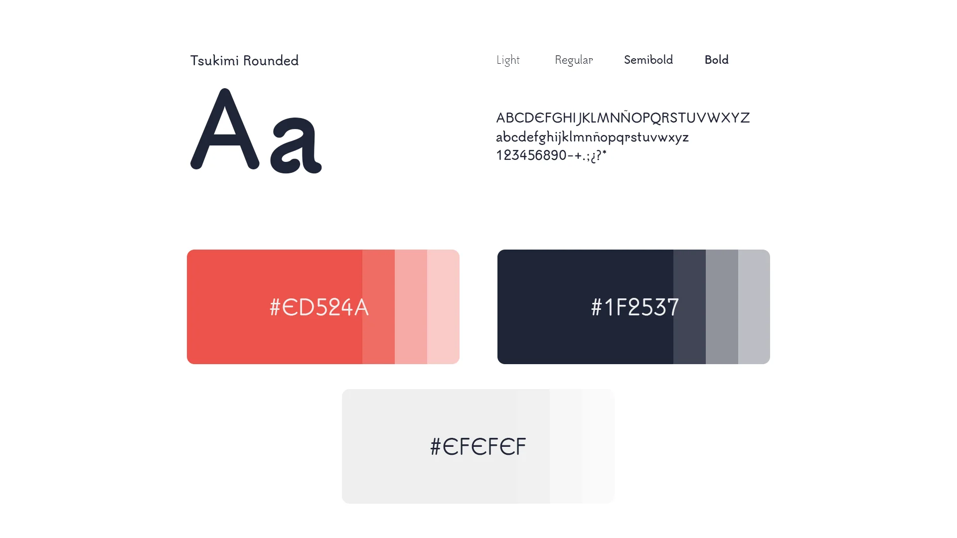
A circular symbol that brings together the E of Espiga, the O of d'Or and an ear of wheat in a single shape. The Frenchness is in the palette, not the drawing: midnight blue, white and red, the colours of the flag handled with restraint. A serif with character for the name and a thin, widely spaced typeface for "pyrénées". The system was designed for the workshop's day-to-day: bags, cups, packaging and signage.
Process
How we did it
The same method as always: understand the business before drawing anything, and never move on to the next phase without your approval.
Discovery
Understand the business- Kick-off meeting
- Competitors
- Goals
Concept
Find the idea- Moodboard
- Sketches
- Creative direction
Identity
Build the brand- Logo
- Colour & type
- Applications
The concept
The E of Espiga and the O of d'Or embracing an ear of wheat, in the colours of France: the workshop and its accent in a single seal.
A good croissant doesn't need a beret to be French. That's why the Espiga d'Or brand had to wear France in its colours, not in clichés.
01
Visual identity
Logo · Colour · Typography
02
Brand applications
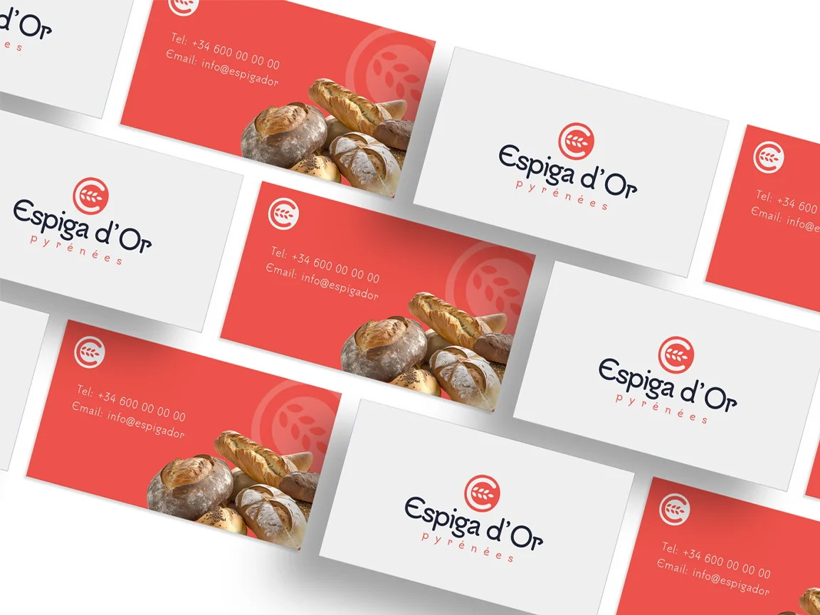
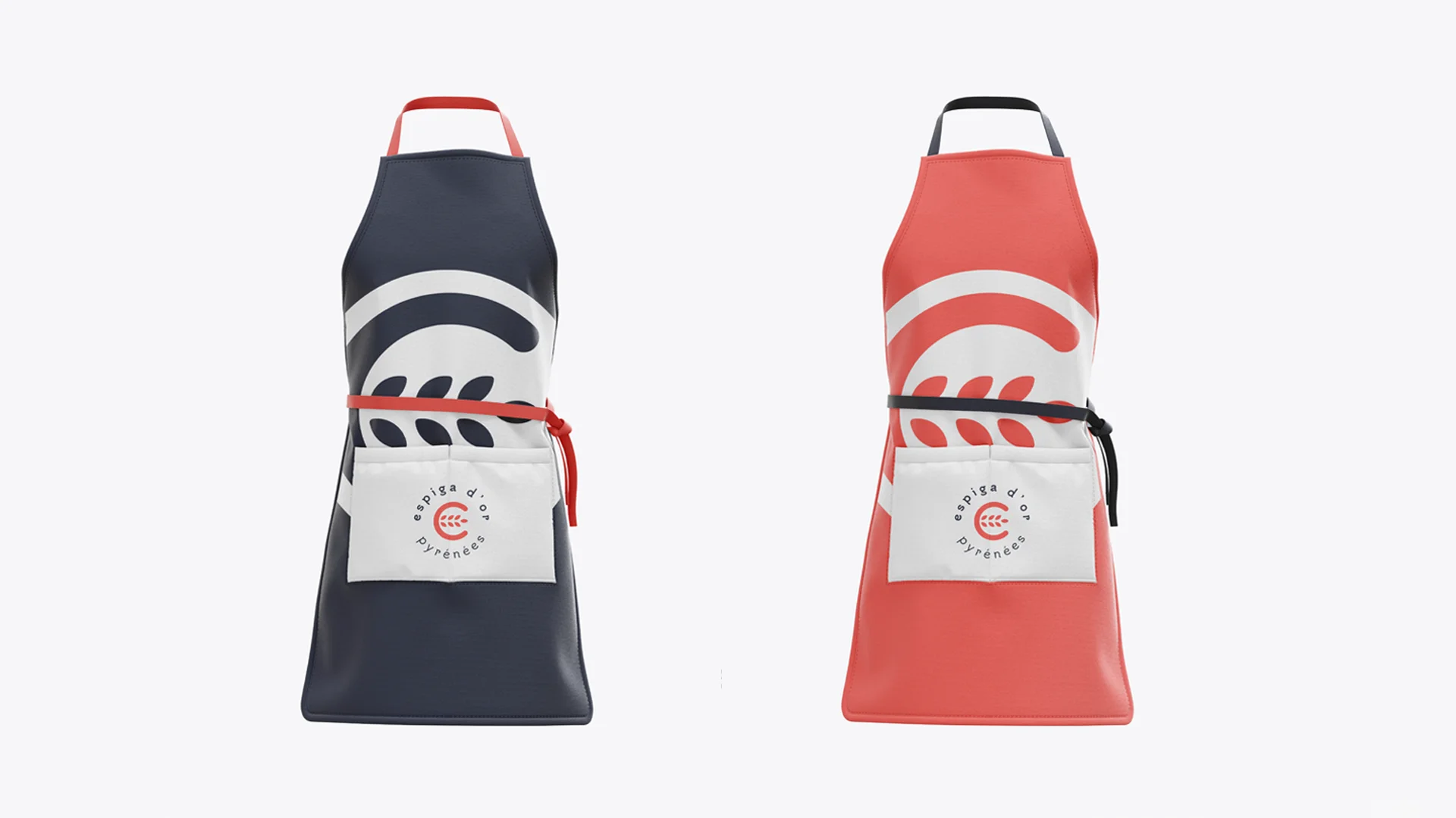
Stationery · Apparel · Posters