About the project
Ferreria Pepe is an ironworks that makes structures for buildings and homes, as well as iron furniture. José is meticulous and demanding with every piece, and he wanted a brand that lived up to his work: cutting-edge, unique and professional.
Challenge and solution
A friendly name, a serious brand
Challenge
"Pepe" is a friendly, trustworthy name, but also very informal for a company that makes structures a building depends on. In a sector where most brands stop at an anvil or a hammer, the goal was the opposite: an identity that conveyed professionalism, responsibility and the minimalist precision José works with, without losing the warmth of the name.
Solution
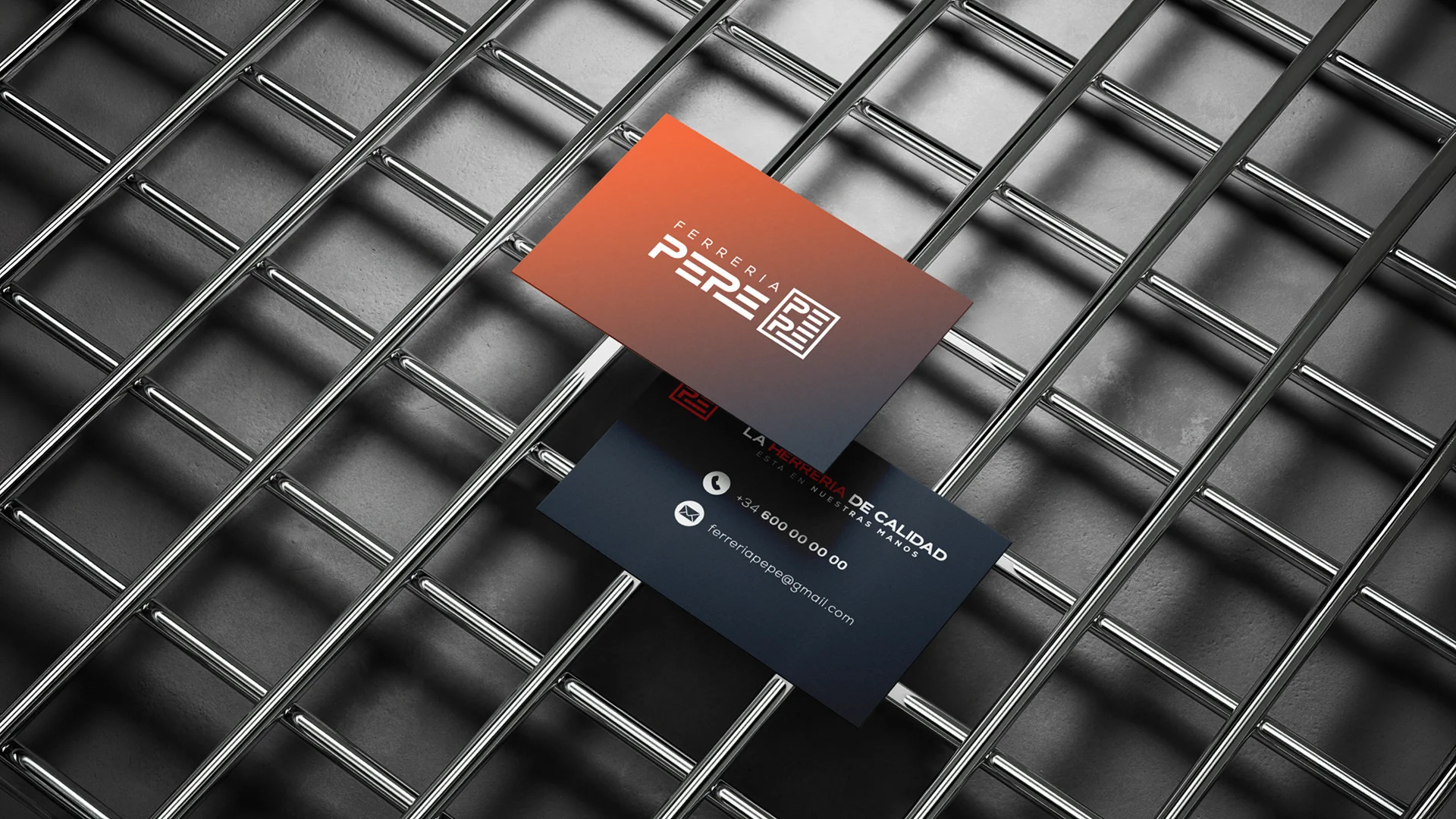
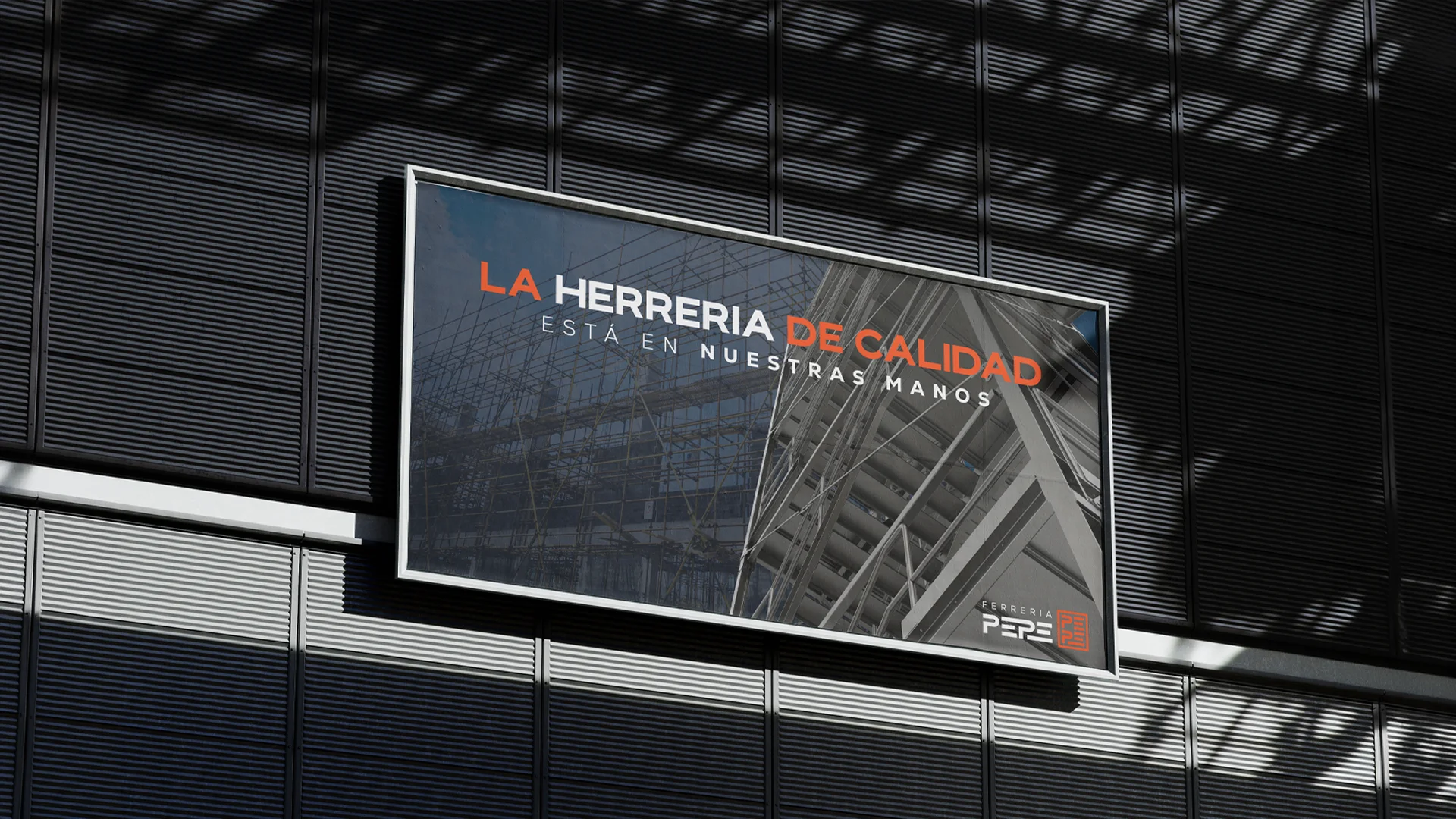
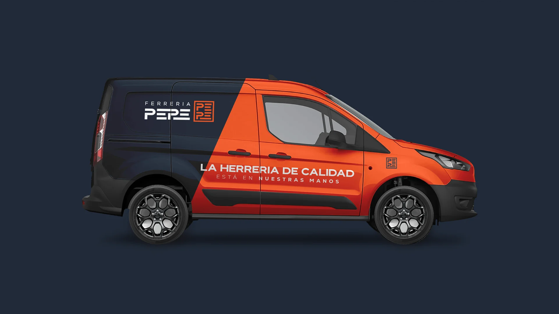
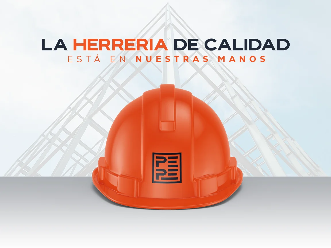
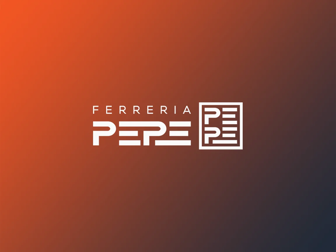
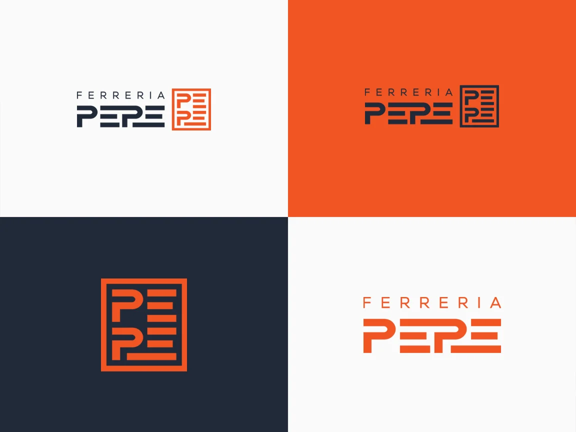
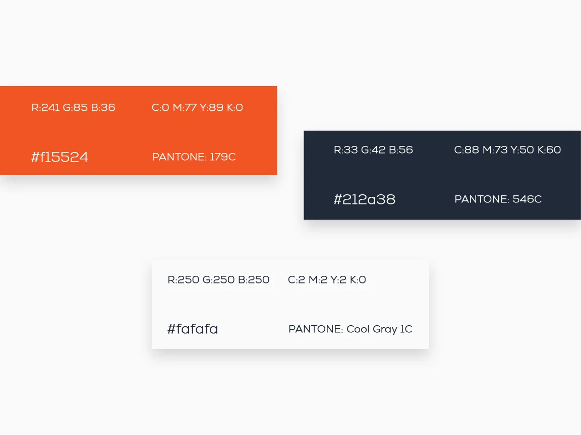
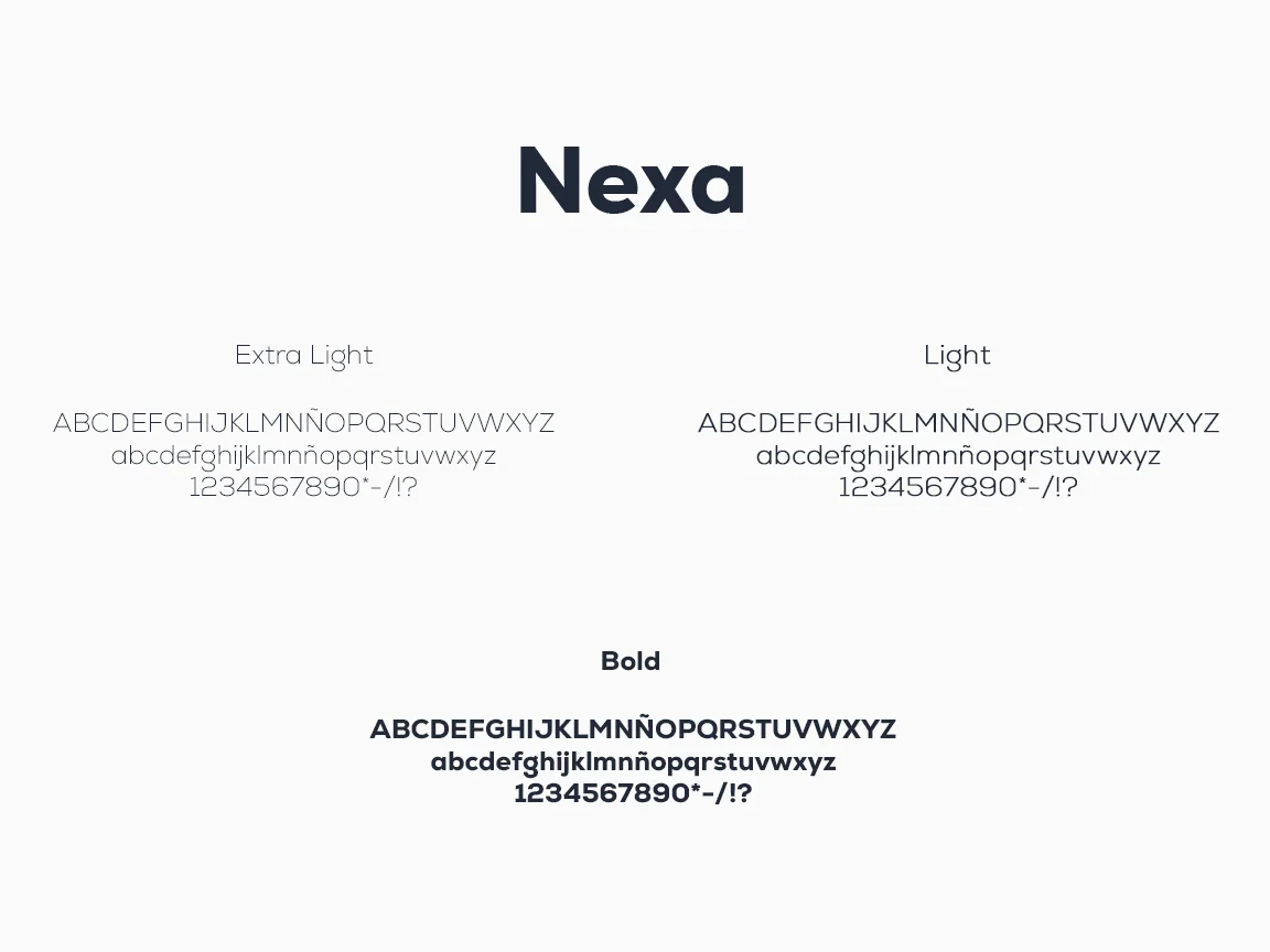
A symbol that brings together three ideas: the iron structure, the physical effort of the trade and Pepe's initial. The result is the four letters of PEPE stacked into a compact block, built like welded iron bars. An intense orange, the colour of red-hot metal, on an almost-black blue, and a solid sans-serif typeface. The system is applied wherever he works: helmets, stationery, business cards and on site.
Process
How we did it
The same method as always: understand the business before drawing anything, and never move on to the next phase without your approval.
Discovery
Understand the business- Kick-off meeting
- Competitors
- Goals
Concept
Find the idea- Moodboard
- Sketches
- Creative direction
Identity
Build the brand- Logo
- Colour & type
- Applications
The concept
The letters of PEPE, built like an iron structure: straight bars, exact joints and a solid block that stands on its own.
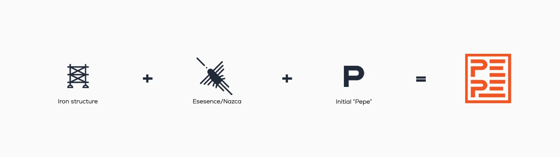
In an ironworks, everything you can't see has to hold. That's why the Ferreria Pepe brand had to be as solid as its structures.
01
Visual identity
Logo · Colour · Typography
02
Brand applications
Stationery · Apparel · Posters