About the project
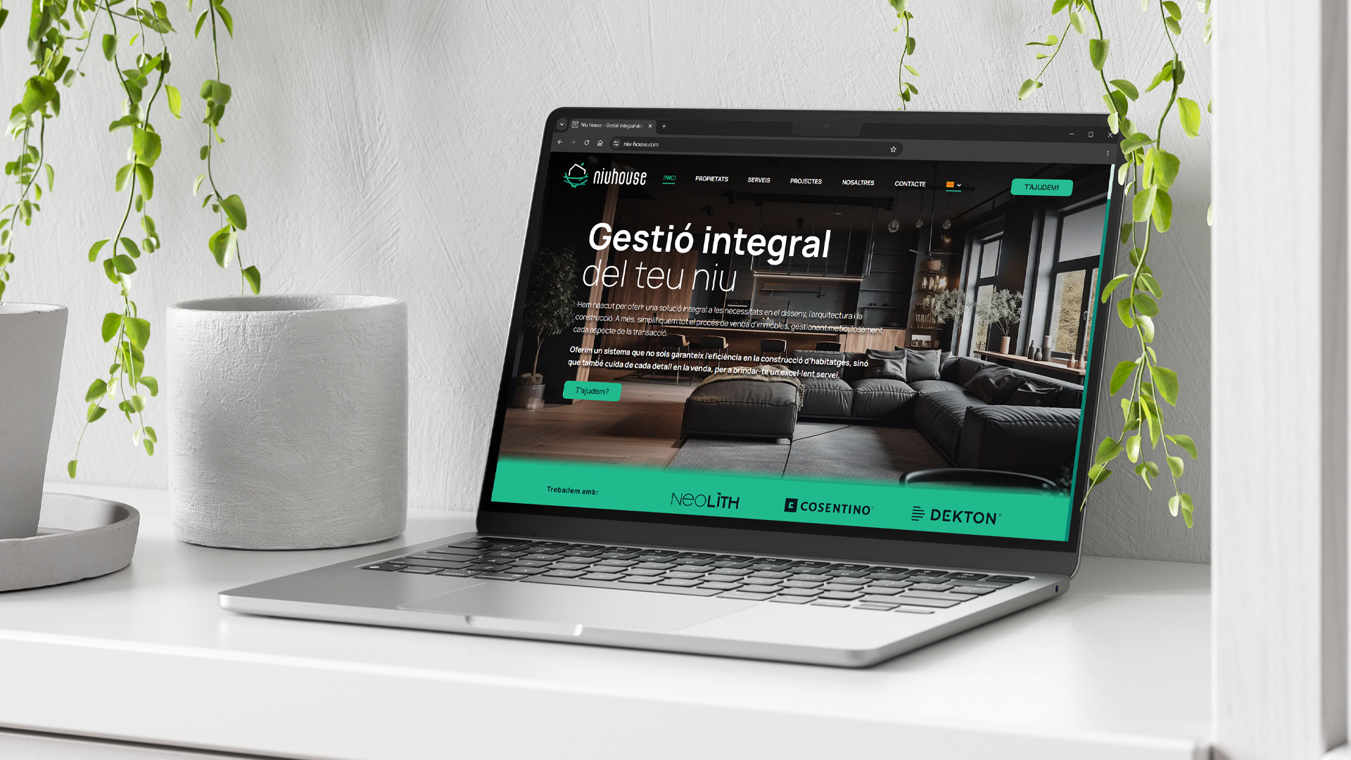
Niu House manages property projects from start to finish: buying and selling, construction, renovation and paperwork, with its own technical office. They needed a brand and a website that conveyed what they promise every client: a nest made to measure.
Challenge and solution
Making their difference visible
Challenge
Niu House was entering a sector full of cold, almost identical brands: rooftops, corporate blues and messages focused on price. Their difference was real —they guide clients through the whole process, from purchase to renovation, with their own technical office— but you couldn't see it. They needed an identity that told it in seconds and a website that turned visits into calls.
Solution
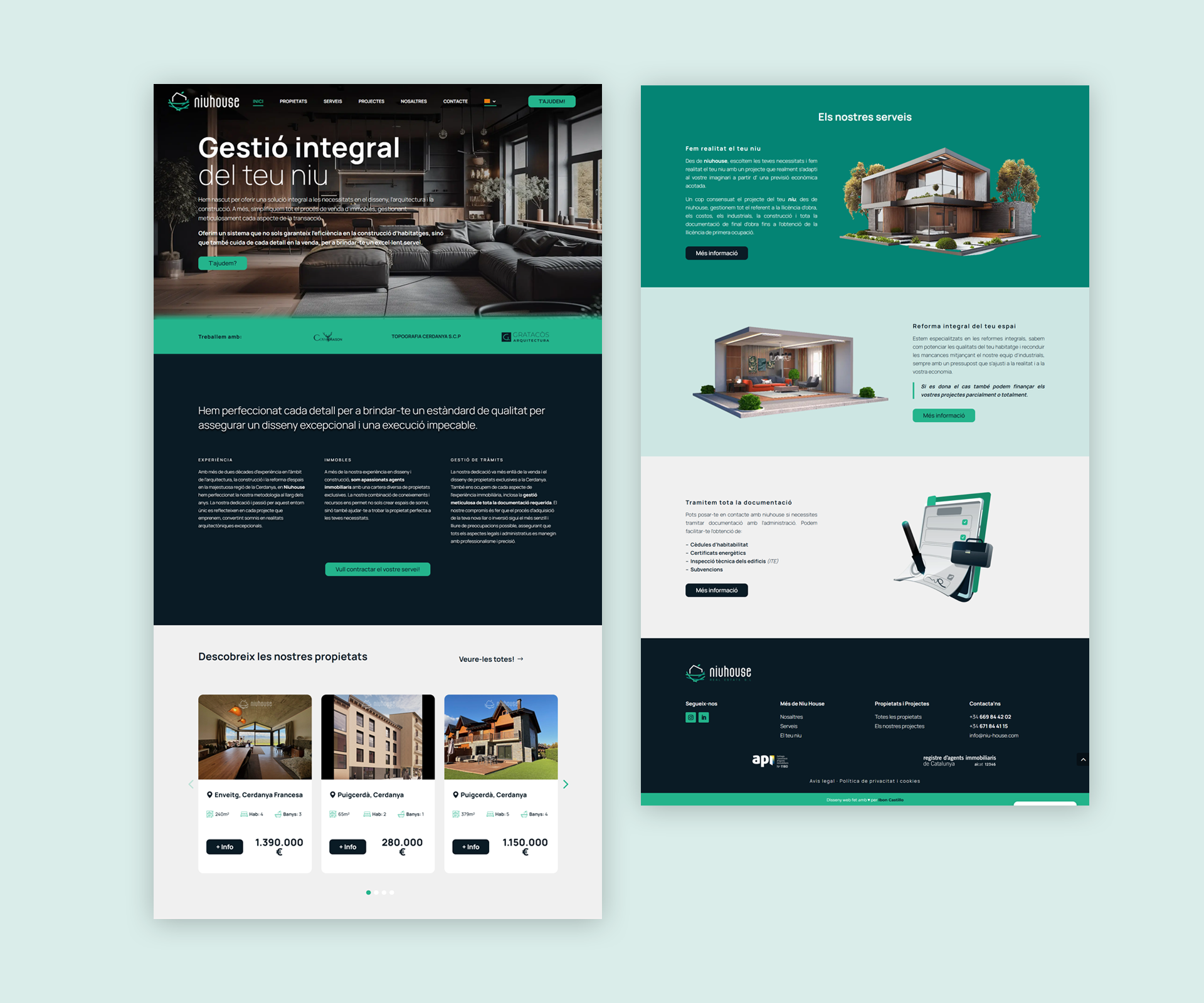
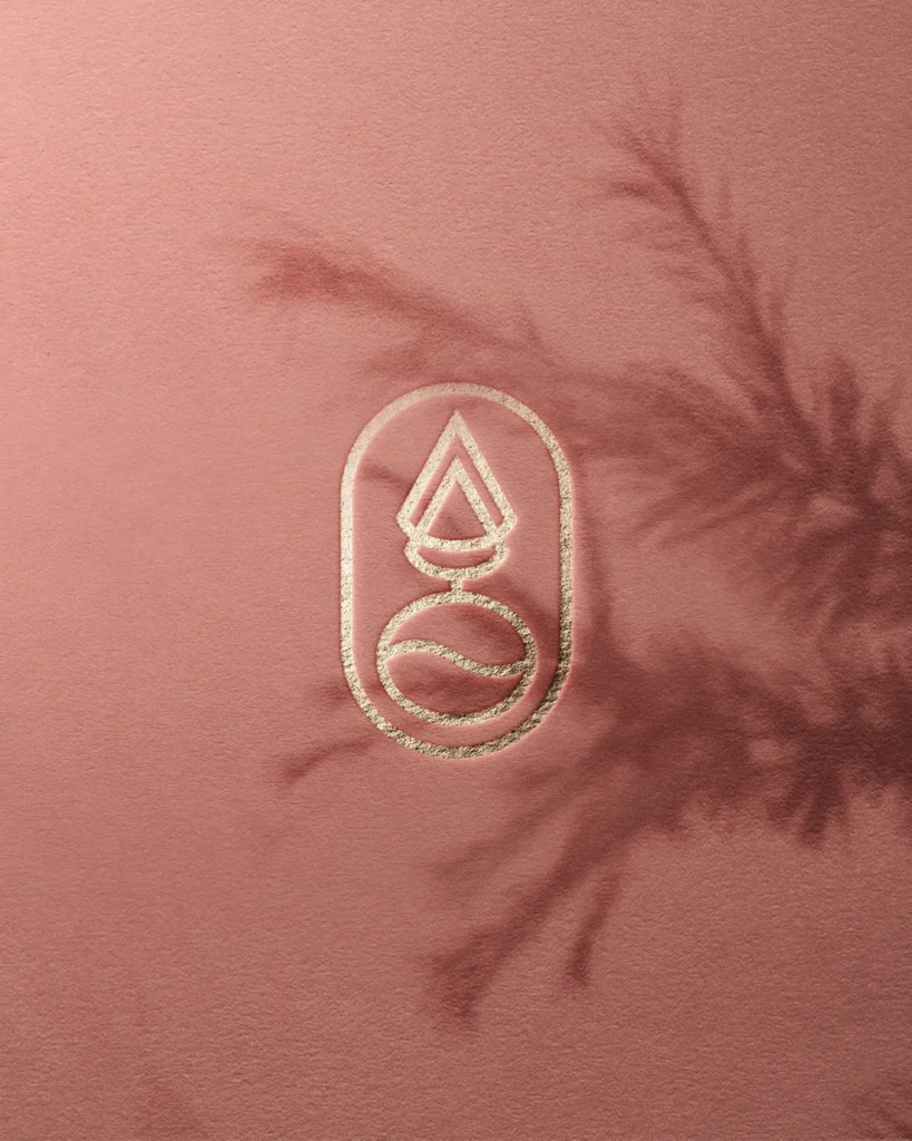
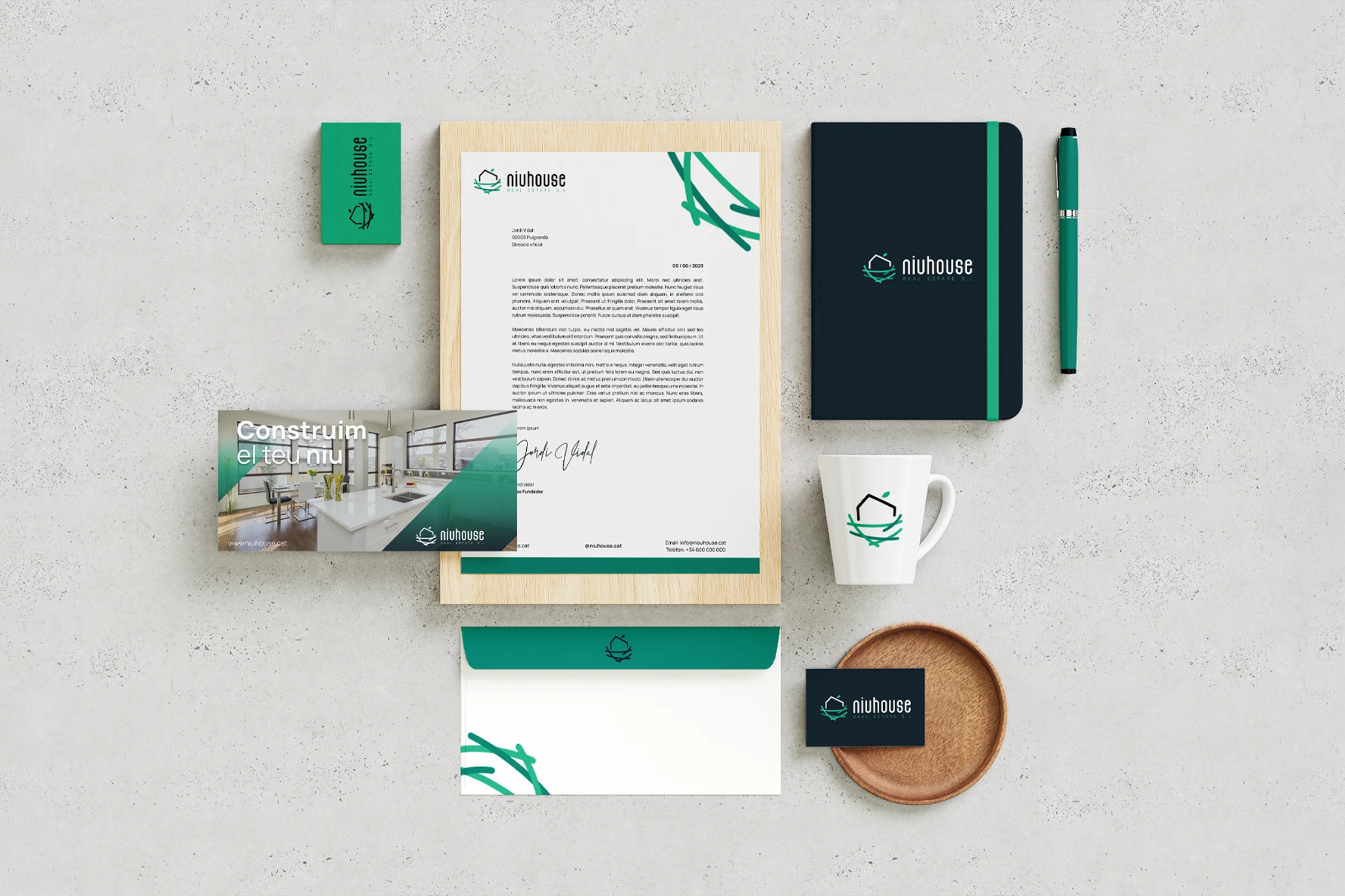
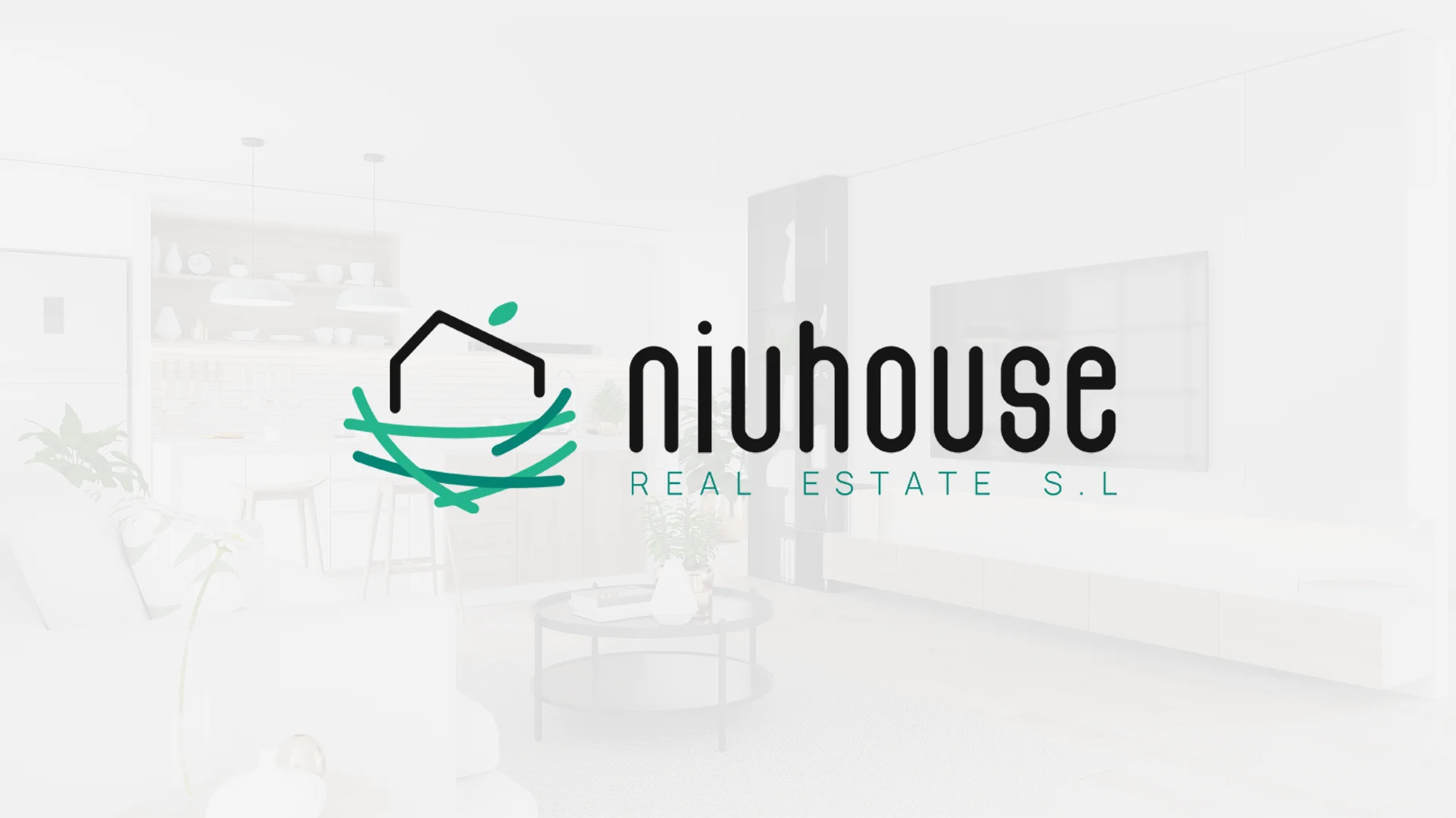
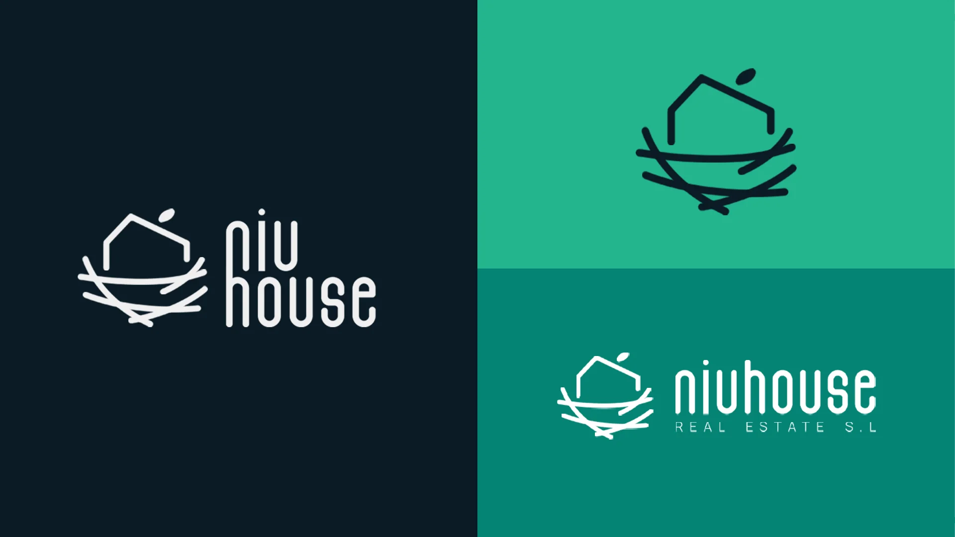
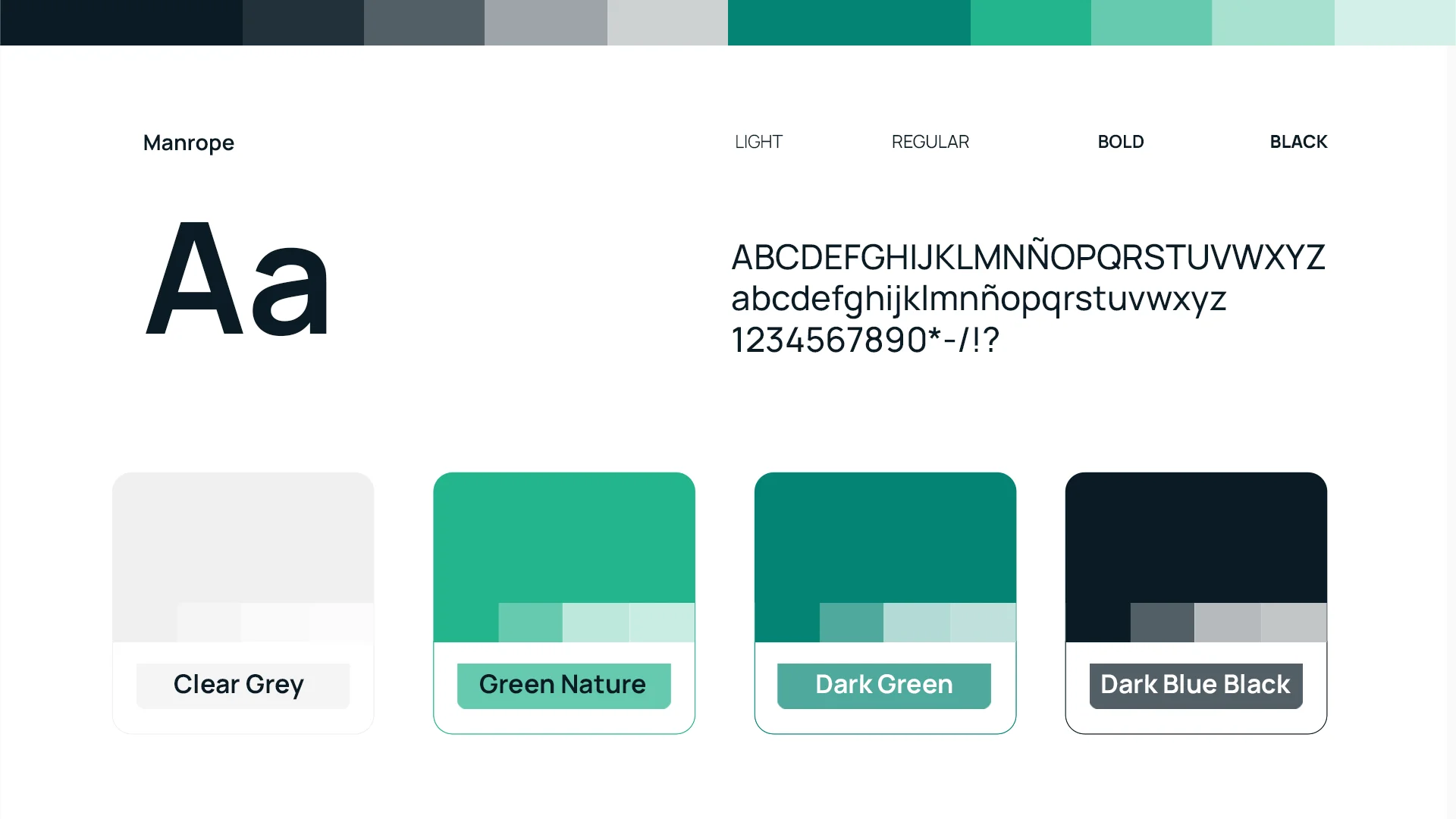
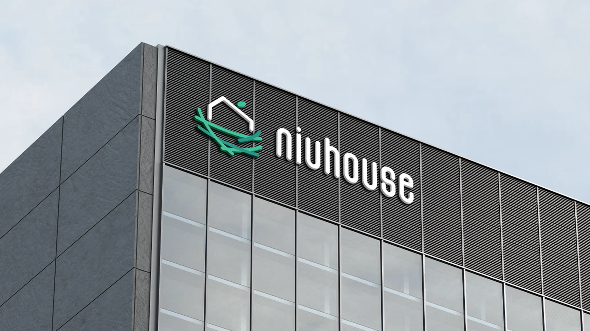
We built the brand around a simple idea: the nest. A symbol with a house resting on a nest of green strokes, a rounded, friendly typeface and a palette of greens that speaks of nature and La Cerdanya. The website organises the services into a clear journey, with contact always one click away.
Process
How we did it
The same method as always: understand the business before drawing anything, and never move on to the next phase without your approval.
Discovery
Understand the business- Kick-off meeting
- Competitors
- Goals
Concept
Find the idea- Moodboard
- Sketches
- Creative direction
Identity
Build the brand- Logo
- Colour & type
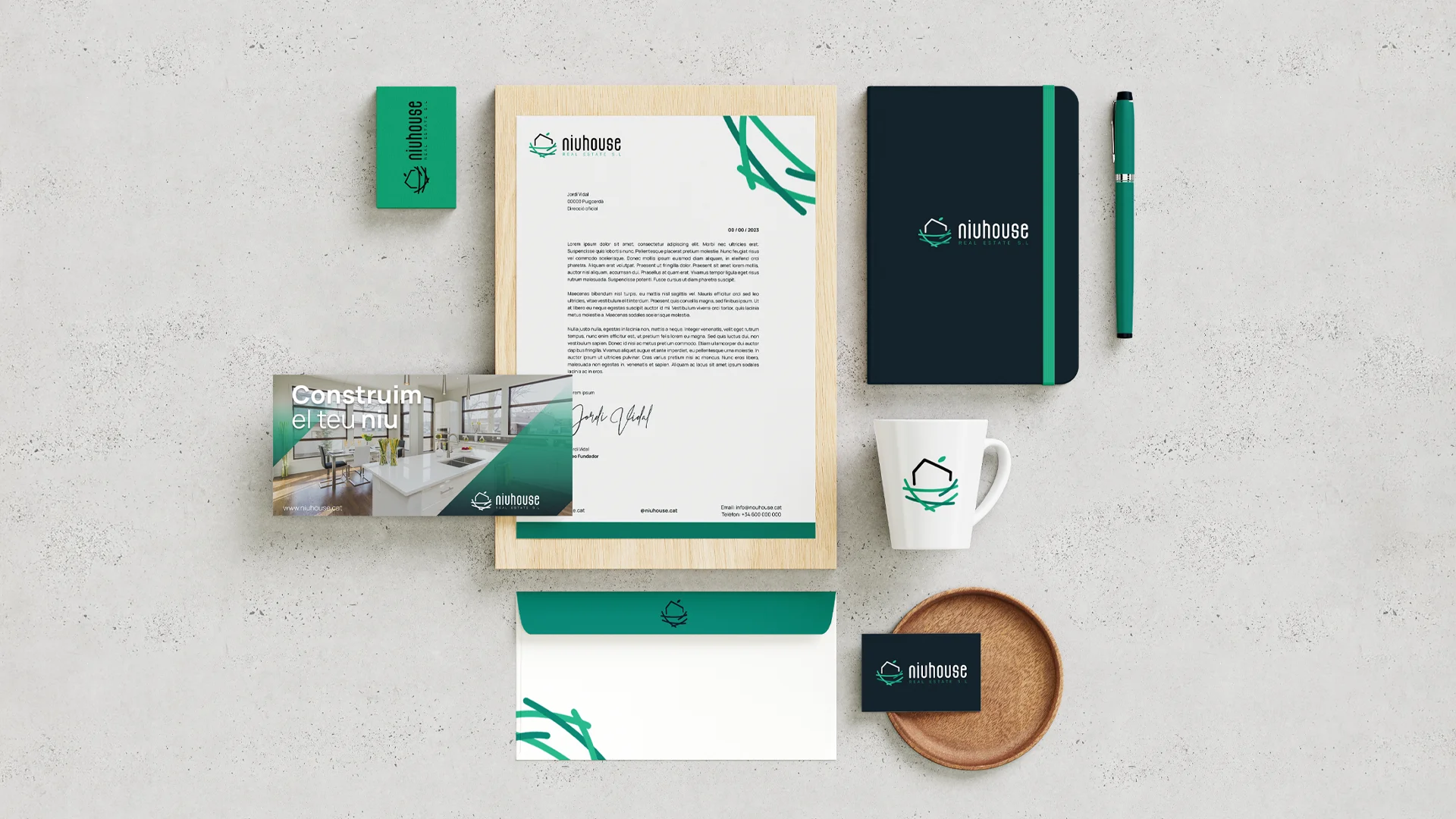
- Applications
Website
Take it online- Structure
- Design
- WordPress
The concept
"Niu" means nest in Catalan, and "house" is, well, house. The symbol brings the two words together: a house resting in its nest, the made-to-measure home Niu House promises every client.
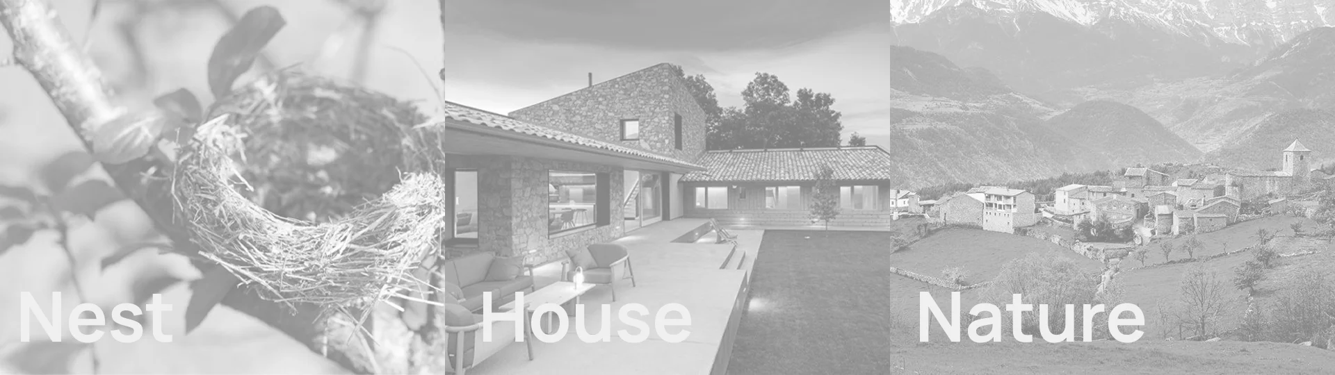
You buy a house; you build a home. That's why the Niu House brand had to speak of nests, not square metres.
01
Visual identity
Logo · Colour · Typography
02
Brand applications
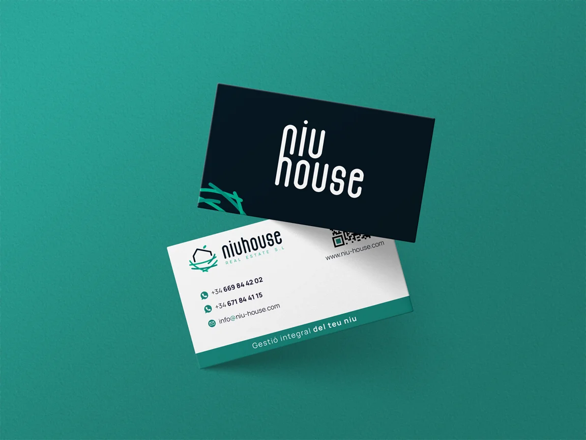
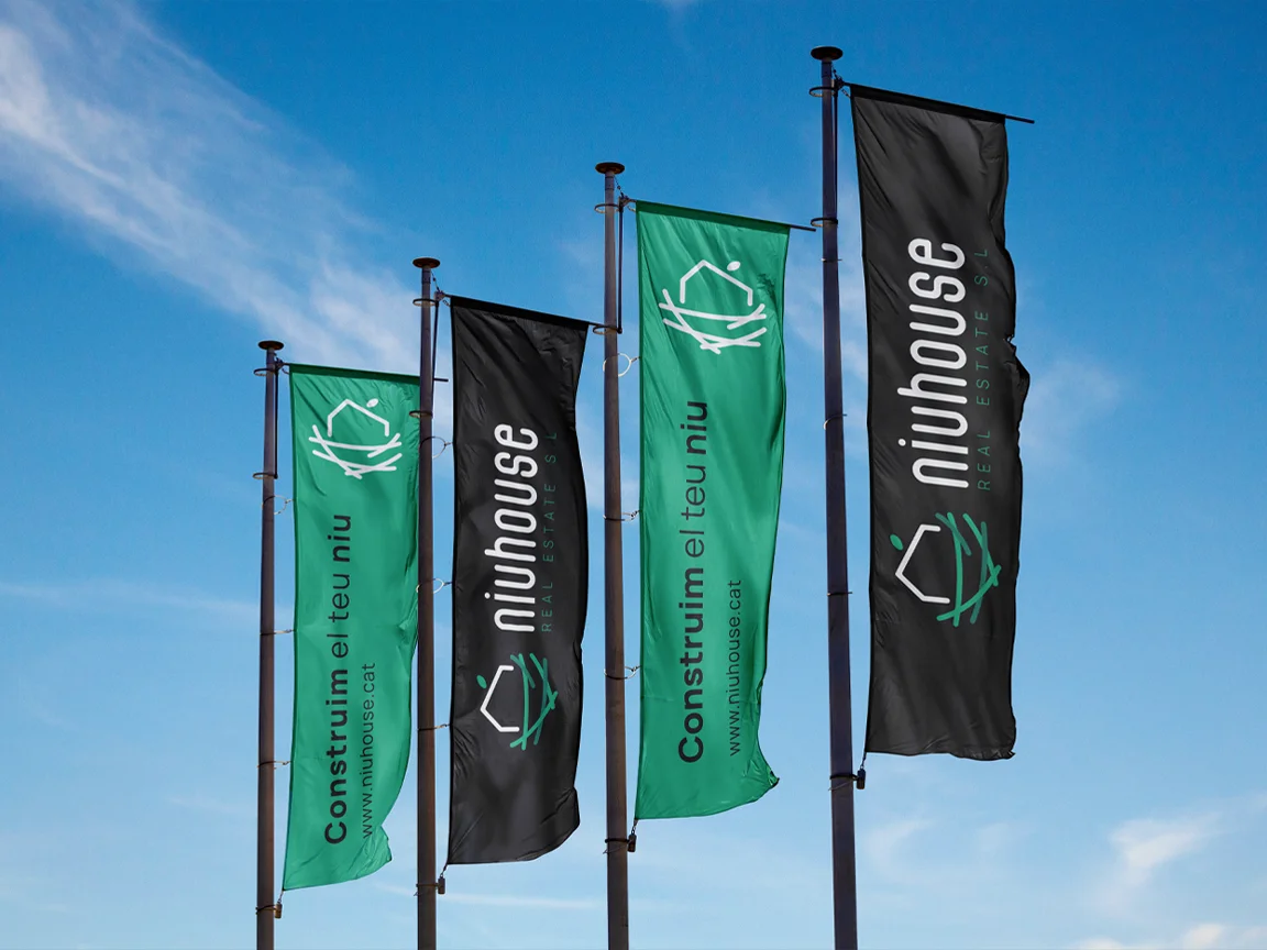
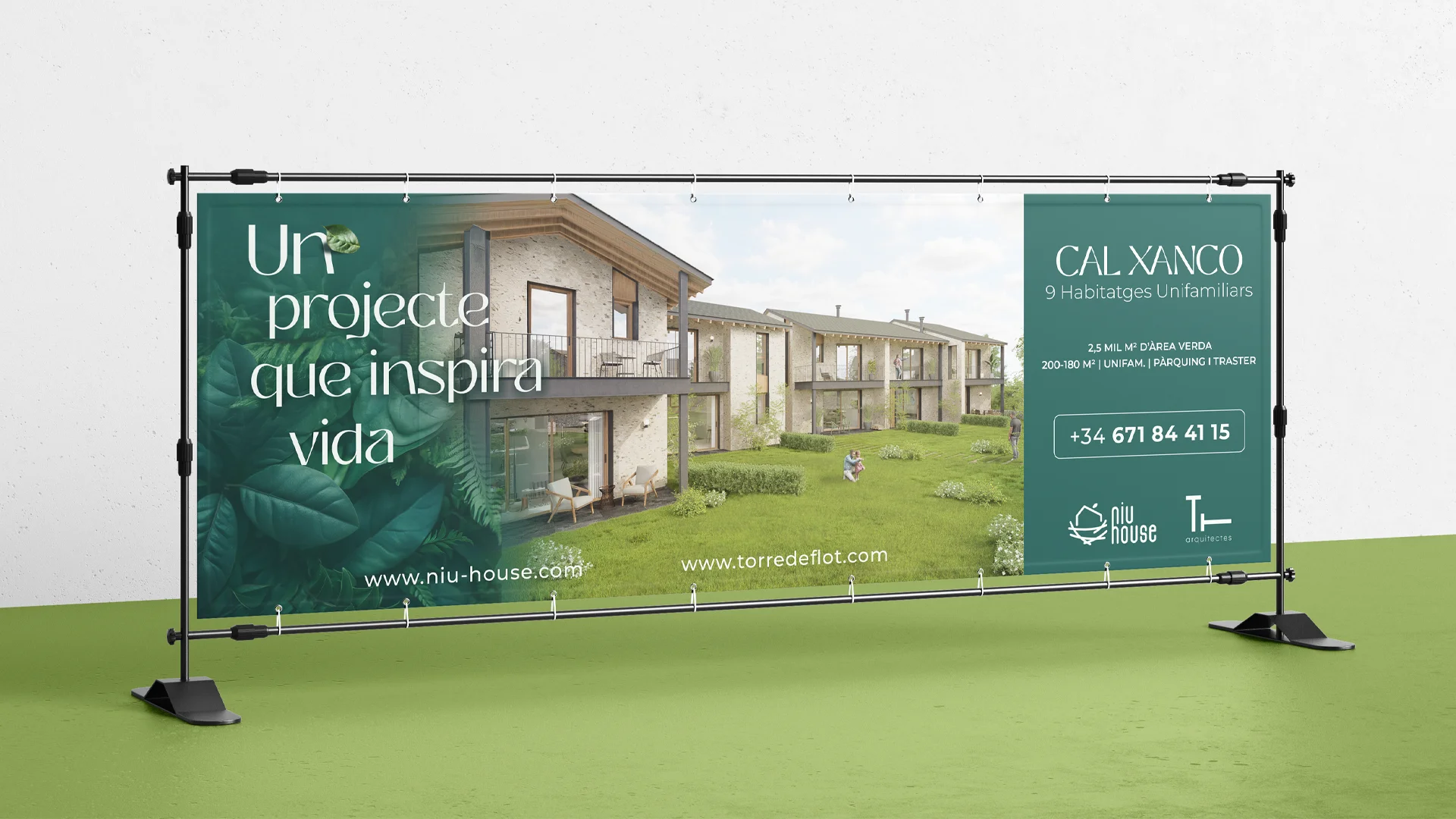
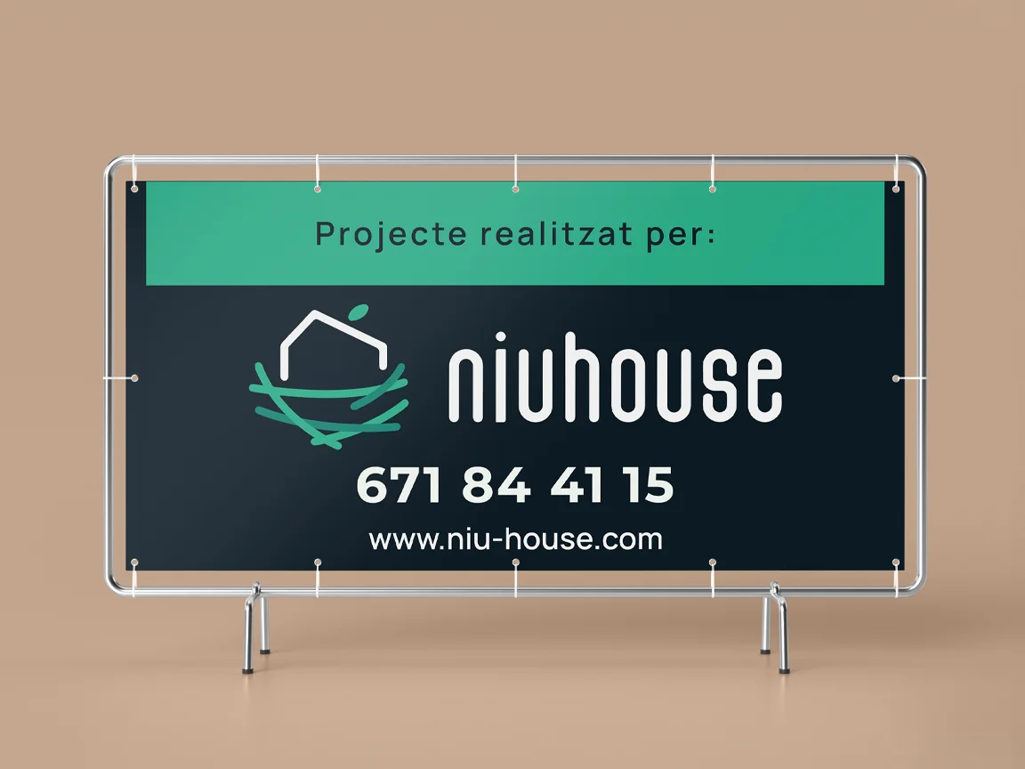
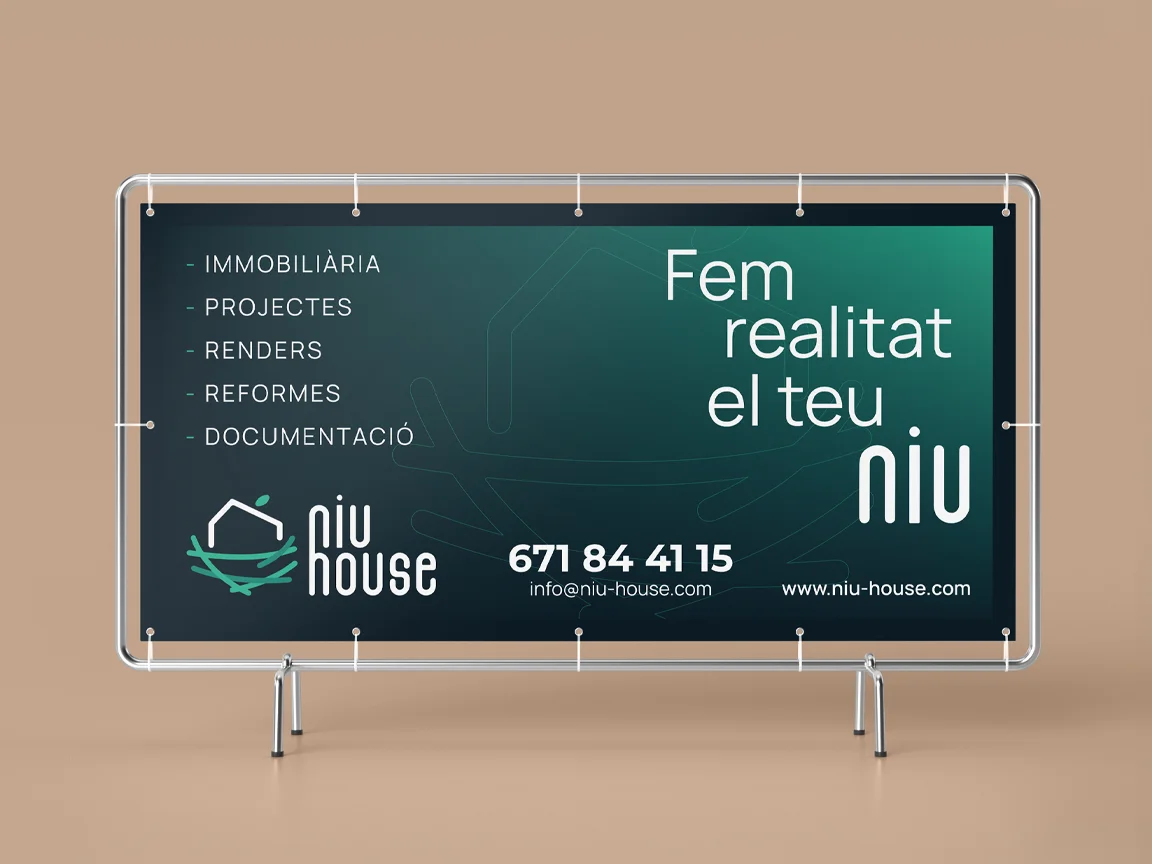
Stationery · Apparel · Posters
03
Digital presence
Web design