About the project
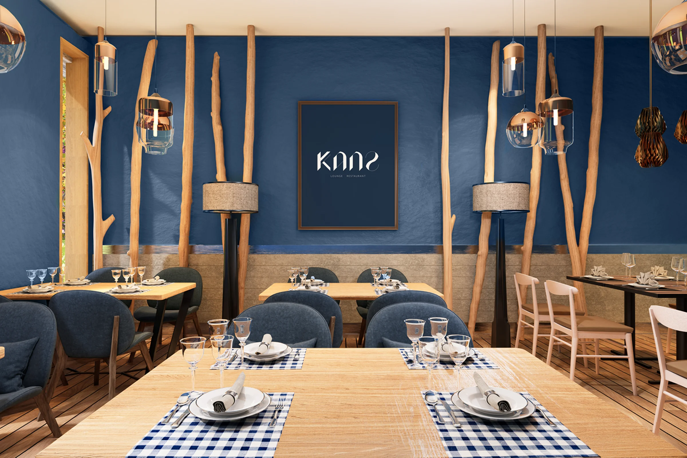
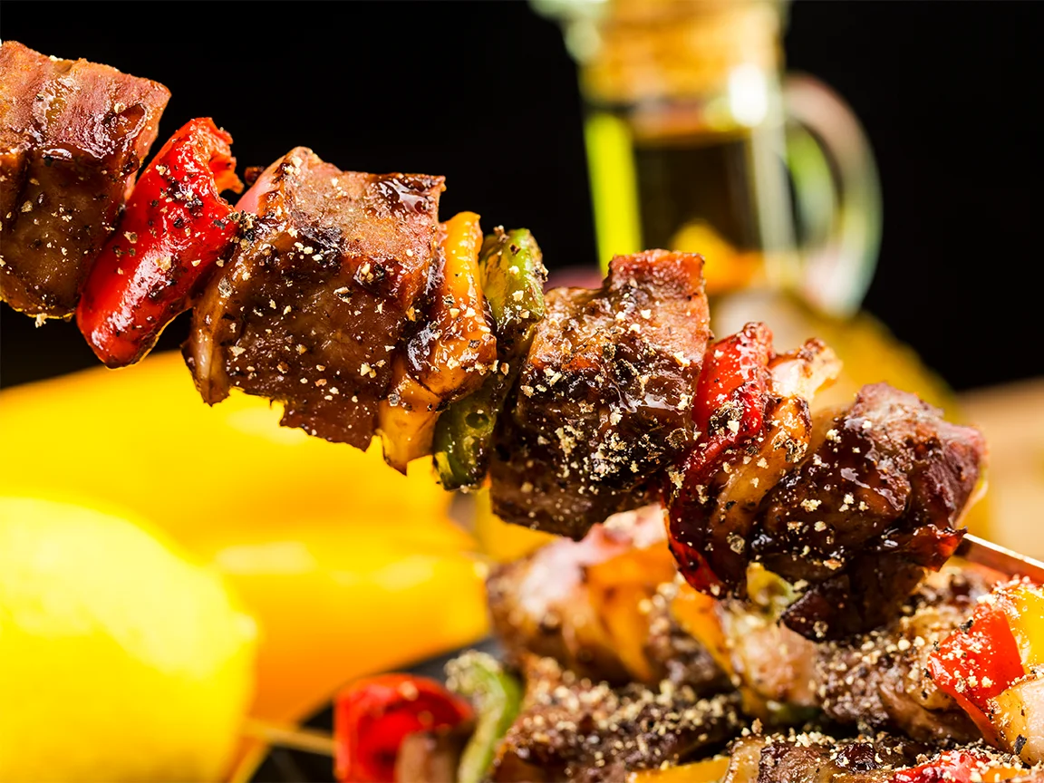
KANZ is Moussa El Kanze's restaurant in Llívia, the Spanish village surrounded by France in the heart of La Cerdanya. Its cooking blends the local Catalan tradition with Moroccan Arab cuisine. For his new venture he needed an image that conveyed, above all, elegance and professionalism.
Challenge and solution
Two cuisines, one identity
Challenge
A restaurant that brings two traditions together risks falling short on both: either it slips into exotic clichés or it loses its Moroccan roots entirely. KANZ wanted an elegant place, worthy of its cooking, where both cultures could live side by side without clashing. The brand had to tell that balance naturally and work in the dining room, on the menu and on social media.
Solution
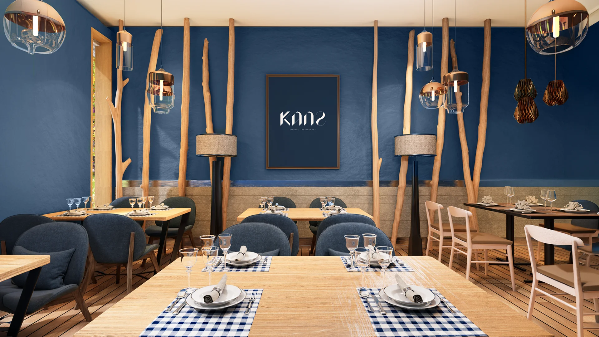
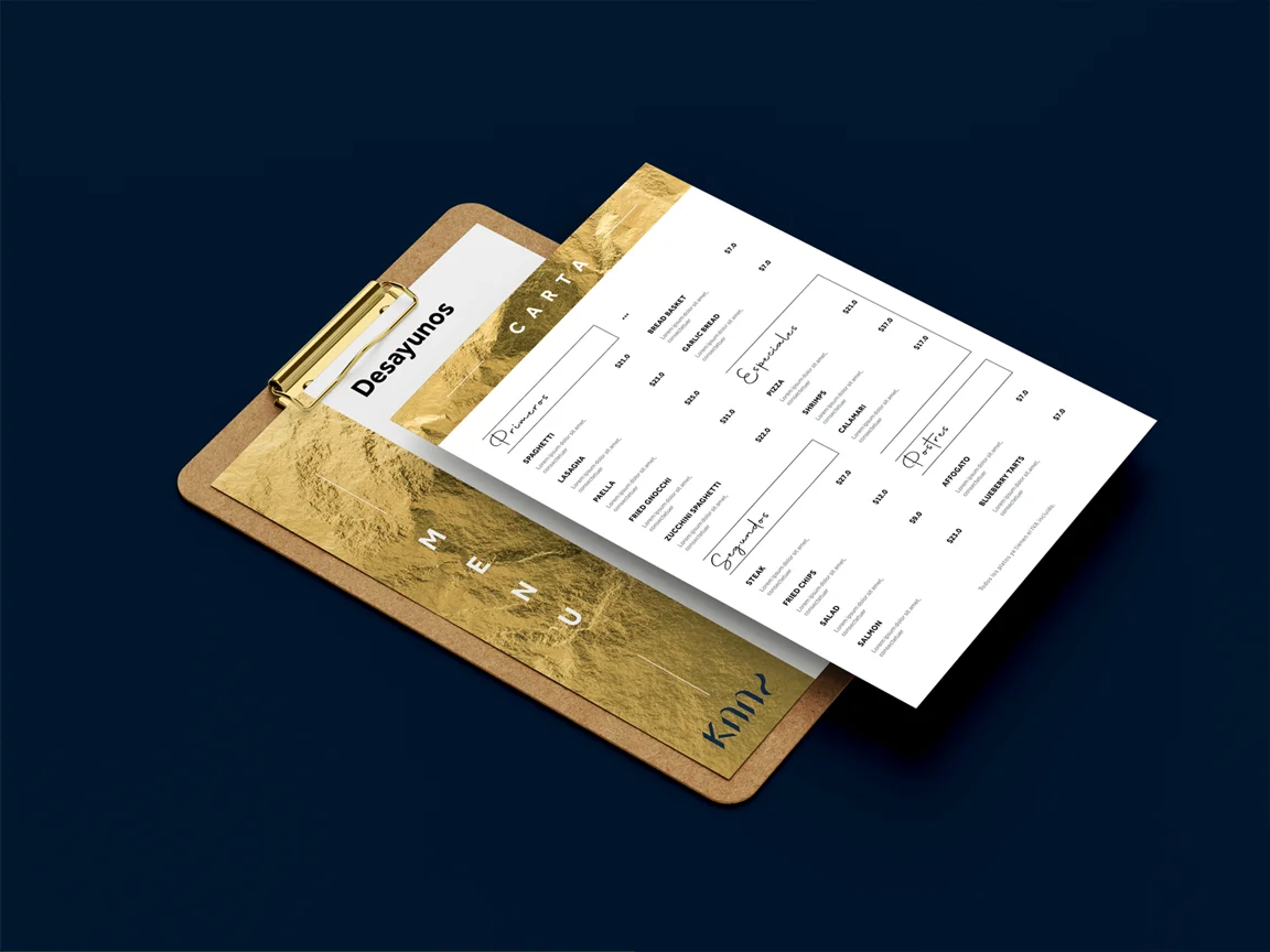
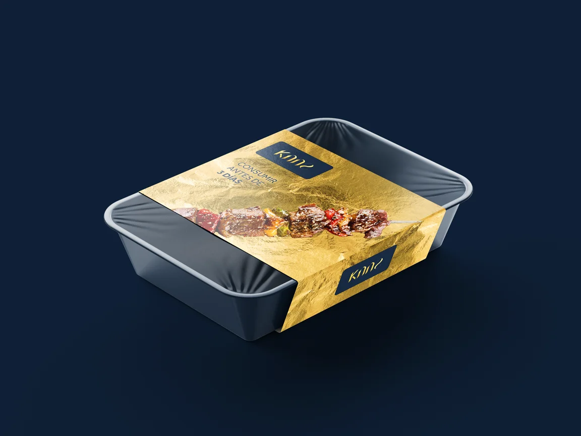
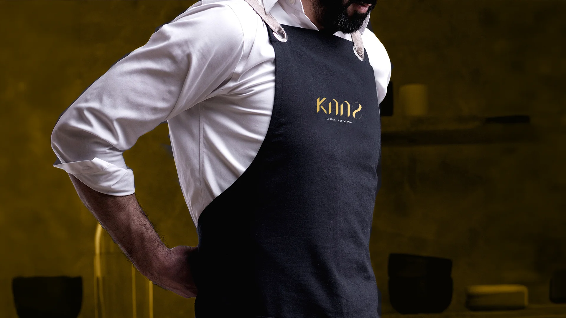
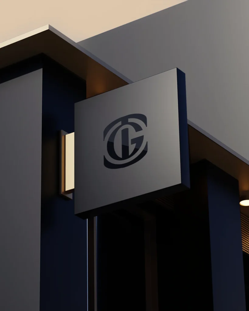
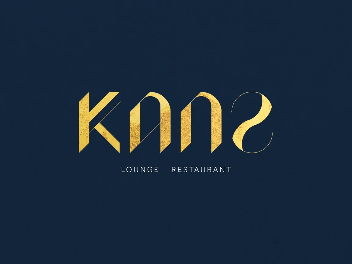
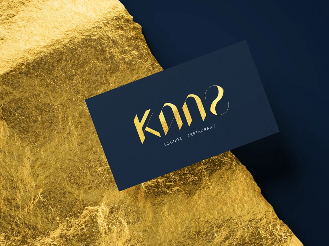
A custom-drawn logo built on a geometric grid inspired by traditional Moroccan mosaics, with soft curves that bring elegance and a professional feel. The name, which means "treasure" in Arabic, rests on a gold that connects with its story, set against a deep midnight blue, sand and earth tones. The identity is completed by applications for the dining room, the menu and social media, so the restaurant is recognisable in every detail.
Process
How we did it
The same method as always: understand the business before drawing anything, and never move on to the next phase without your approval.
Discovery
Understand the business- Kick-off meeting
- Competitors
- Goals
Concept
Find the idea- Moodboard
- Sketches
- Creative direction
Identity
Build the brand- Logo
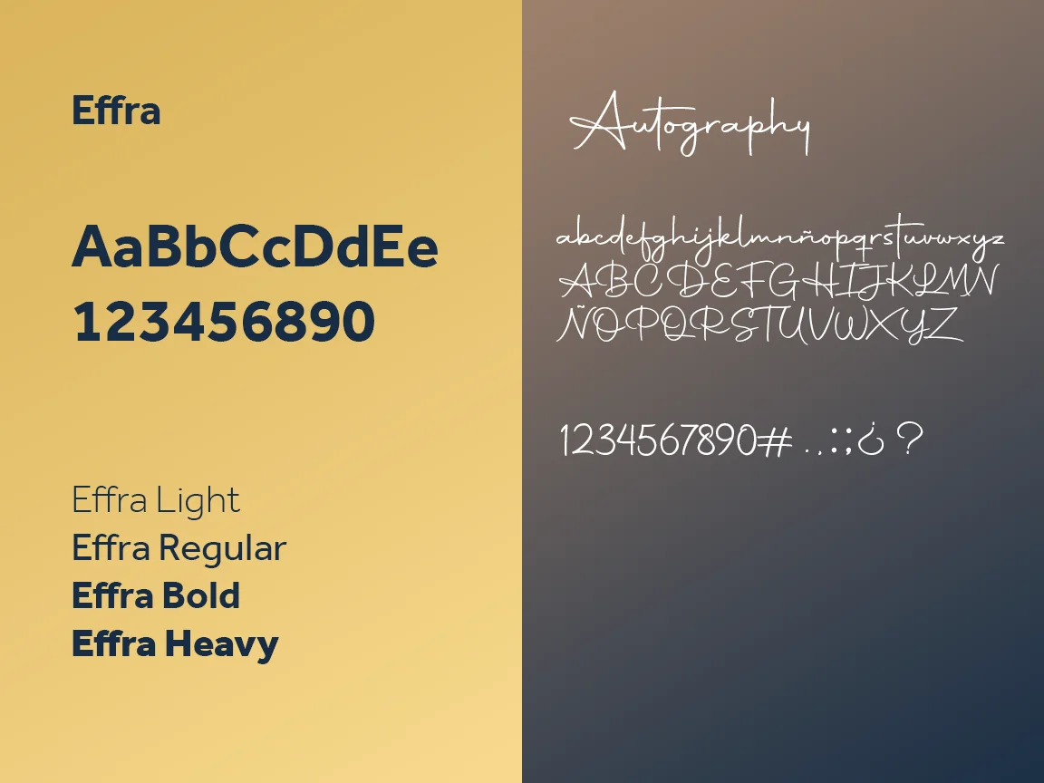
- Colour & type
- Applications
The concept
KANZ means "treasure", and Moussa's wife's name means "gold". Hence the gold and lettering built like a Moroccan mosaic: precise geometry, soft curves and the sheen of something kept with care.
At KANZ's table two cultures meet, and the brand had to say so without a single word: with the geometry of a mosaic and the gleam of gold.
01
Visual identity
Logo · Colour · Typography
02
Brand applications
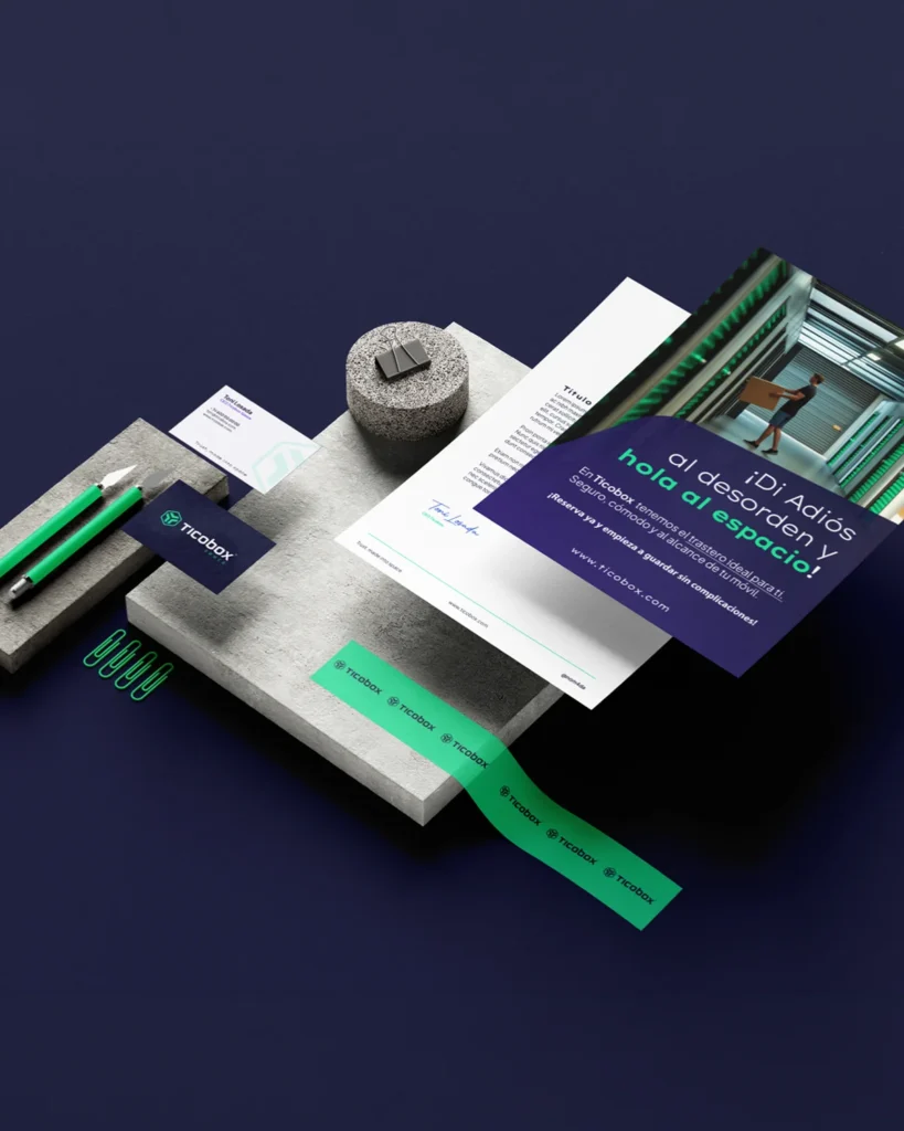
Stationery · Apparel · Posters