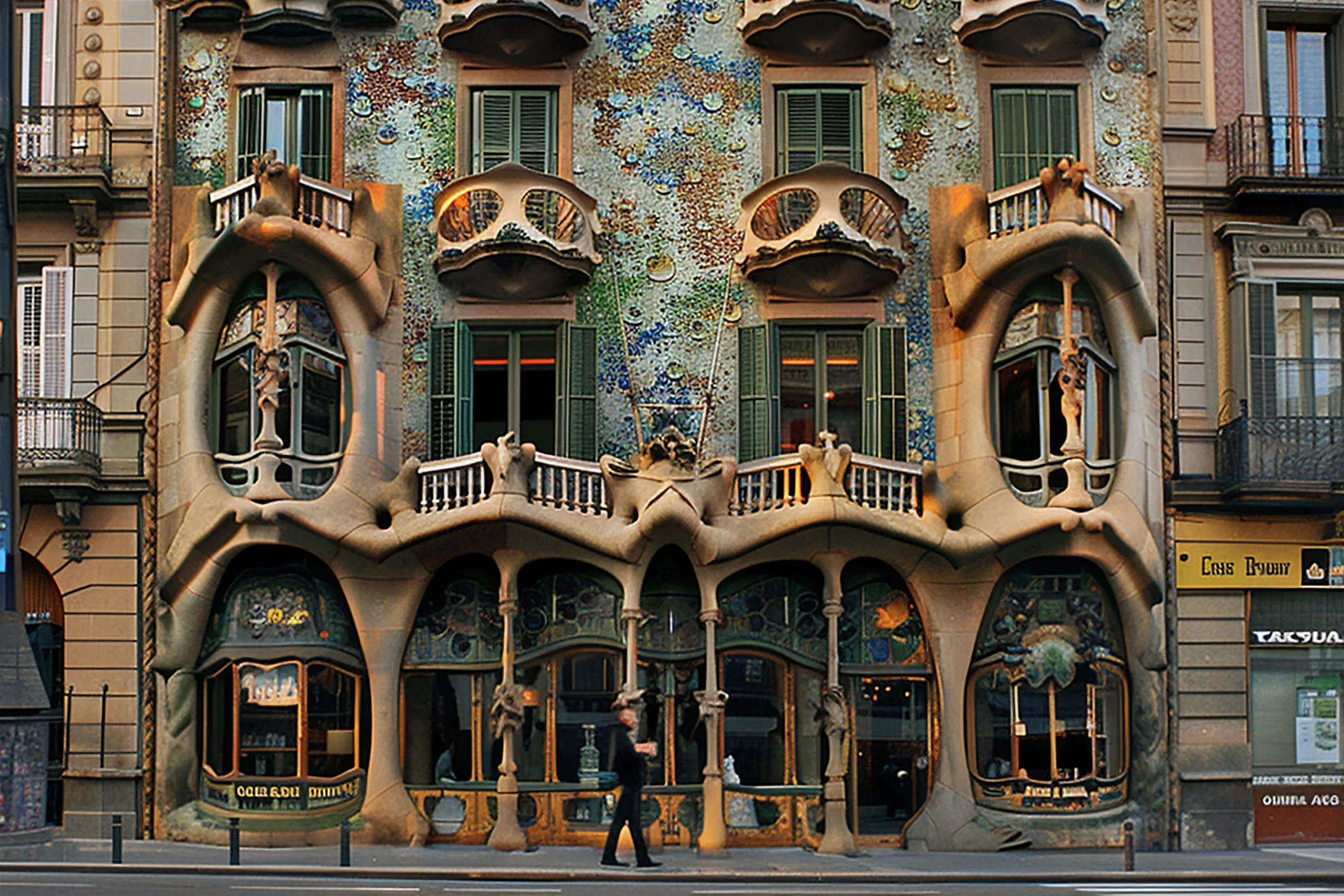
About the project
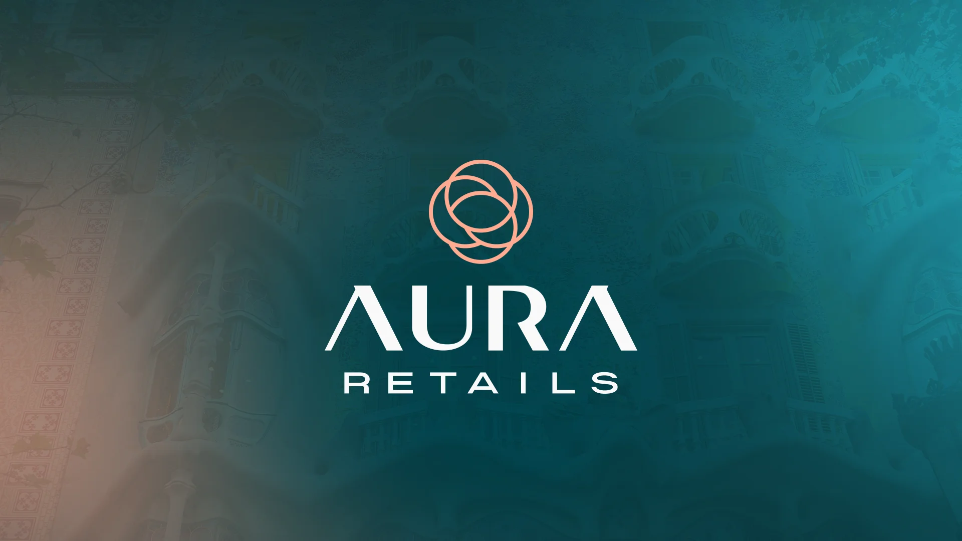
Aura Retail takes its name from its founder, Aura, and shares her energy: a young real estate firm that helps entrepreneurs open their business in Barcelona and its metropolitan area. Buying, selling, leasing and transferring commercial premises, with a personal touch, new technology and full advisory support. It needed a brand that conveyed trust, freshness and transparency in a sector where they're in short supply.
Challenge and solution
Real estate, but with a breath of fresh air
Challenge
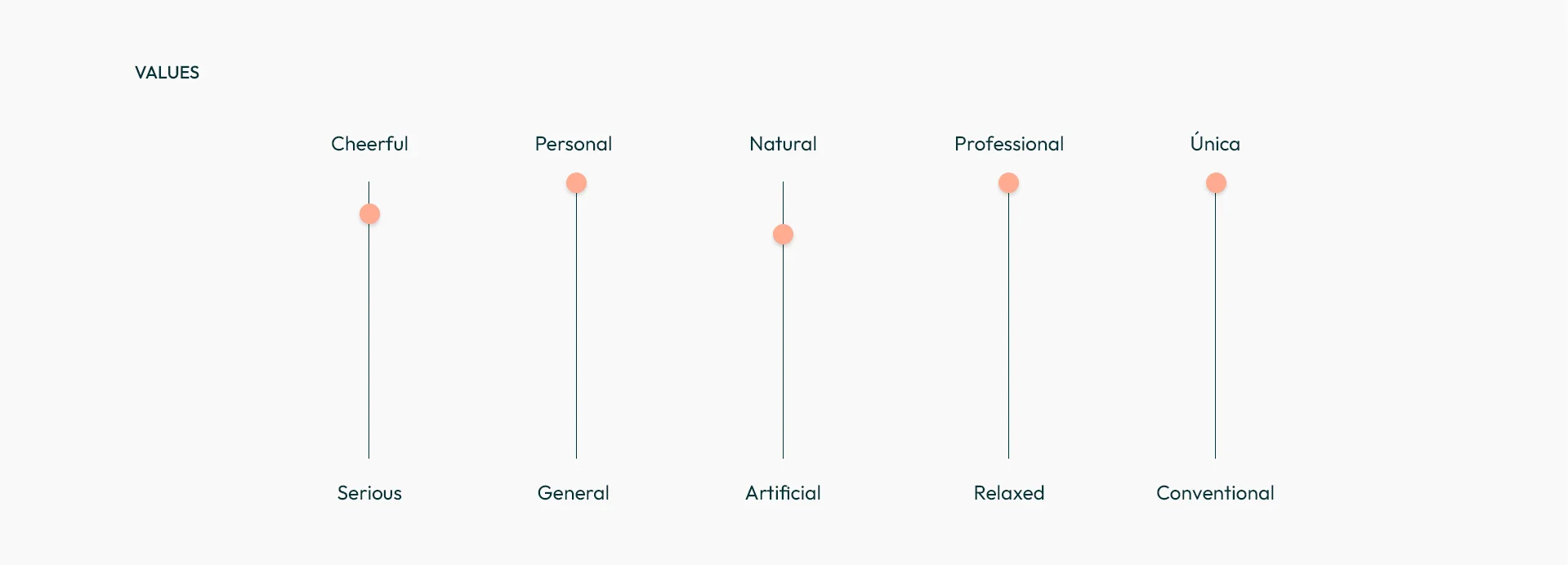
The commercial property market in Barcelona is competitive, and not always clean: plenty of opaque brokering and brands that only talk about square metres and prices. Aura Retail wanted to stand out for exactly the opposite: closeness, honesty and real results. The brand had to be professional and unique, but also cheerful, natural and personal, and connect with entrepreneurs as well as owners and investors.
Solution
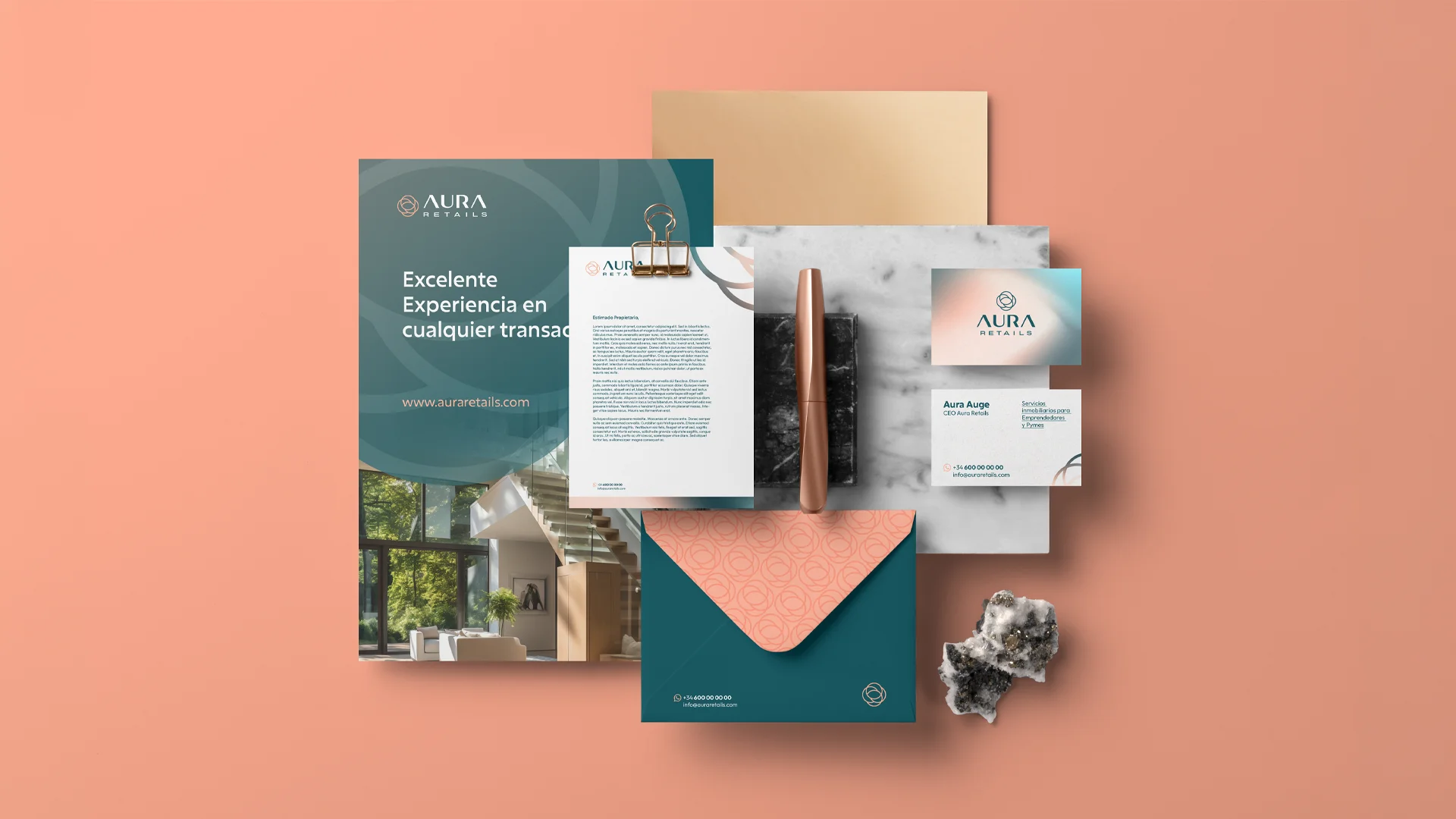
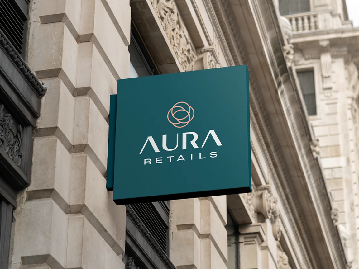
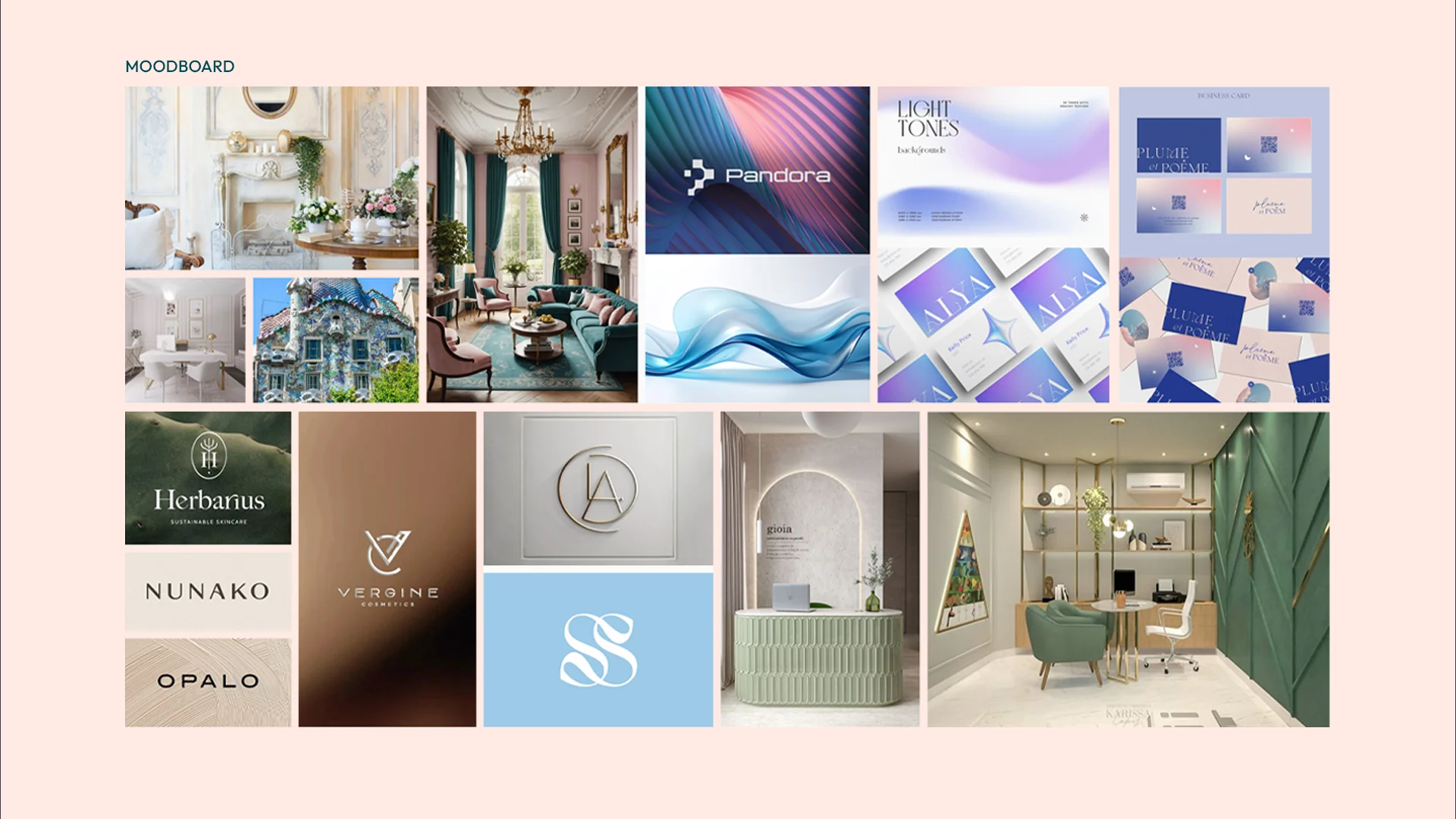
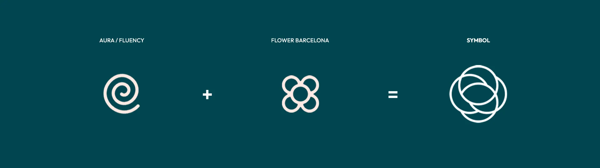
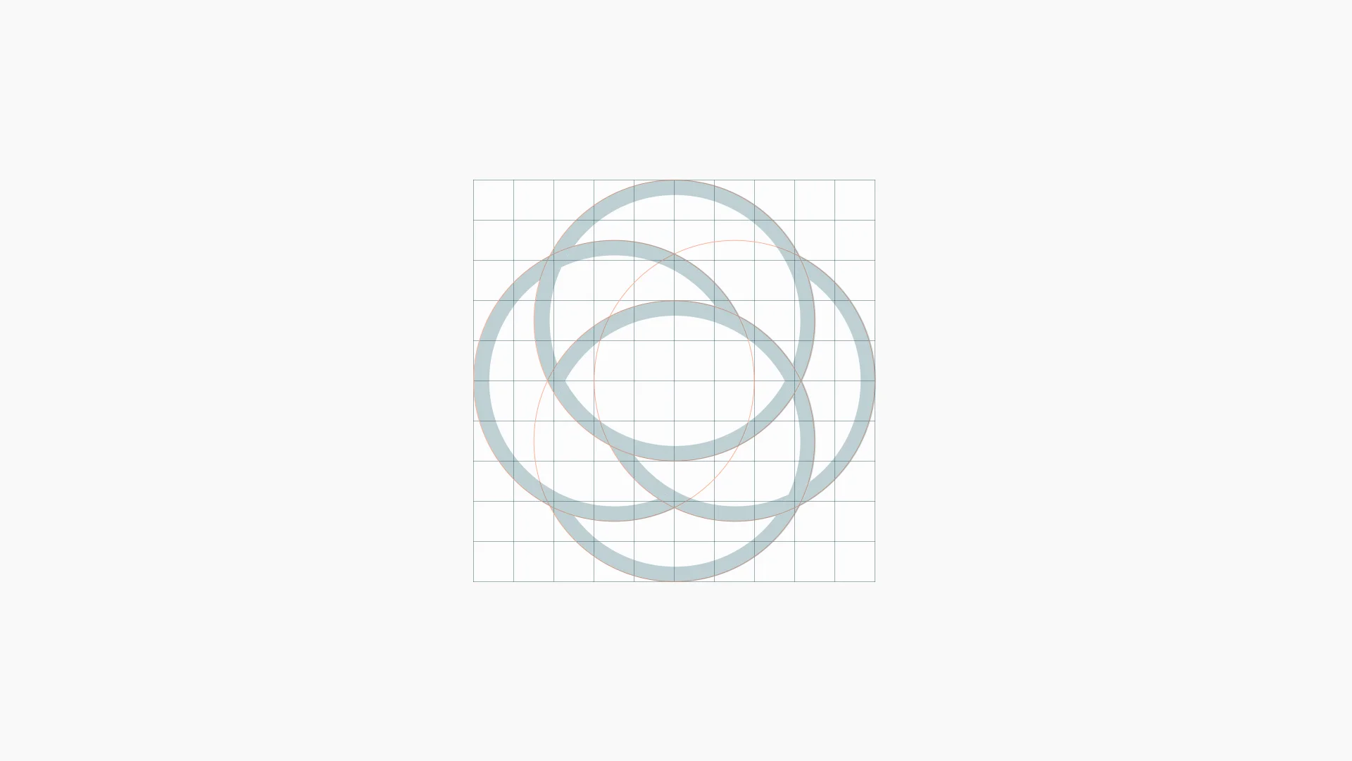
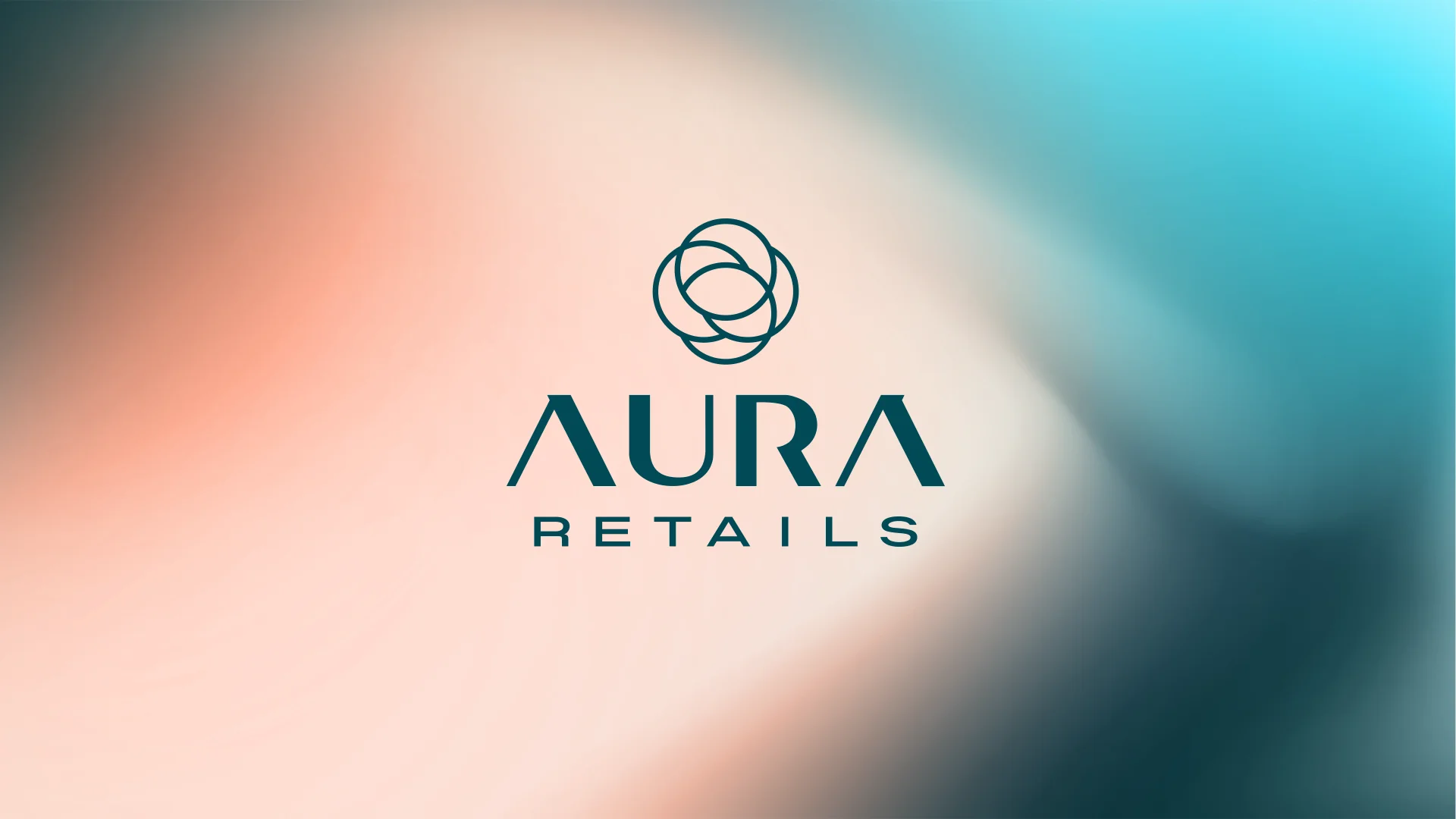
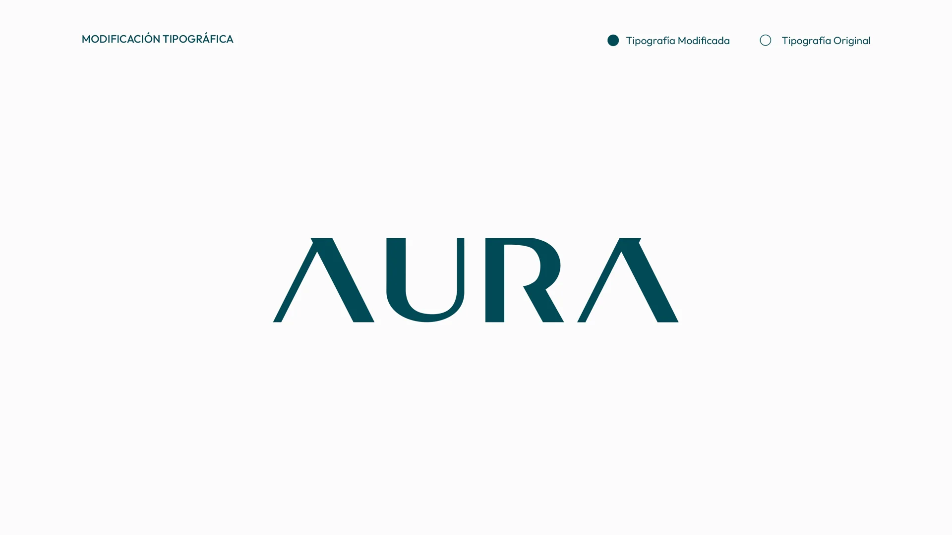
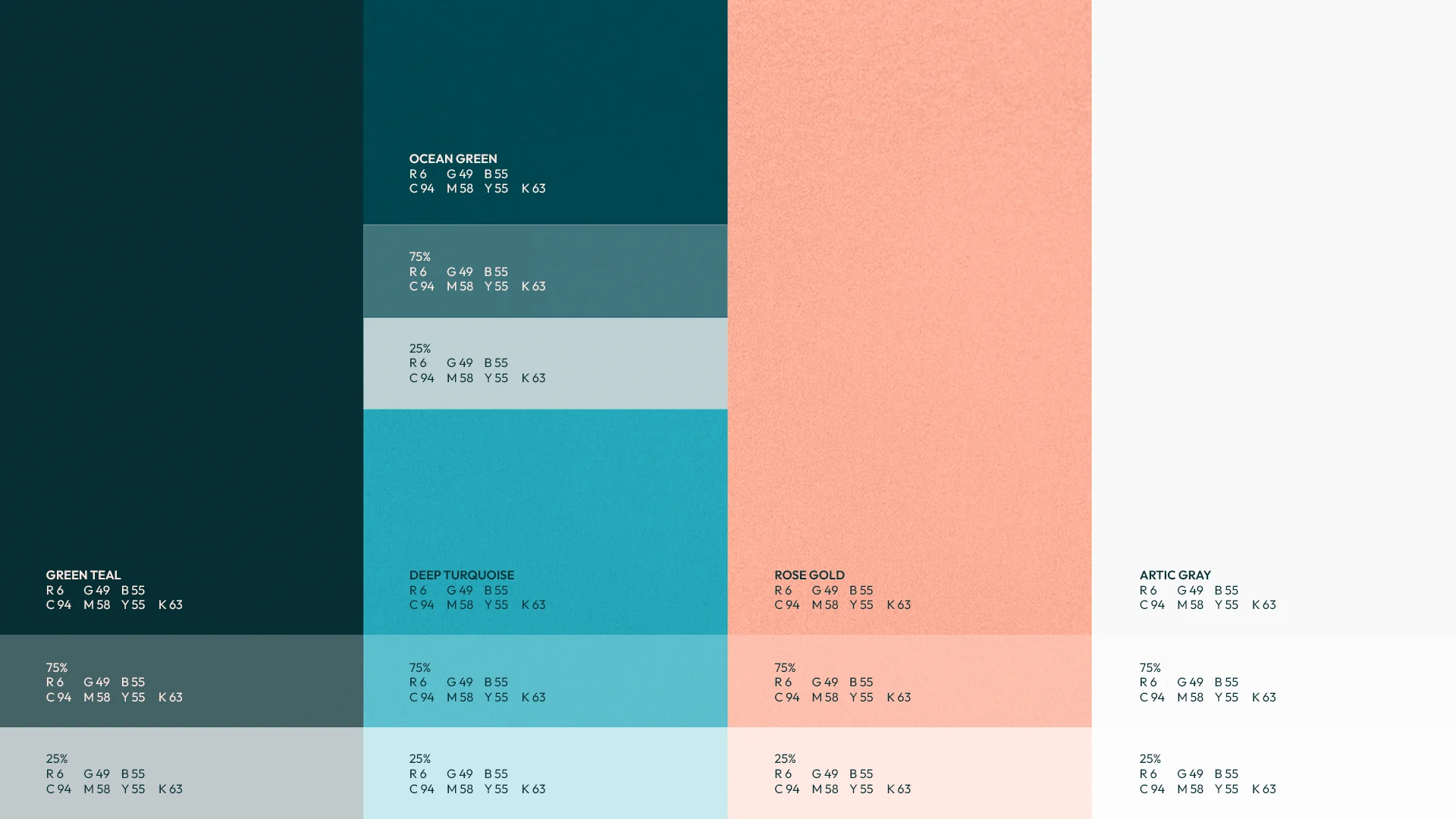
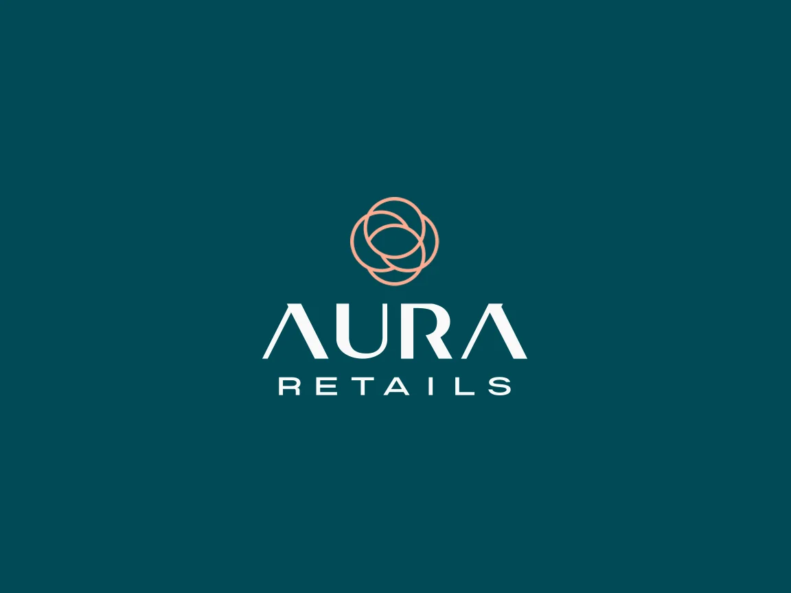
A symbol that brings two ideas together. On one side, the aura: a spiral that speaks of a breeze, of flow and of a fresh start. On the other, the Barcelona flower tile, the modernista icon of the city's pavements, with a touch of classic elegance. Built on a grid of circles, the rings intertwine into a single shape that also speaks of the bond between the brand and its clients. The palette combines teal and ocean greens, a deep turquoise, rose gold and arctic grey. An elegant, luminous system, with one foot in the city's tradition and the other in what's next.
Process
How we did it
The same method as always: understand the business before drawing anything, and never move on to the next phase without your approval.
Discovery
Understand the business- Kick-off meeting
- Competitors
- Goals
Concept
Find the idea- Moodboard
- Sketches
- Creative direction
Identity
Build the brand- Logo
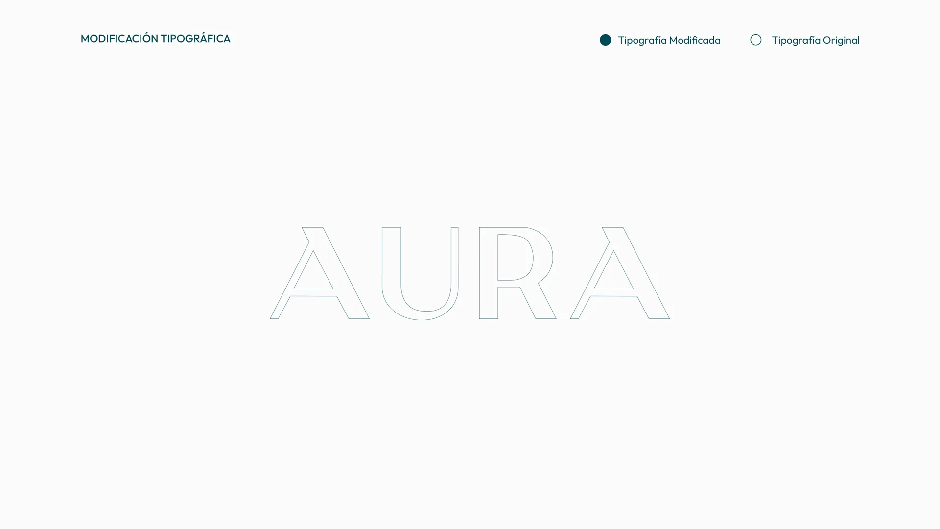
- Colour & type
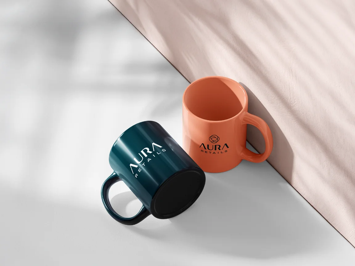
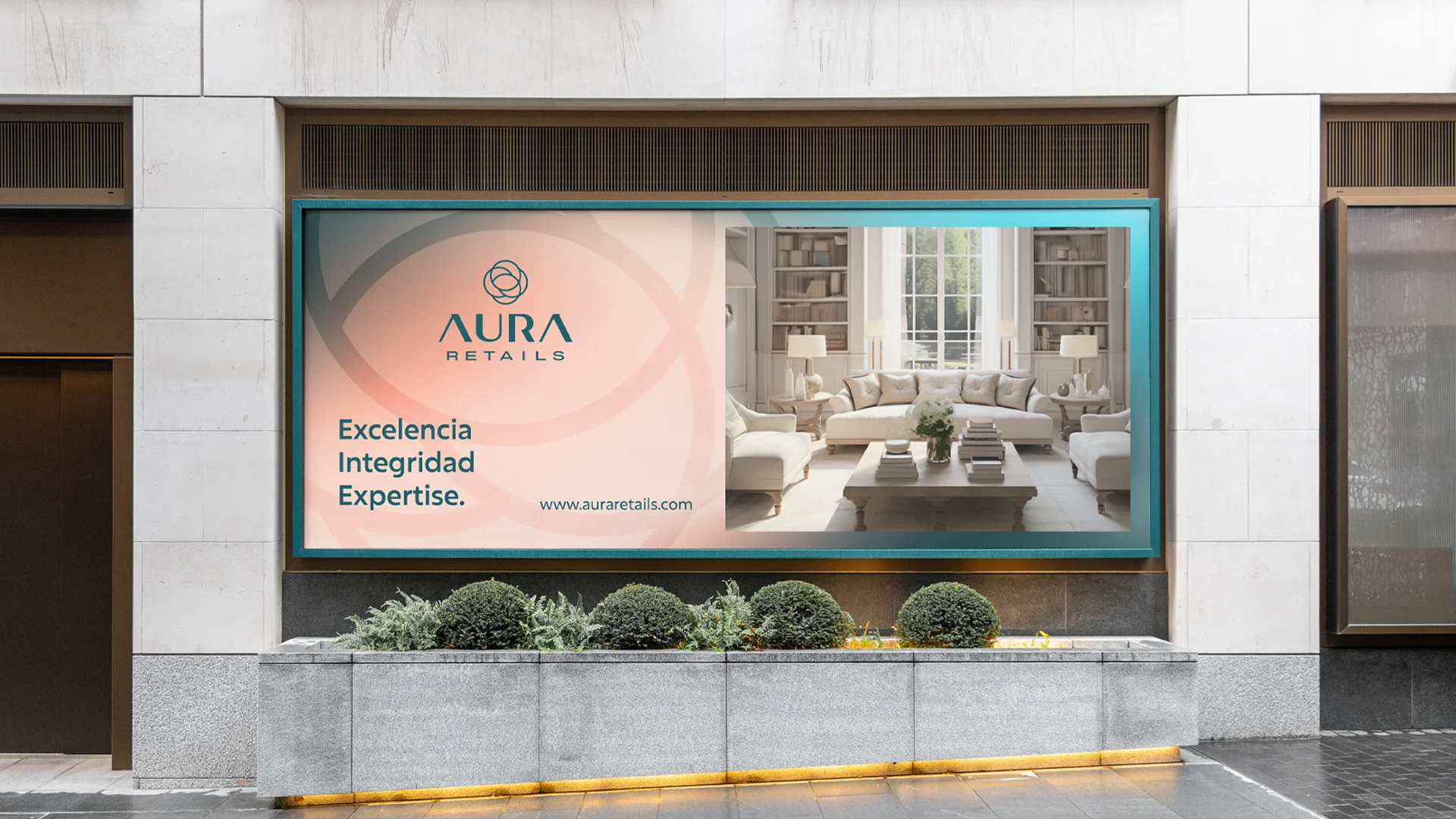
- Applications
The concept
The Barcelona flower, reimagined as an aura in motion: interlocking circles that bring together the city's modernista elegance and the flow of a fresh start.
Opening a business means starting something new. That's why the Aura Retail brand had to feel like a breath of fresh air, and like Barcelona at the same time.
01
Visual identity
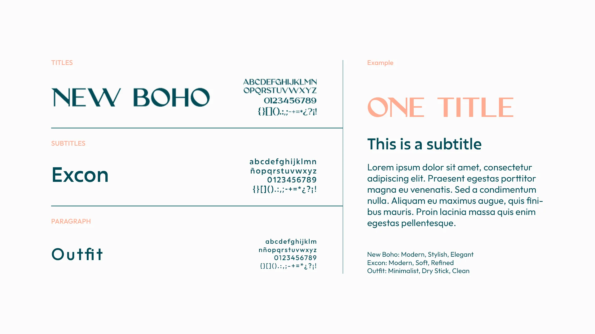
Logo · Colour · Typography
02
Brand applications
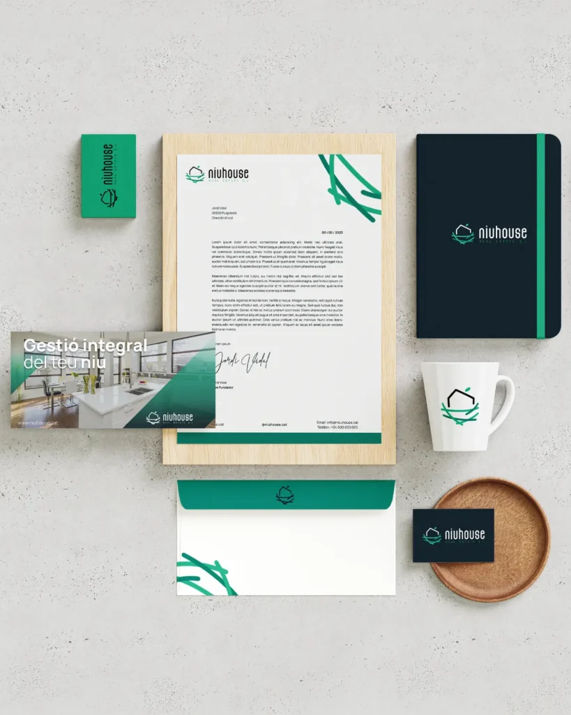
Stationery · Apparel · Posters