
About the project
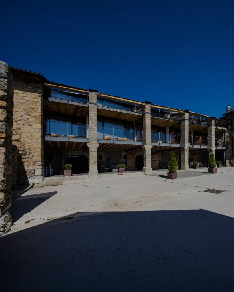
Tico Capital is the holding company that brings together the group's businesses, including Ticobox Space, Moments TICO and Tico Grupo Inmobiliario. It was born in La Cerdanya with a clear idea: to grow with purpose without forgetting where it comes from. It needed a parent brand that conveyed solidity, vision and closeness, and gave all its companies a shared origin and a shared direction.
Challenge and solution
Firm roots, open vision
Challenge
A holding company doesn't sell a product: it sells trust. It has to convince partners, investors and teams that behind every business there's a serious group with a clear course. Tico Capital wanted to convey that business muscle without losing what makes it different: that it's born and grows from La Cerdanya, committed to the area and its people. The brand had to sound like capital without looking like a cold investment fund, and act as an umbrella for businesses as different as storage units and a café.
Solution
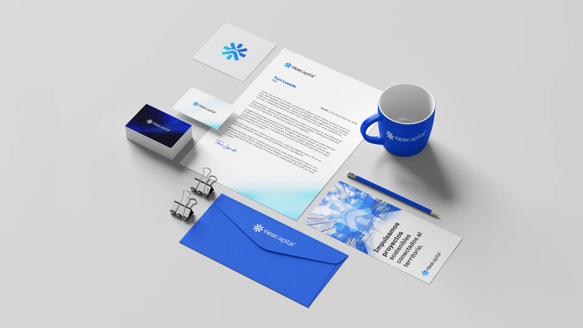
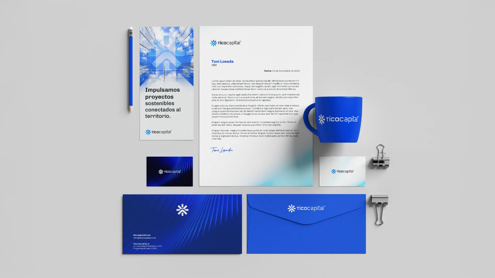
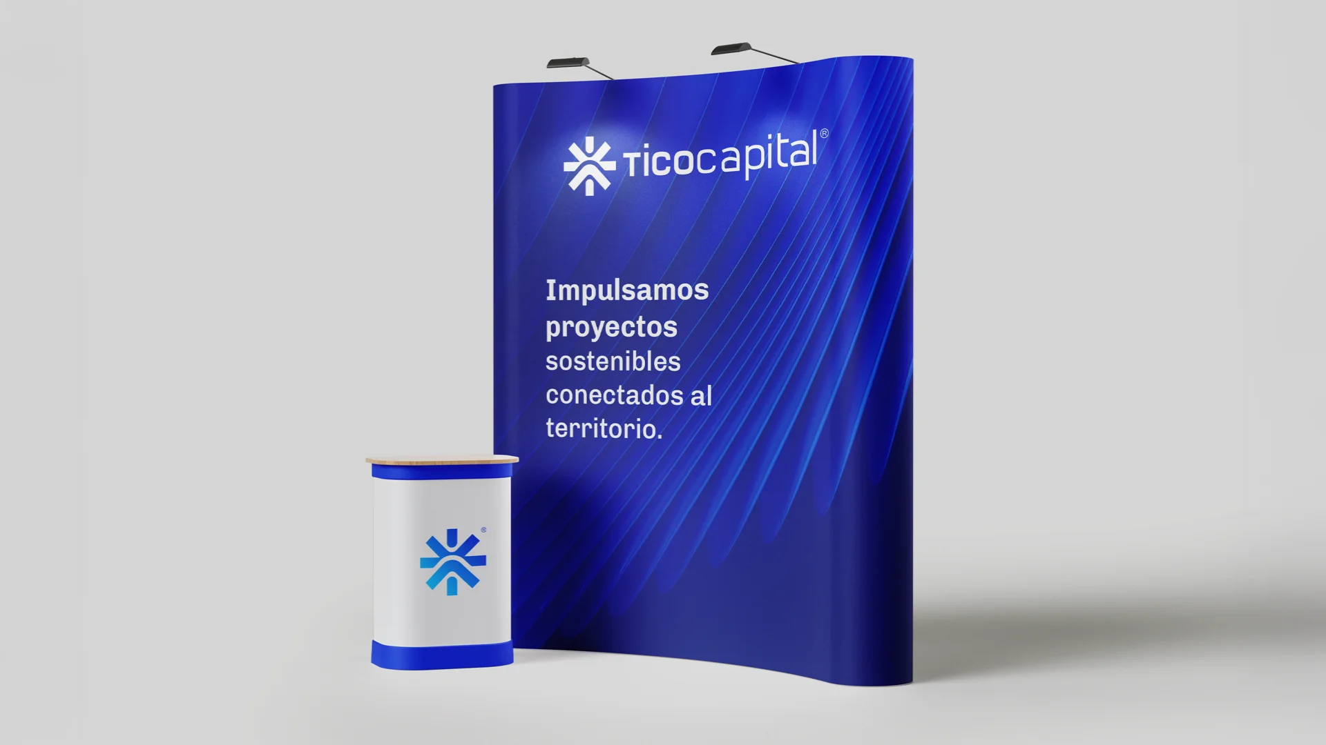
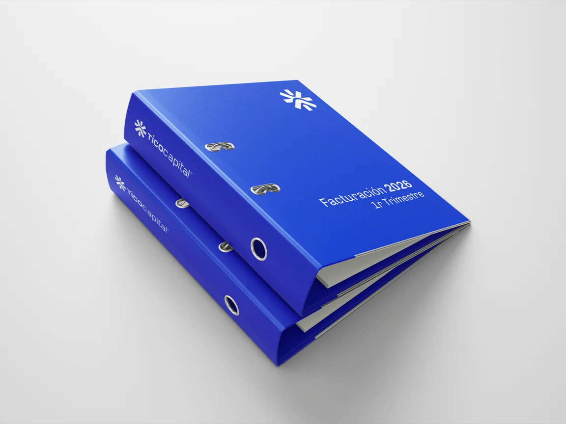
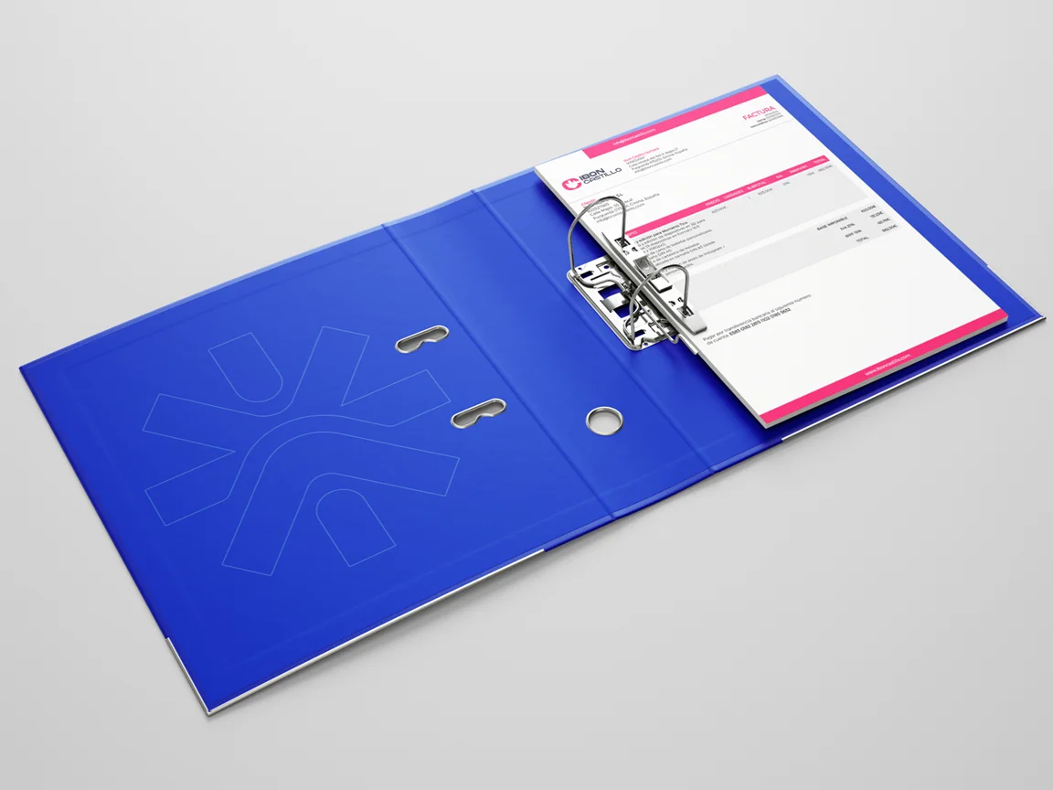
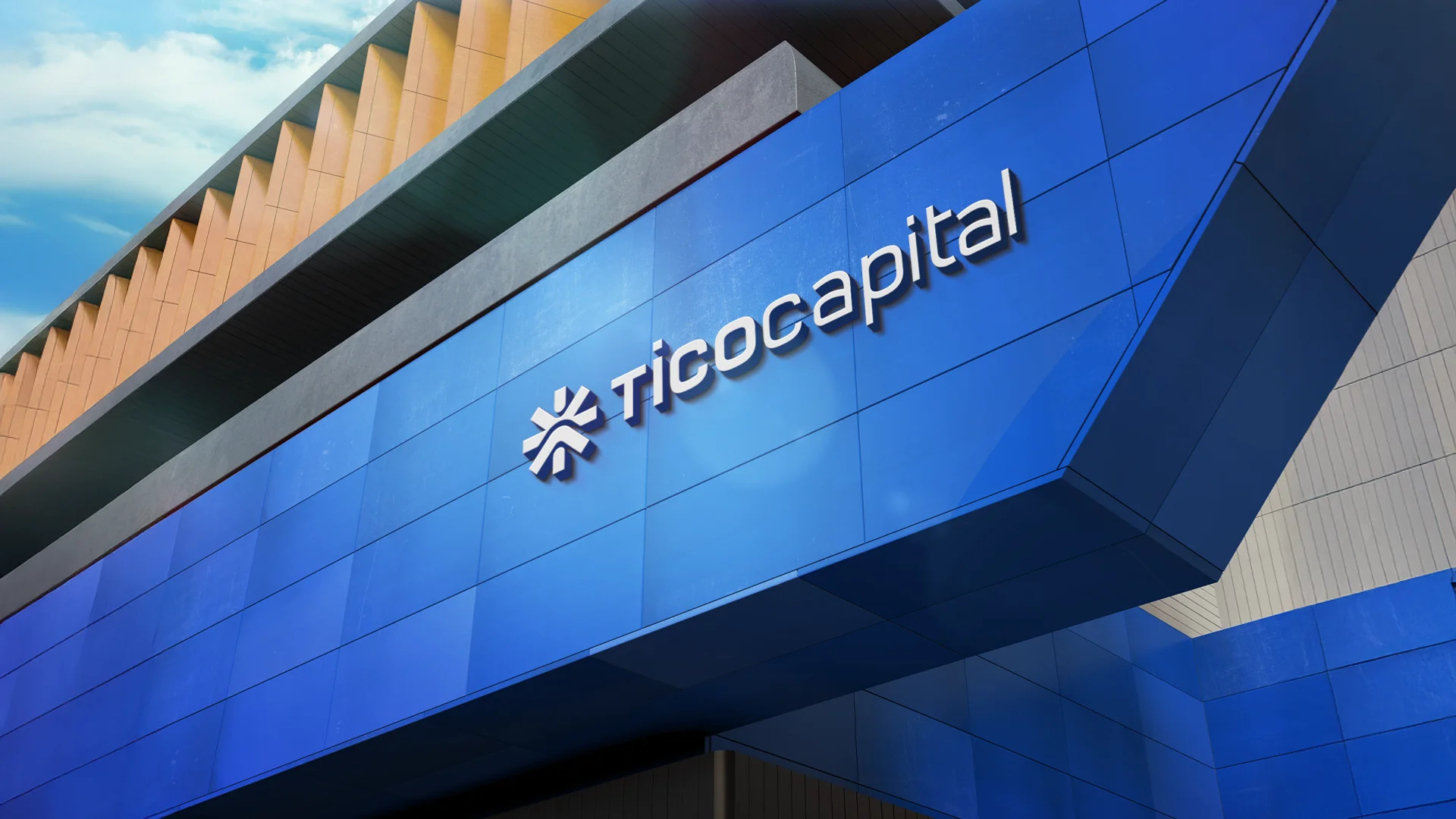
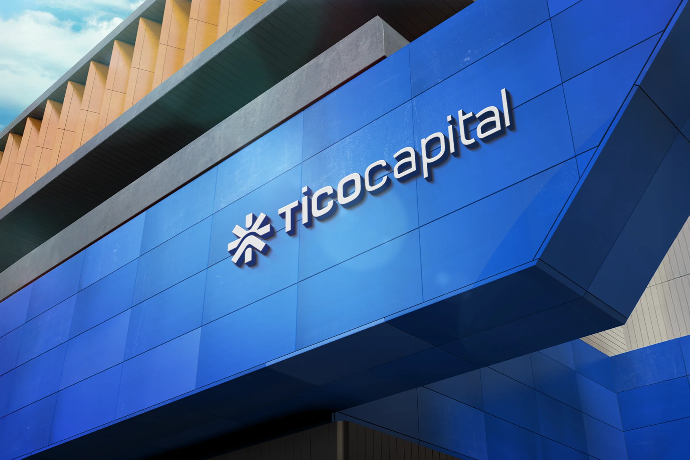
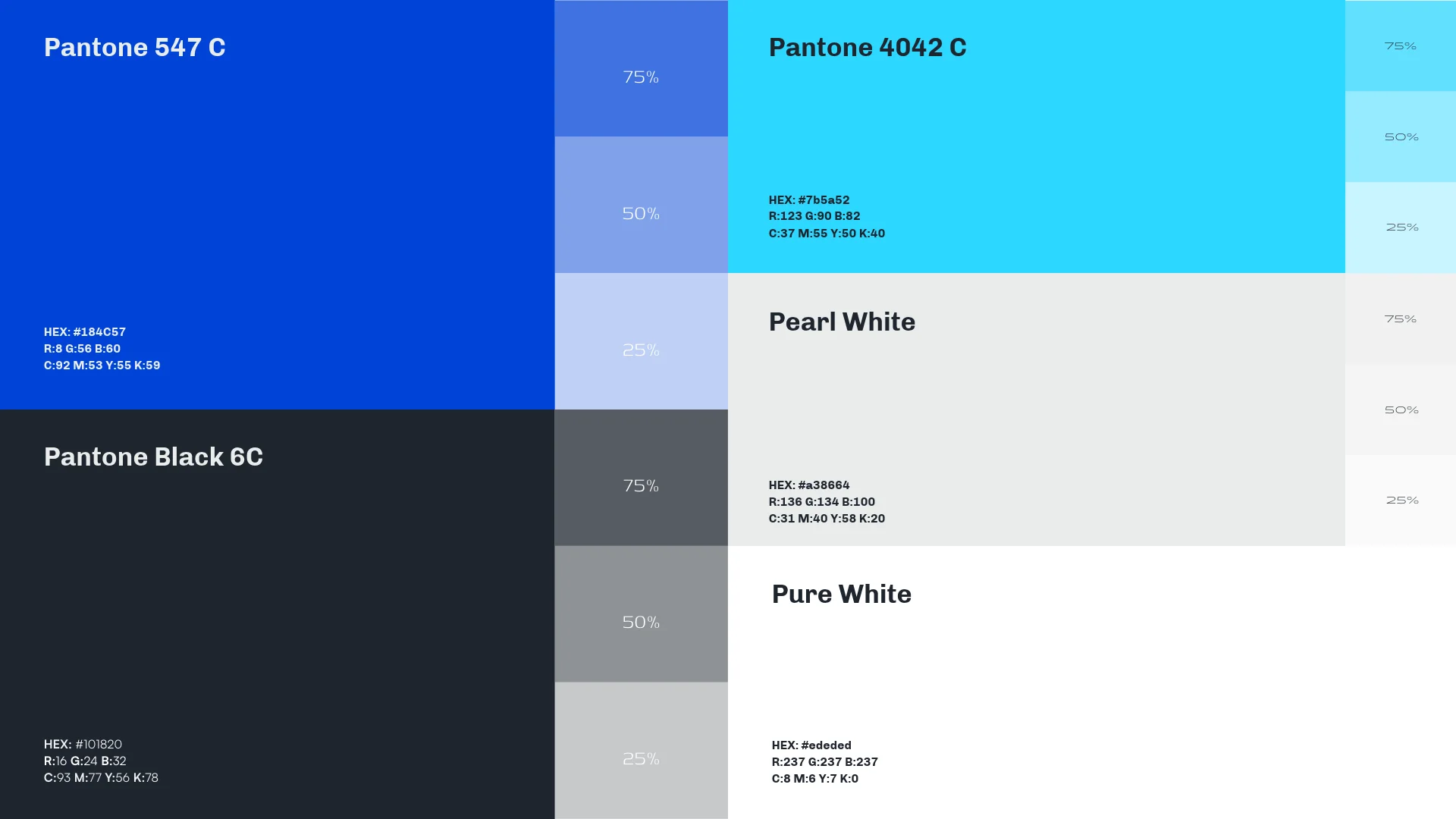
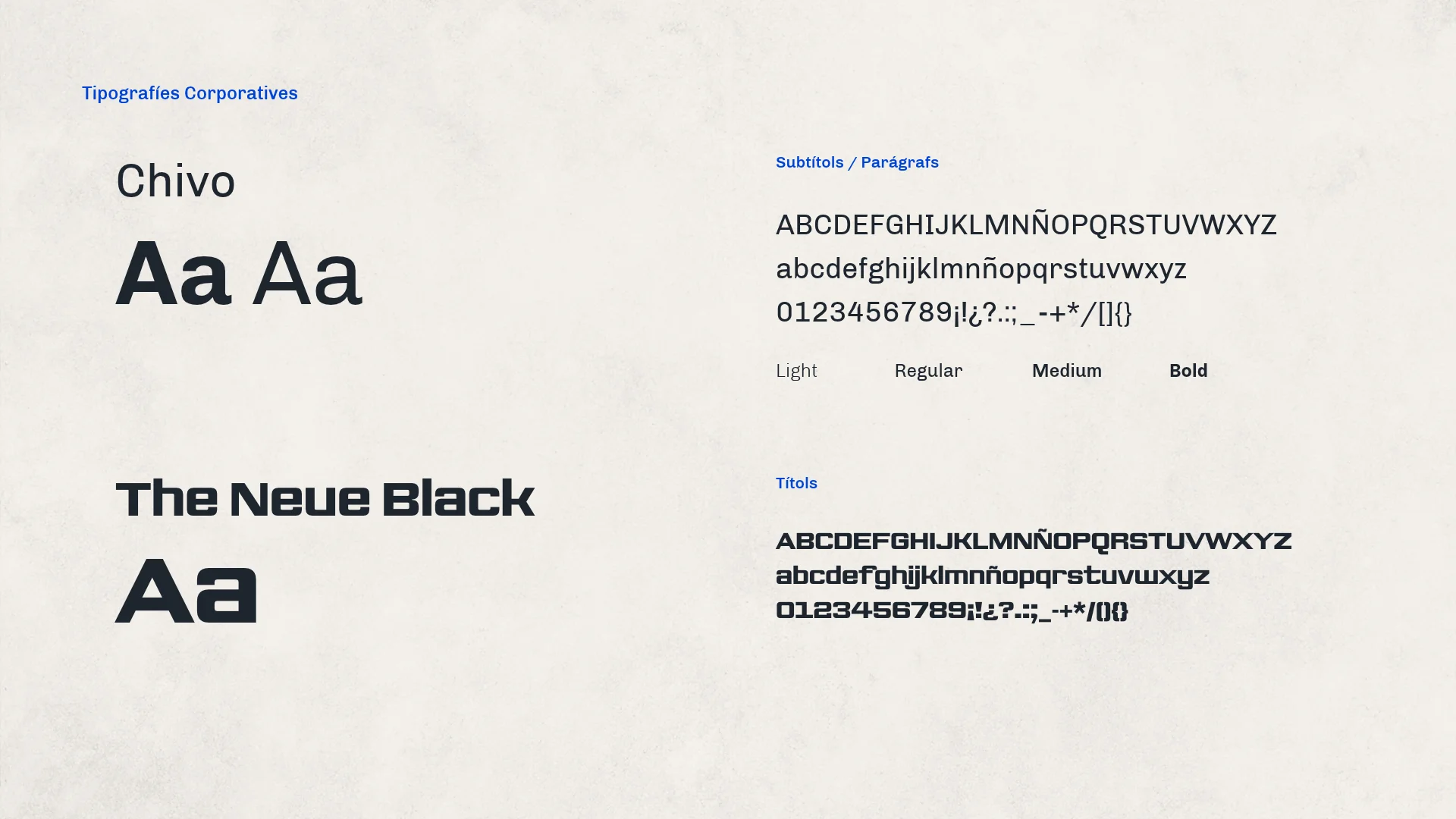
The symbol comes from Puigcerdà's bell tower seen from above: its octagonal floor plan is the base of a grid on which four ideas are built. Those ideas are the T of TICO, the C of Capital, an arrow marking the direction and a target at the centre. Together they form an eight-armed shape, like a compass rose pointing everywhere from a single point. Its logotype pairs TICO in bold with "capital" in a fine stroke, all on the same grid. For colour, an intense electric blue, black, cyan, pearl white and pure white; for type, The Neue Black for headlines and Chivo for body text. From there, the system reaches stationery, corporate folders, event stands and the building sign.
Process
How we did it
The same method as always: understand the business before drawing anything, and never move on to the next phase without your approval.
Discovery
Understand the business- Kick-off meeting
- Competitors
- Goals
Concept
Find the idea- Moodboard
- Sketches
- Creative direction
Identity
Build the brand- Logo
- Colour & type
- Applications
The concept
The octagonal floor plan of Puigcerdà's bell tower, turned into a compass rose: the T, the C, the direction and the target, all built from the same centre.
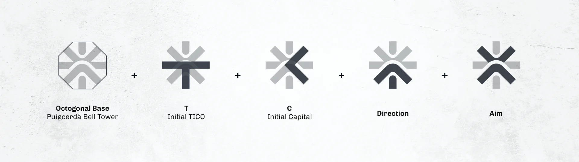
A group of companies needs a starting point. That's why the Tico Capital brand is born from Puigcerdà's bell tower and points in every direction.
01
Visual identity
Logo · Colour · Typography

02
Brand applications
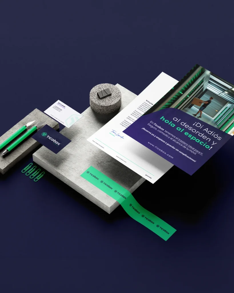
Stationery · Apparel · Posters