

About the project
Taxi Ginestà is Josep Mª Ginestà's taxi, taking locals and visitors all over La Cerdanya. He needed an image of his own, approachable and connected with the people of the region, that conveyed safety, comfort and cleanliness at first sight of the vehicle.
Challenge and solution
Recognised from the pavement
Challenge
In the taxi business, branding barely exists: a roof sign, a licence number and little else. So a trusted driver gets mistaken for any other, and customers choose blindly. Josep Mª wanted the opposite: for people to recognise him, remember him and call him again. The image had to be professional and approachable at the same time, and work above all where it's most visible: the vehicle itself.
Solution
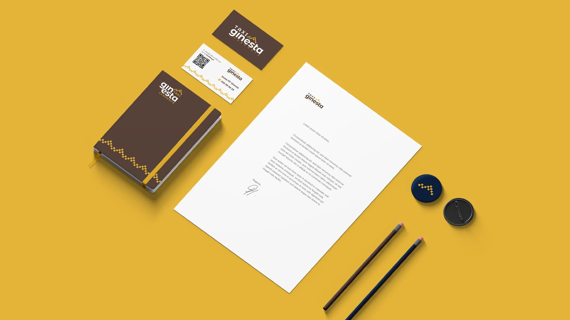
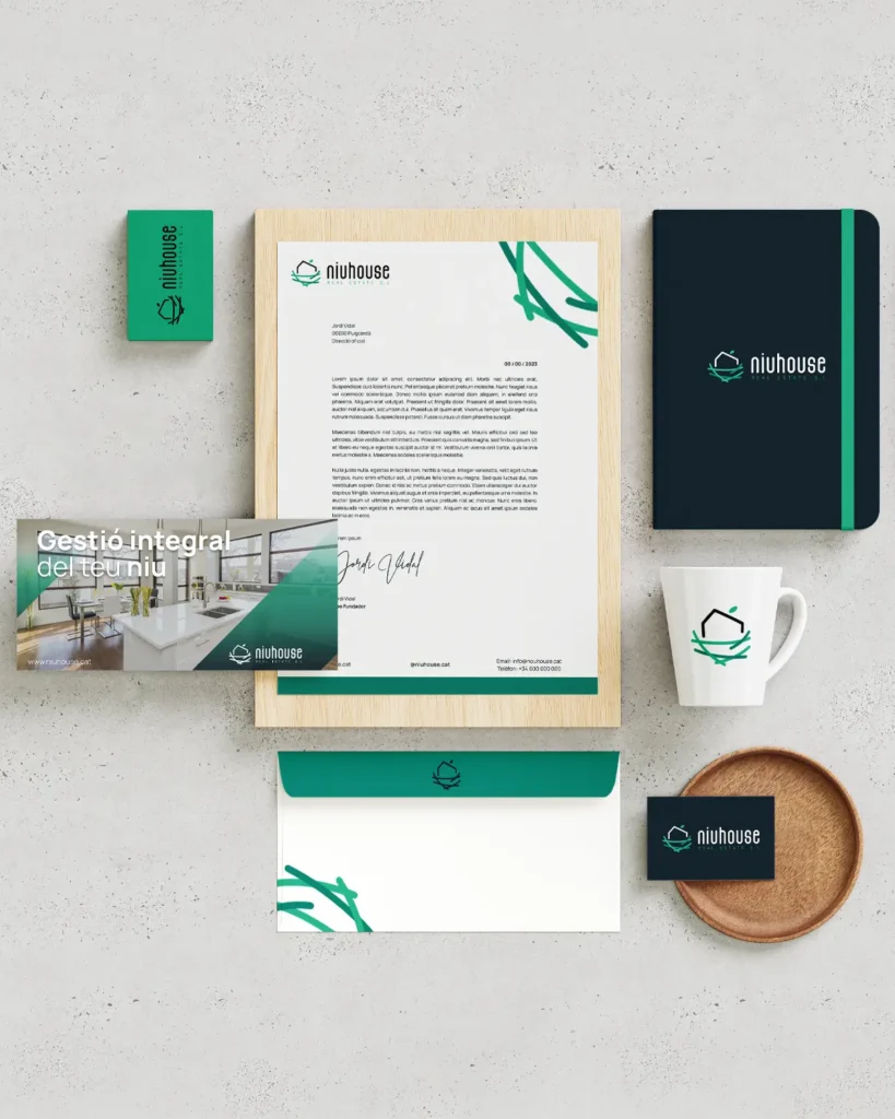
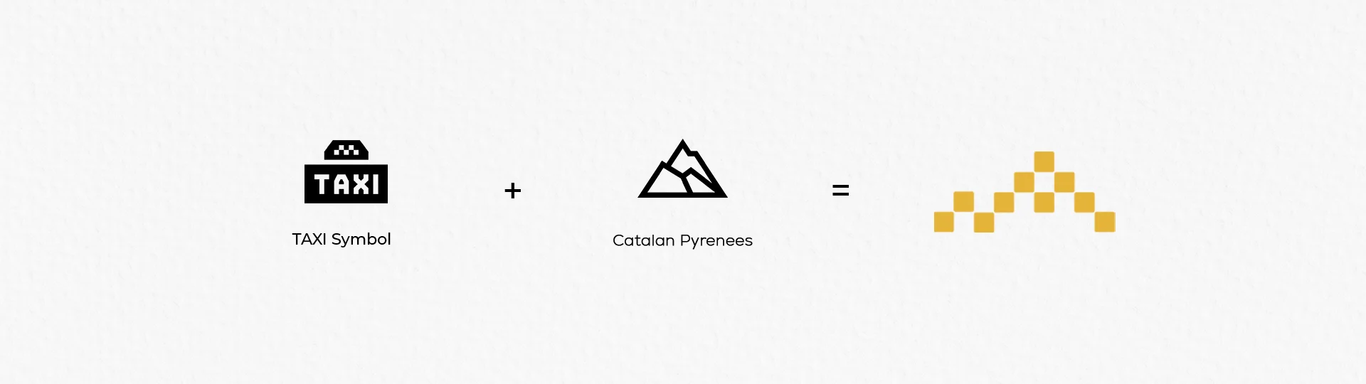
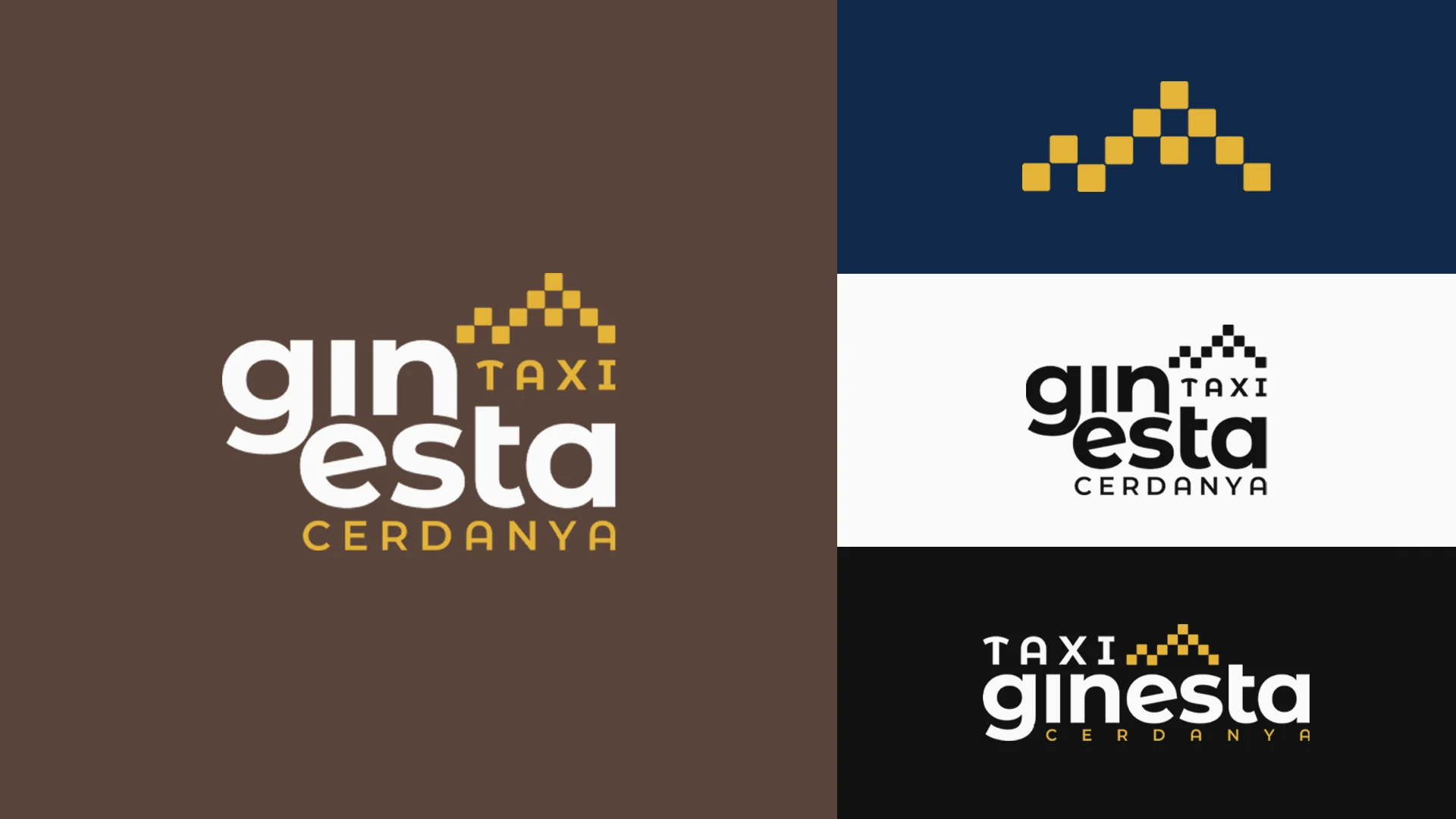
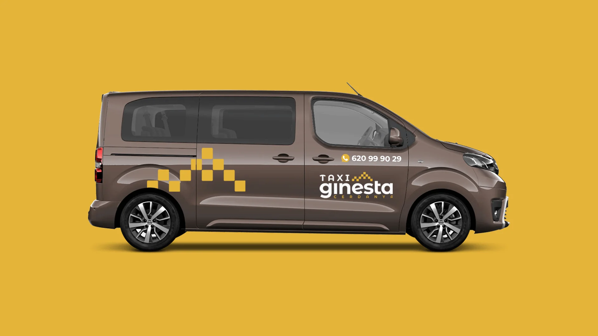
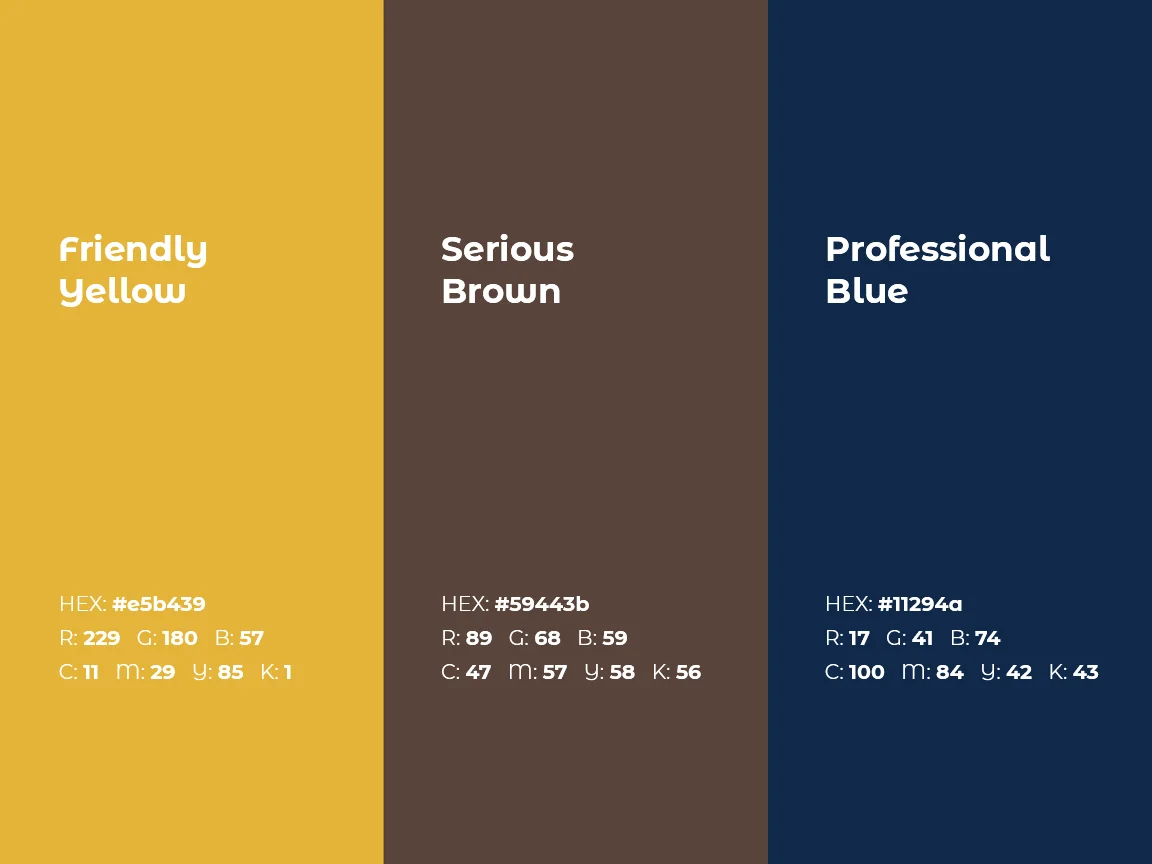
A logo that takes the classic taxi chequerboard and turns it into the mountains of the Pyrenees: a recognisable nod to both the trade and the region. The palette combines a mustard yellow that brings warmth, a brown that adds seriousness and a professional midnight blue. The chequerboard becomes a pattern that wraps the van from end to end, and the system is completed by business cards and stationery so customers keep the number.

Process
How we did it
The same method as always: understand the business before drawing anything, and never move on to the next phase without your approval.
Discovery
Understand the business- Kick-off meeting
- Competitors
- Goals
Concept
Find the idea- Moodboard
- Sketches
- Creative direction
Identity
Build the brand- Logo
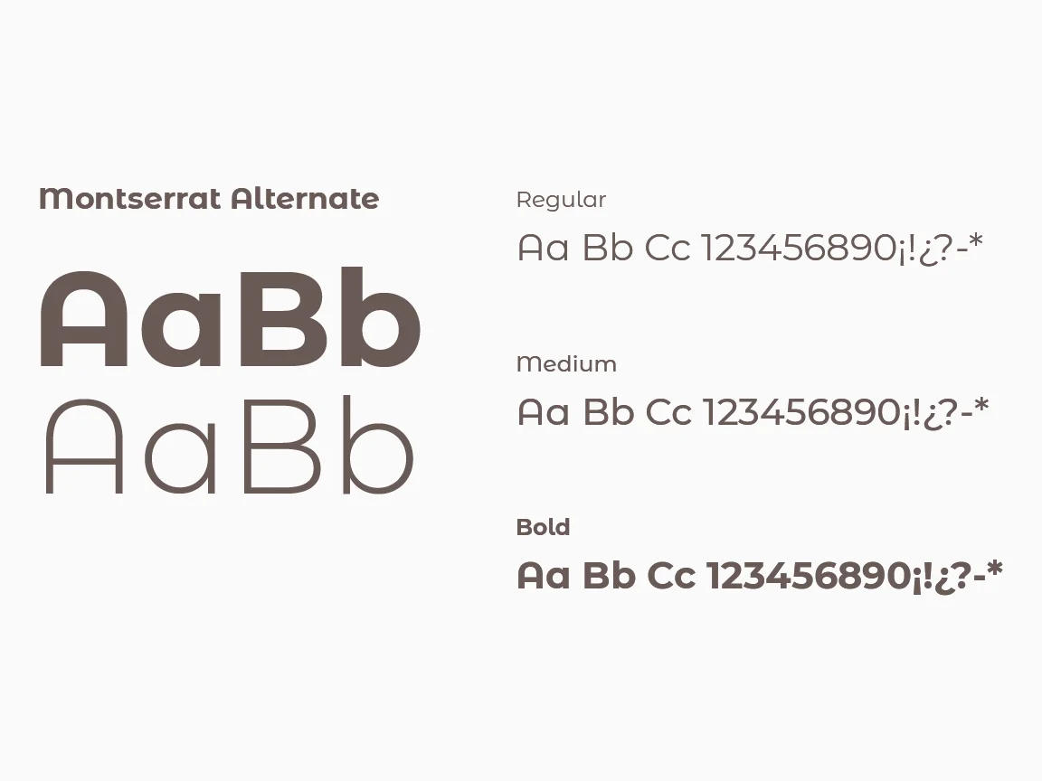
- Colour & type
- Applications
The concept
The classic taxi chequerboard, drawn as the mountains of the Pyrenees: the trade and the region in a single gesture, recognisable from a hundred metres away.
A taxi is chosen in seconds, sometimes from the pavement. That's why Josep Mª's brand had to stand out from afar and build trust up close.
01
Visual identity
Logo · Colour · Typography

02
Brand applications
Stationery · Apparel · Posters