
About the project
Fusteria Esquerrer is Marc Esquerrer's carpentry workshop, working all over La Cerdanya: kitchens, wardrobes, doors and bespoke projects in mountain homes. He wanted an elegant, understated brand that lived up to his work and conveyed craftsmanship, care and a love of wood.
Challenge and solution
Trust before the first meeting
Challenge
In carpentry, almost every brand looks the same: browns, saws, hammers and the name in any old typeface. That makes it hard to tell a workshop that builds bespoke furniture from one that just assembles it. Marc's work was top level, but his image didn't show it. He needed a brand that conveyed elegance and personality, stood apart from the sector and looked good next to the wood.
Solution
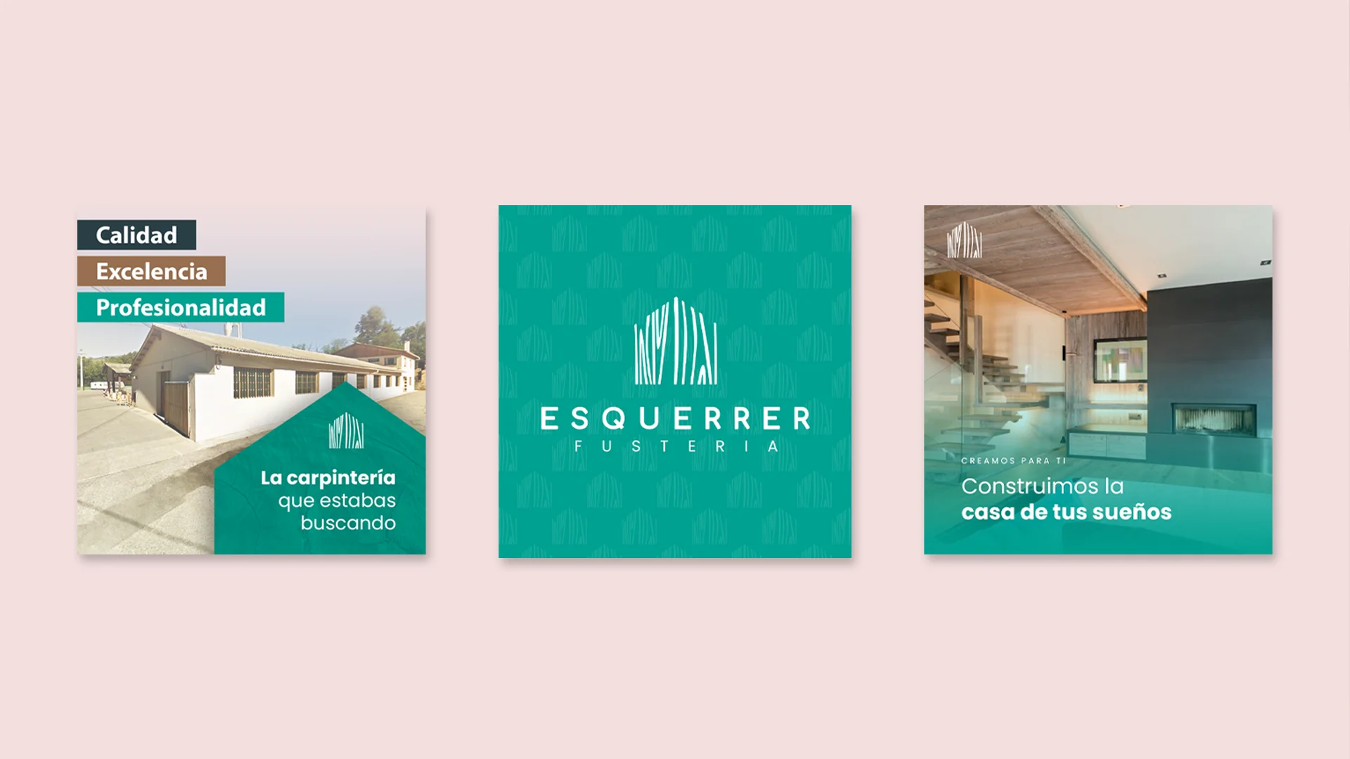
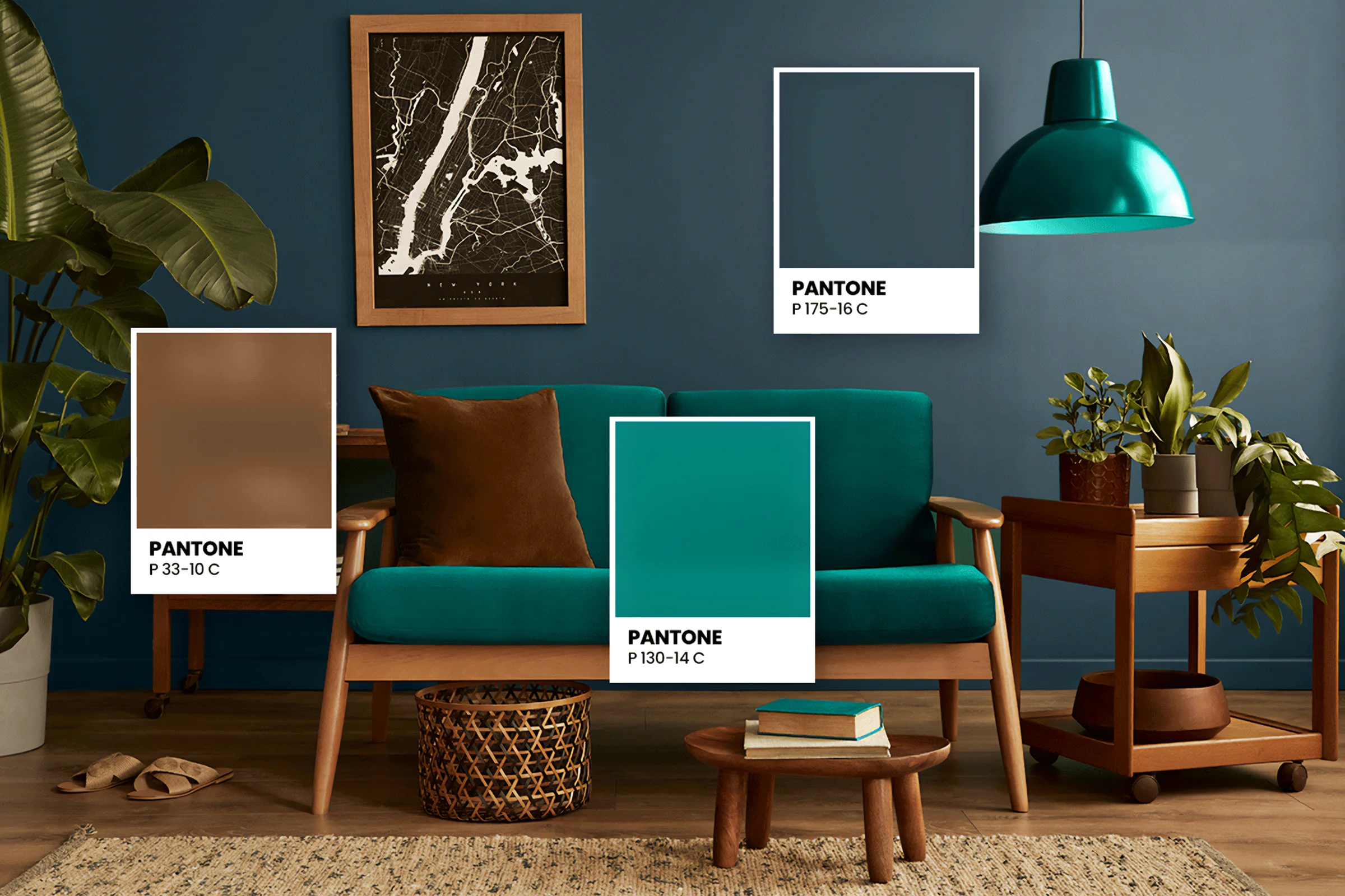
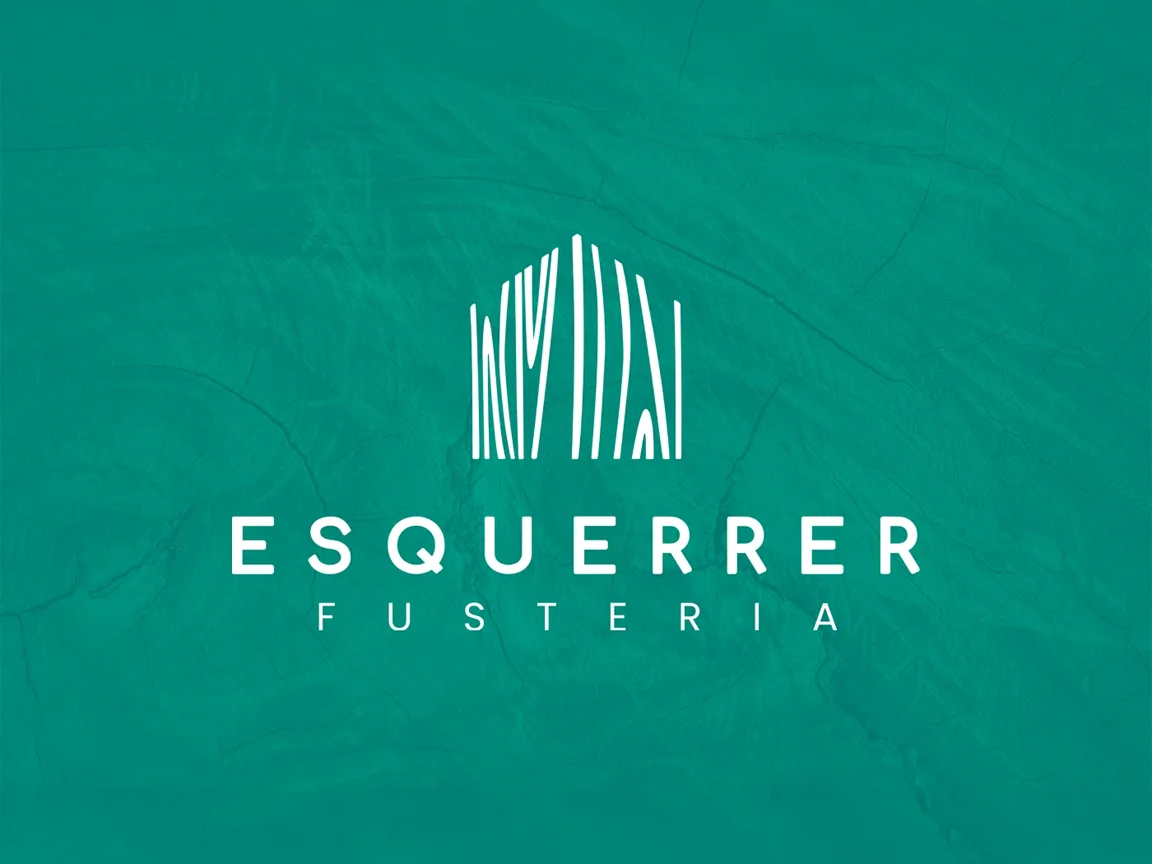
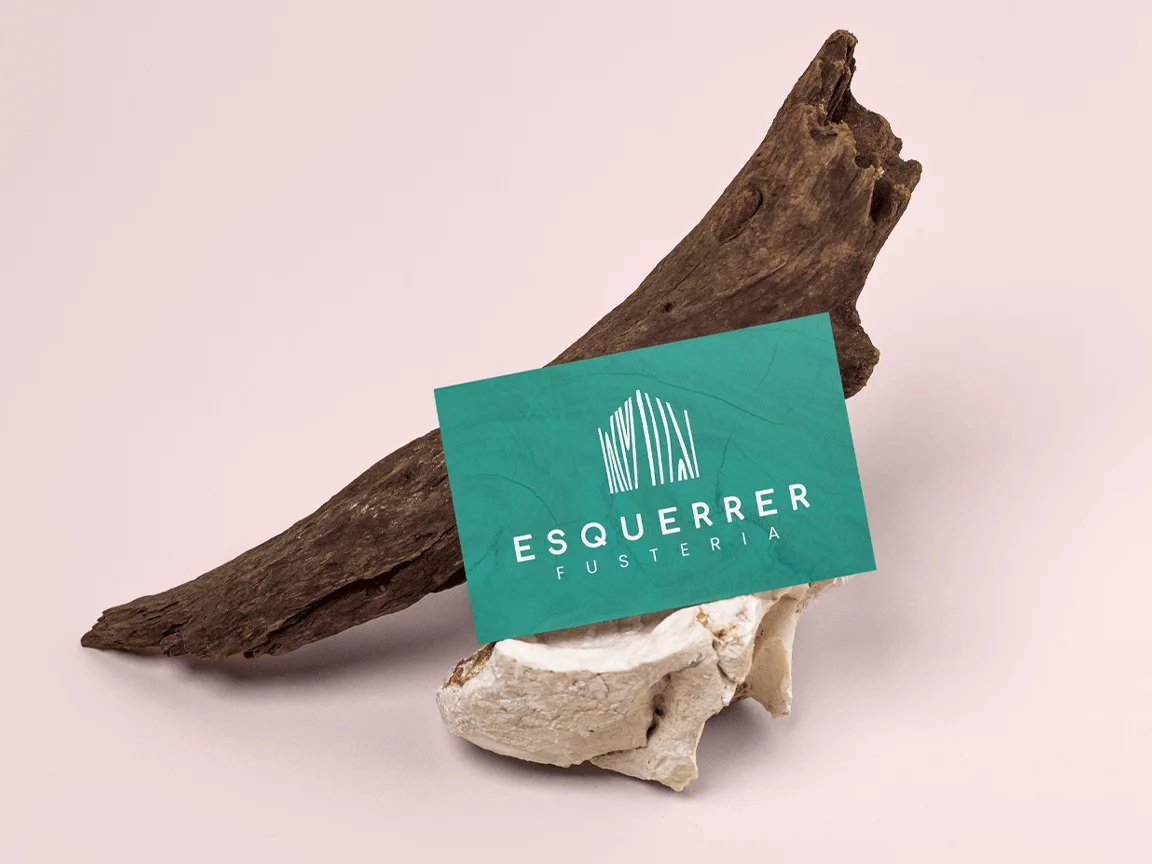
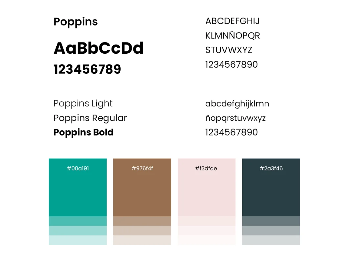
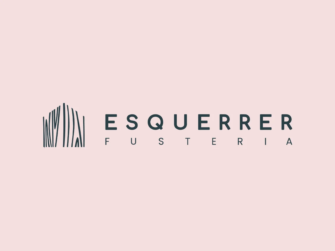
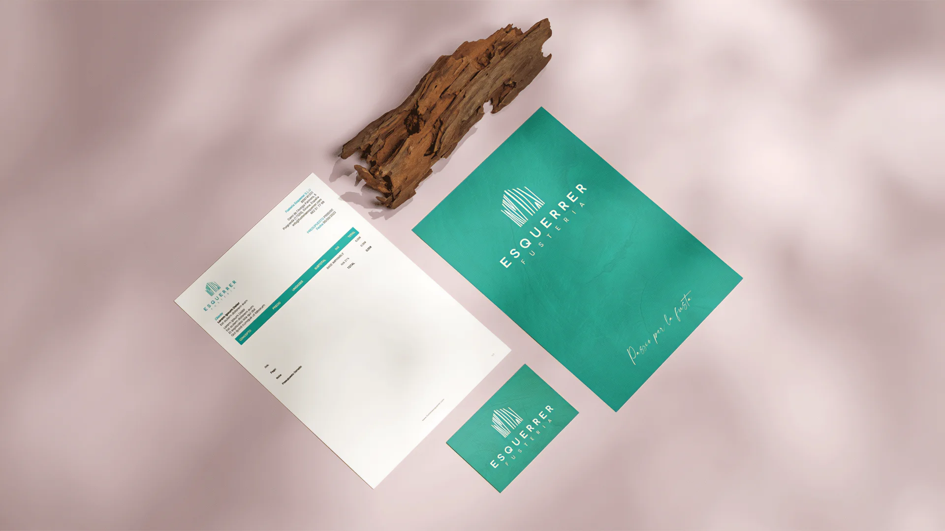
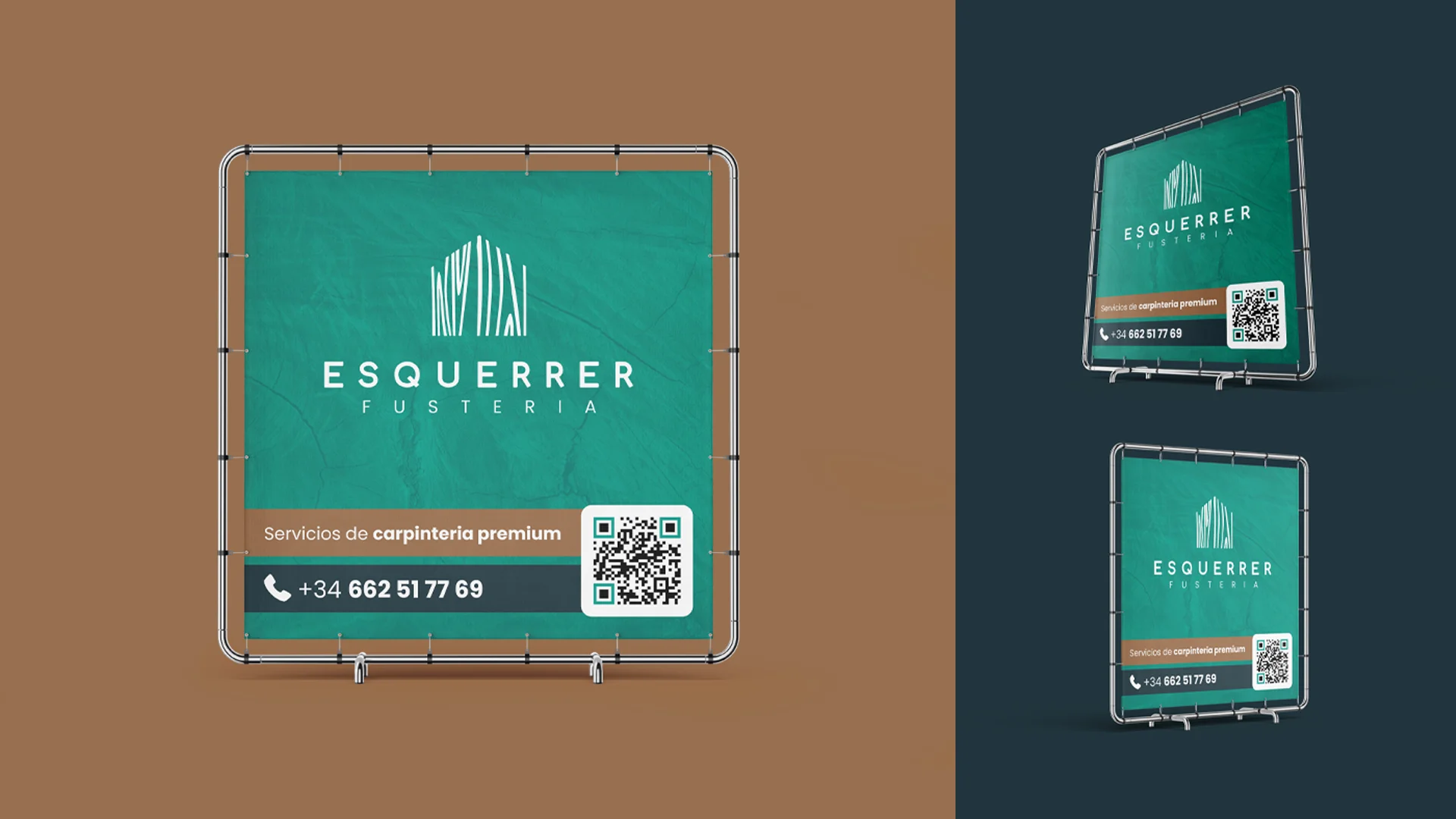
A symbol that draws a house with the grain of the wood, a palette that avoids the sector's predictable brown with a turquoise green as the main colour, and a widely spaced sans-serif that brings air and elegance. For the tagline, «Passió per la fusta» (Passion for wood), a script typeface that adds the handcrafted touch. All designed to sit alongside real textures: planks, edges and finishes.
Process
How we did it
The same method as always: understand the business before drawing anything, and never move on to the next phase without your approval.
Discovery
Understand the business- Kick-off meeting
- Competitors
- Goals
Concept
Find the idea- Moodboard
- Sketches
- Creative direction
Identity
Build the brand- Logo
- Colour & type
- Applications
Website
Take it online- Structure
- Design
- WordPress
The concept
A house drawn with the grain of the wood: the material Marc works with and the place where every one of his pieces ends up.
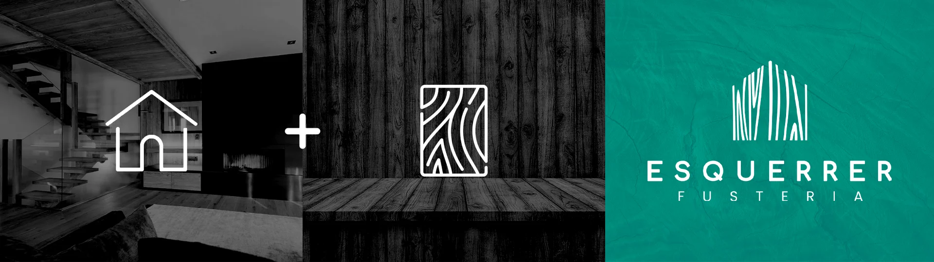
In carpentry, detail isn't explained: it's seen. That's why the Esquerrer brand had to be as well finished as the furniture that leaves his workshop.
01
Visual identity
Logo · Colour · Typography
02
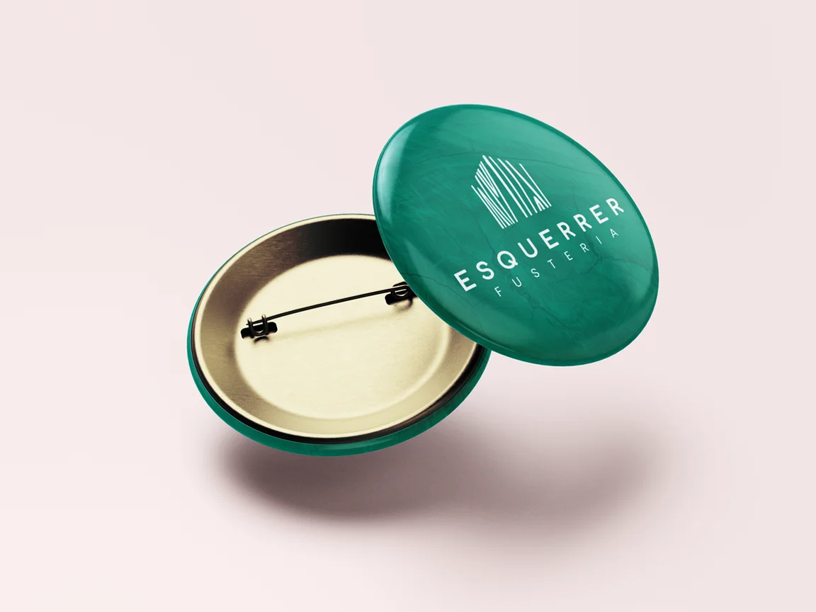
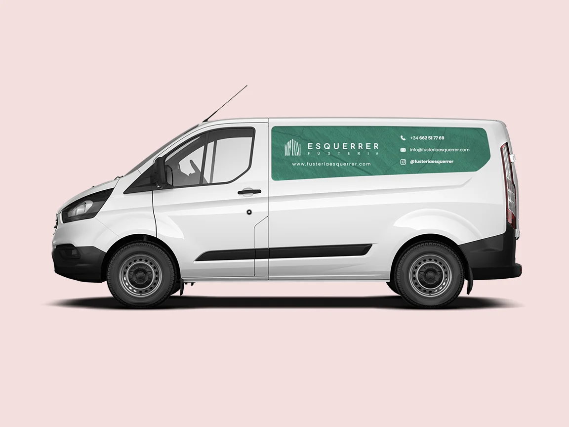
Brand applications
Stationery · Apparel · Posters
03
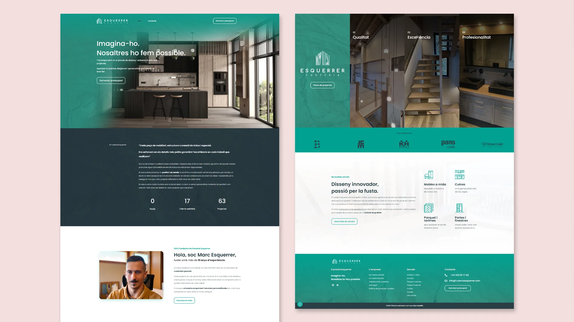
Digital presence
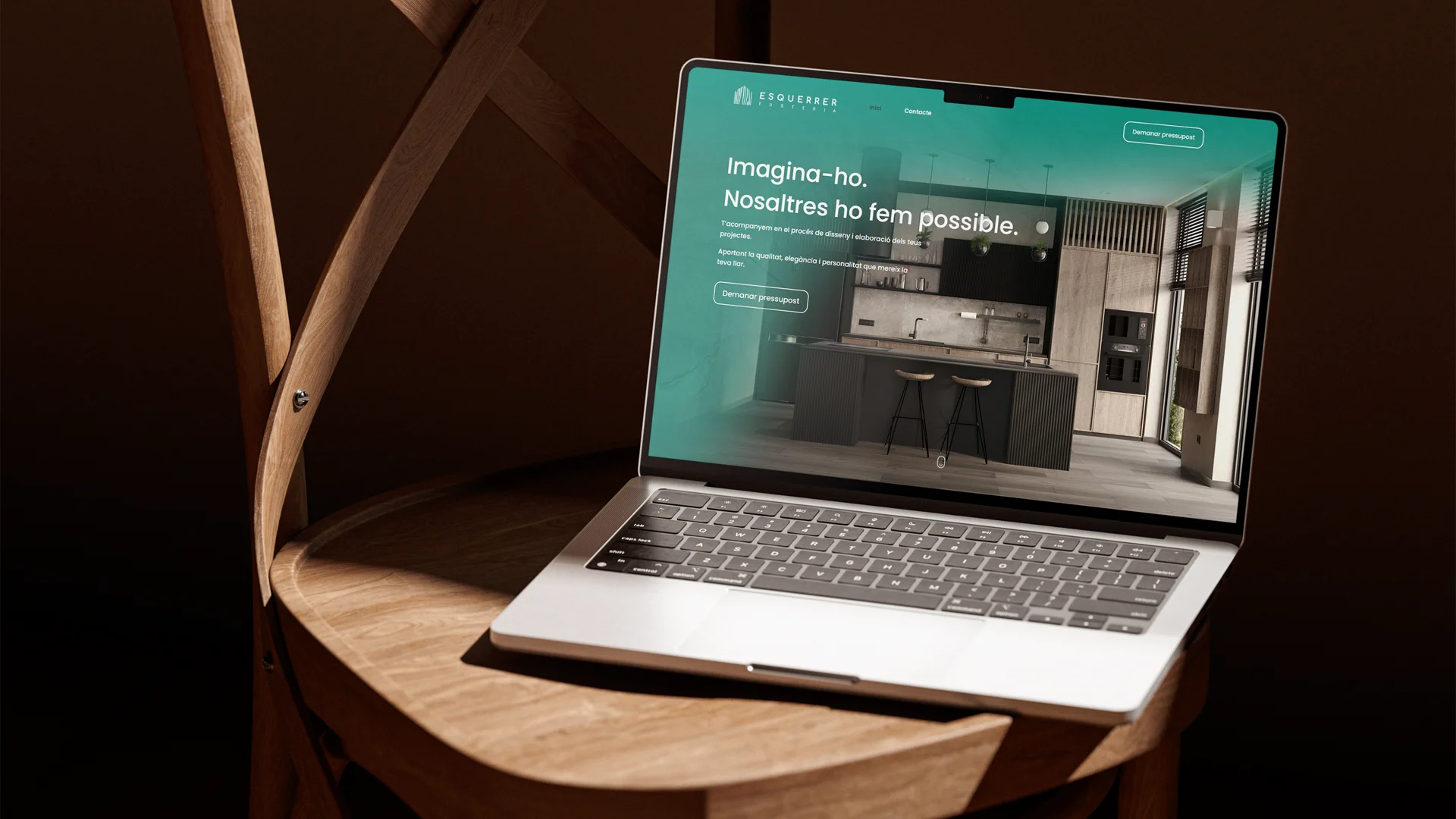
Web design · Social media